The Great Coca-Cola Can Debacle
If you’ve ever changed the handles on your cabinets, or moved a wall clock, you know that we are creatures of habit. We gravitate towards the right (unless you’re that one, slow a-hole blocking rush-hour stair traffic) and buy our beverages based solely on the color of the can.
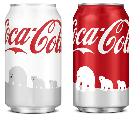
We’d like to think that we’re incredibly self-aware, able to make informed choices and possess open minds, but if the recent Coca Cola s-can-dal has taught us anything, it’s that we’re anything but. Basically, as an attempt to call attention to a partnership with the World Wildlife Fund, the powers-that-be at Coke released a special holiday version of their classic red can — something they do every year — but this one was, wait for it … white. GASP!

Mayhem ensued, with diabetics unknowingly guzzling the classic (read: sugar-filled) formula — duped as they were by the white can. “It was too similar to the Diet version!” they exclaimed. “It tasted differently“, others insisted. Never mind that the can clearly shows the “Coca-Cola” logo — much different, aesthetically from the Diet Coke branding — and that the iconic script occupies nearly a third of the can. Also, ignore the fact that the outside packaging remained red. America had had enough and demanded that the hoighty-toighty design-conscious snobs stop messing around with their beloved can.
So, they did. Coke is pulling their “bastardized” cans from shelves and replacing them with different, more consumer-friendly (red) designs — a plan they claim was always in the works (how convenient).
Aside from highlighting the incredibly finicky nature of the American consumer, this recent s-can-dal only reinforces what most designers already know: change is a difficult sell. No matter how much of an improvement, or how much more aesthetically pleasing a design may be, re-branding a product (or company, or person) can be an enormously difficult and touchy undertaking.
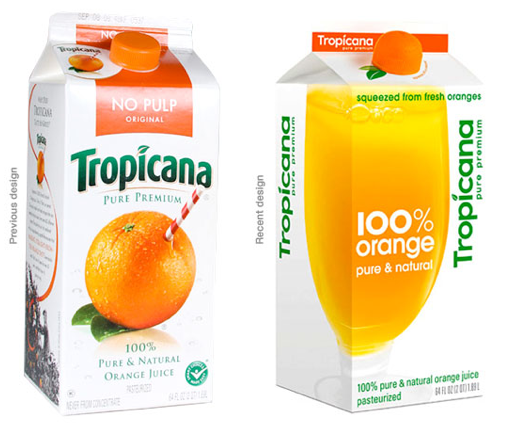
 Aunt Mae’s corner cupcake shop is one thing. Huge, well-loved and well-known brands face the ire and criticism of the whole world, or at least it can seem like it (especially with the advent of that every-man’s soapbox, Twitter). Just ask the marketing departments at Tropicana or the Gap — both companies rolled out “drastic” (and I’m sure, very expensive) redesigns of their beloved brands this year, only to say out with the new, (back) in with the old, as a response to the outcries each respective design received.
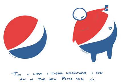
People don’t like change, or at least most people don’t — whether they’re aware of it or not. Just because something is new, however, does not mean it is inherently evil — although I could argue that there have been plenty of re-brands that should have been scrapped, or at least immediately re-worked (I’m looking at you, Pepsi).
As designers, we generally have pretty amazing jobs. We’re not working in a coal mine, or operating on hearts — at the same time, our profession is legitimate and some times (if we’re lucky) even influential. We have to be thoughtful and respectful with our ideas, whether they be for Aunt Mae or an industry titan like Coke.
And then, we have to stand behind our choices as professionals, or be prepared to crumble and suffer the often-times, very public (and expensive) indignity of a “just kidding” (Qwikster, anyone?).
Sorry, comments for this entry are closed at this time.
