This summer, the 427 Design team was tasked with giving the Padua Franciscan High School mascot a fierce facelift. When designing the new athletic logo, a lot had to be taken into account. He needed to be representative of the staff and student body of Padua Franciscan; positive, strong and respectable. The new Bruin would require balance, should be stern and intimidating, yet not vicious or violent.
Oftentimes when a high school logo is developed, inspiration is drawn from college and/or professional team logos. But we feel that athletic teams at the high school level also deserve a strong and original logo. So we set out to deliver a great product without borrowing from an existing design. Padua Franciscan High School already stands out in so many ways, so the goal was to create a rebirth of the Bruin that would stand out in a sea of generic team logos. This logo would need to embody all that Padua stood for on and off the field or court.
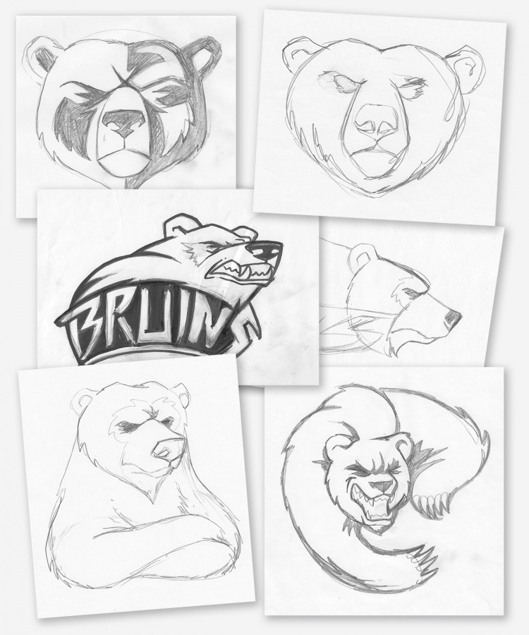
Putting Pencil to Paper
In these initial sketches the bear was just starting to take shape. What started as a minor update to the existing logo (bottom right), quickly developed into a complete overhaul. While nearly four dozen different concepts were developed through this process, this small grouping shows the progression and various secondary logo ideas; essentially depicting the Bruin in every angle and mood imaginable. The top two are the genesis of what would become the final logo.
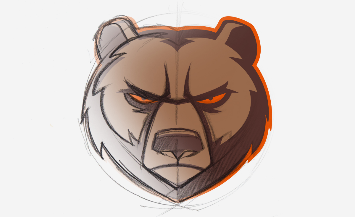
Once we settled on the front facing Bruin as the main logo, work began trying to find the right style. The challenge with a front facing bear is the angle of the face, it could easily look too much like a lion or wolf depending on the brow and muzzle placement. We started with an open roaring mouth concept, but it proved to be far too aggressive.
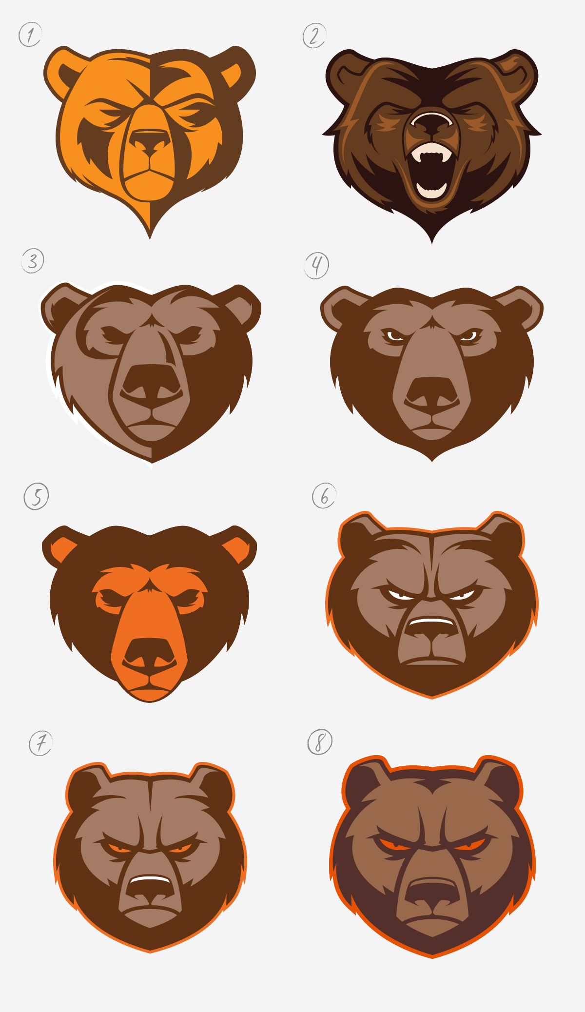
As you can see below, subtle changes through the various revisions make for significant changes overall.
The Life Cycle of the Bruin Rebranding
- A straight vector version of the initial top left sketch.
- A secondary concept featuring an open “roaring” mouth that was agreed to be a little too aggressive.
- A variation of the use of half-light/half-shadow approach.
- A variation of 3 but with a center light source, showing that when compared to the next version, how dropping the muzzle slightly can change his personality entirely
- Another variation in muzzle placement, as well as color usage.
- This was stage in which the look started to click with the whole team as a final concept.
- Narrowing of the face and facial features to give him a lean and mean presence. Aiming for a rounder appearance rather than a heart shaped one previously depicted.
- A minor adjustment to his “beard” and enlarging his facial features and Viola!
From one logo concept comes three variations of the Padua Athletics brand. It is important to have a tight design where the various elements can stand alone, and be just as recognizable as they are when they are presented all together. This gives the new Padua Franciscan High School athletic logo the versatility and originality that sets it apart from other athletic logos. The Bruin head can stand alone, as can the Padua Franciscan Bruins word mark. And then, the shield marries the imagery and the name together for a complete logo.
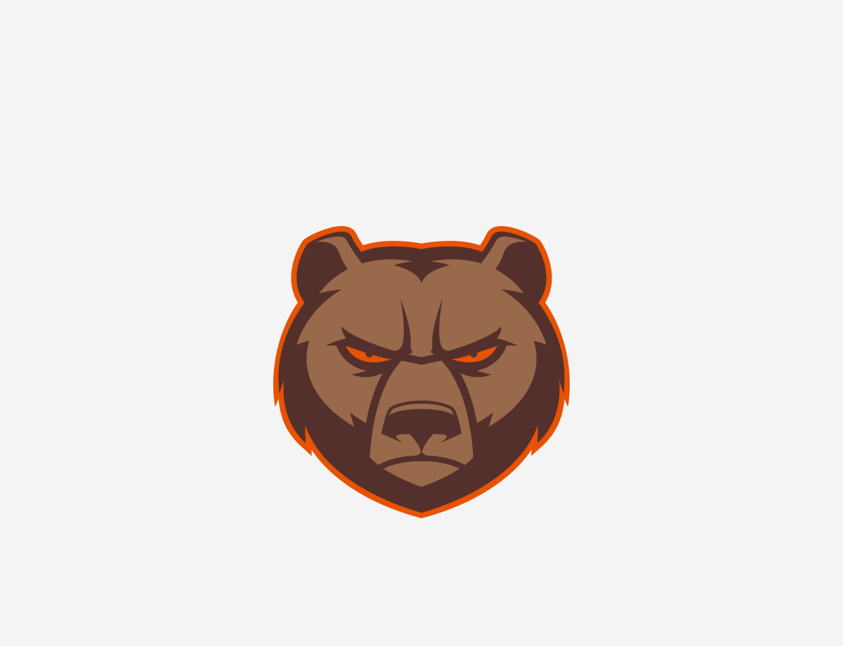 In the end, we are really proud of the final product. The new logo strikes a great balance of meeting all the goals and objectives of the project. More to come on the next phase of the Bruin logo, as we develop additional angles and positioning.
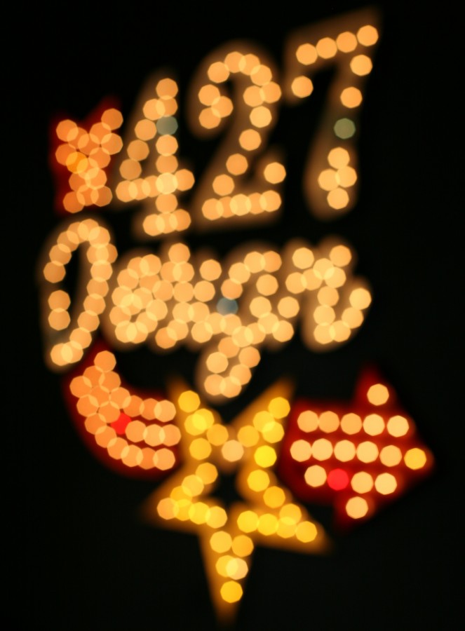
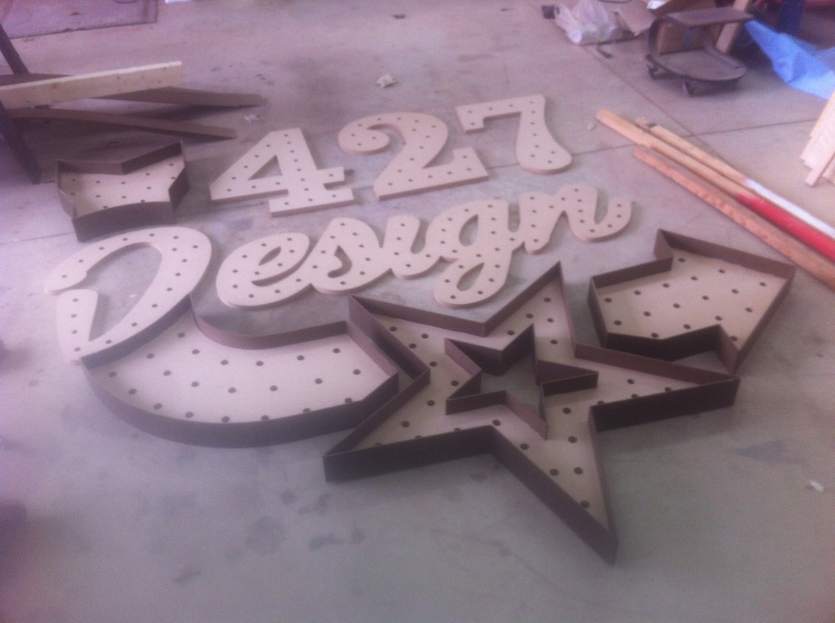
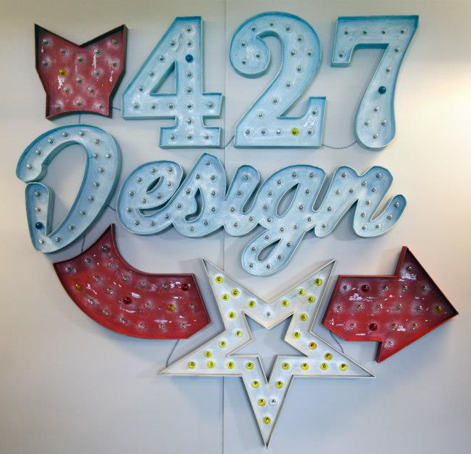
If you came to our 7th annual Open House on April 26th, you may have noticed a new addition to our office walls: a huge, lighted marquee sign consisting of our name, star logo and a curving arrow (it’s kind of hard not to notice).
When we first picked our Open House theme nearly a year ago (Lucky No. 7/Vegas) we almost immediately decided that we wanted to make a sign. Few things scream “Las Vegas” more than large, lighted signs, but we knew that we’d want something that could not only fit into our theme, but remain in our office for years to come. Our creative director, Justin, volunteered to take on the enormous task of building the sign, and one of our designers, Alexandra, designed it.
Here’s a peek into the process:
Research
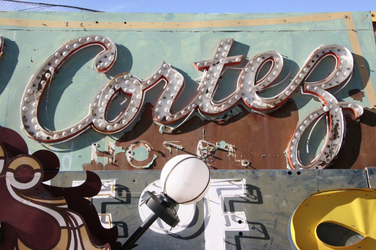
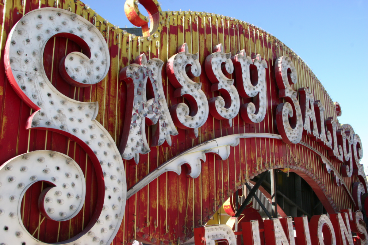
Most of our projects begin with extensive research. We had toured the Neon Sign Museum‘s boneyard on a trip to Vegas a few years back, so we started combing through the photos we took there for inspiration. We knew we wanted an arrow — and our logo was a given — but choosing the right typefaces and styles for the “427 Design” part was tricky.
We didn’t want the sign to feel too gimmicky or too themed; we wanted a classic and vintage look that would feel at home in our office.
While Alexandra was busy formulating the design, Justin was researching the construction end of the project. We initially considered making the sign from metal, but we quickly realized that wood was the most feasible option.
We knew we would be using bulbs (instead of neon), and we loved the dimensional quality of the signs with raised sides.
Design
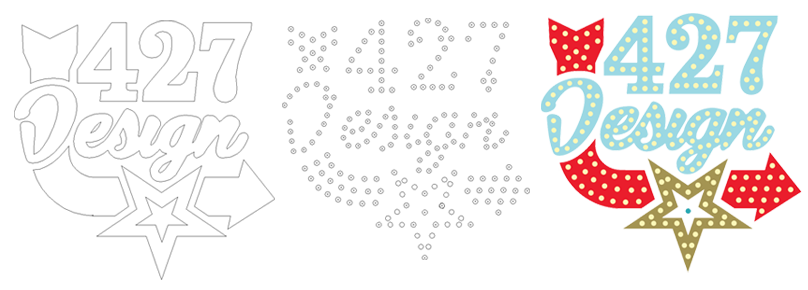
We designed the sign as vector art in Illustrator. We bought strings of simple, clear, round bulbs and measured one — after the final design was agreed upon, we took the same file and plotted out the placement of each light bulb.
Laser-Cutting
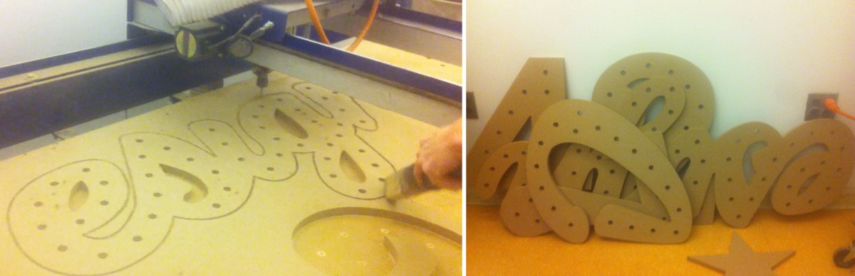
With the final plans in hand, Justin enlisted the help of Brad’s son Bryan. Bryan and Justin traveled to the Art Institute of Pittsburgh (their Alma Mater) to use their laser-cutting table. The bases for each section of the sign were cut from MDF, and a hole for each bulb was drilled.
This saved a lot of time and potential headaches, and ensured that our sign was as close to the original design as could be.
Adding Dimension
After the individual pieces were cut out, Justin began adding dimension to each one with strips of masonite. The straight sides were relatively simple: a few nails, some glue and a very precise measuring.
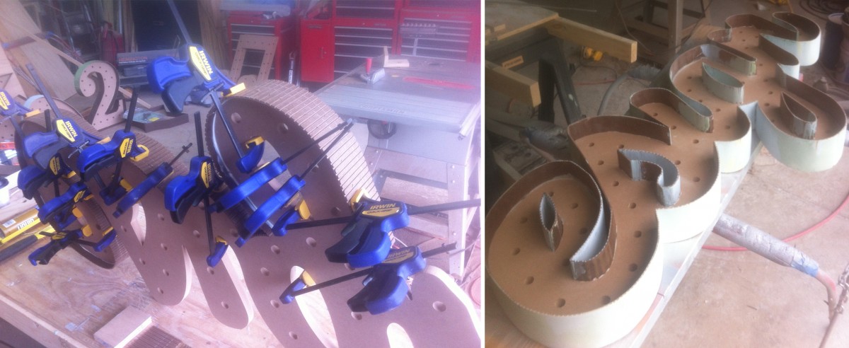
The curves were a different story. In order to get the masonite around the tight curves, he had to notch each strip so it wouldn’t break under the tension. After nailing and gluing the strips, he filled in the notched areas with body filler (thanks USC!) and sanded each one smooth.
If this sounds fun to you, let me introduce you to Justin’s fingerprints, which reappeared recently after being sanded completely smooth.
Faking Metal
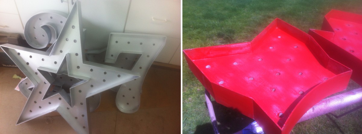
Although our sign was made from wood, we were able to mimic the look of the vintage, metal signs by using various painting techniques. After a few coats of primer, the entire sign was sprayed with a metallic silver spray paint.
The individual pieces were then painted with latex paint in their own color. Using a combination of scraping and sanding, Justin then distressed the pieces, paying special attention to the areas that would realistically have received the most wear (edges, around the bulb sockets, etc.).
Adding Bulbs
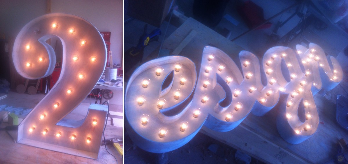
Turning a string of lights into a lighted marquee sign was no small task. Each bulb had to be removed from its string while the wires were wound around the back of each part of the sign. After the sockets were placed into their corresponding holes, the bulbs were screwed back in, one at a time.
We even used a vintage glass-dying kit to tint some of the bulbs — yellow for the star, and a few random red and blue bulbs to give it a used, vintage look.
Hanging the Sign
After everything was cut, sanded, painted and wired, the sign was ready to be transported from Justin’s shop to the office. We decided that it demanded space of its own, so we cleared off a central wall near our sitting area. Hanging such a large sign was a challenge, but with a few helping hands, a lot of picture hanging wire and a few monkey hooks, we got it up and secure a few days before the Open House.
We’re so incredibly happy with the way the sign turned out. The first time we lit all 209, 5-watt bulbs — for a total of 1045 watts — we were in awe (we might have also melted the first dimmer we attached to it). It’s definitely transformed our space (and maybe our electric bill too) and will surely be the highlight of our office for as long as we’re in this space.
If you weren’t able to make it to the Open House this year, you can read more about what you missed here, or check out our photo album on Facebook. If you’d like to see the sign in person, stop by — we’d love to show it to you!
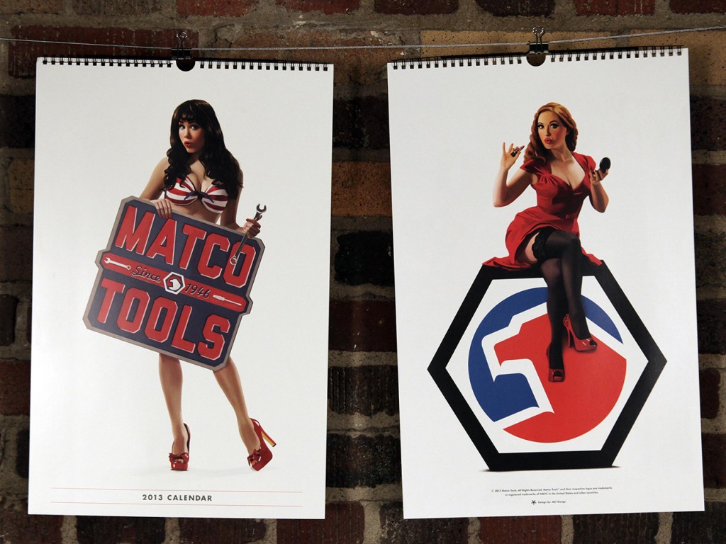
This year, we had the pleasure of working on the Matco Tools calendar for the second time (check out last year’s calendar here). We once again had an amazing time with everyone involved, and we hope it shows.
We decided (with Matco’s blessing) to pursue a pin-up theme, and we wanted to be extra careful to remain faithful to the artform. This meant hiring an artist to create one-of-a-kind illustrations for each page of the calendar — every image you see in the final is hand-illustrated, even down to the tools.
Here’s a peak into our process, from start to finish:
Assemble a Team:
We knew finding the perfect illustrator was key — not only someone talented, but also familiar with the pin-up style that we had in mind. Kelly X not only met those criteria, but she put us in touch with some of today’s top pin-up models, including (eventual calendar girls) Claire Sinclair, Sabina Kelley, Bondi Holly, Angela Riccio and Jessamyn Rose.
We still needed one more girl to round out the year (each girl represents two months), and from the minute we saw Miki Black, we knew she was it.
Lastly, we had worked with Studio Martone (photography) and Dresden Buras (stylist) on 2012′s calendar, and they were happy to reprise their roles for 2013.

Find a Direction:
We knew we wanted to remain faithful to the pin-up style, but what does that mean, exactly? We did weeks of research, poring over the greats: Elvgren, Buell, Ekman, Vargas, Armitage, Ballantyne, and D’Ancona — to just name a few of our favorites.
We found pages upon pages of reference, and began planning our shots based on scenes and situations commonly represented in pin-up artwork. We then had to find a way to plausibly relate each girl/scene back to our common theme of Matco Tools.
In the end, we had more than 20 scene ideas that we narrowed down to the final six.

Find a Style:
Using our pin-up research as a guide, we assembled a minimum of three outfits for each model. We tried to represent a variety of styles, while maintaining a similar look and feel. You may notice that we tried to primarily stay within the Matco color palette (red, white and blue).
We found our clothes/props from many different places, including a mix of modern clothing retailers and vintage sources. In the final product we managed to include three dresses, one jumpsuit, two bikini tops, one bikini bottom, one pair of teeny-tiny boy shorts, two lacy bras, one racing suit and a ton of stockings and garters.

Shoot Reference Photographs:
Much like a lot of the pin-up art of the 40s and 50s, we began with photographic reference. We spent a day with each model at Studio Martone, shooting with as many of our props in place as possible.
The fact that these were eventually being illustrated, allowed us a bit of freedom with our final compositions — for example, we actually shot Bondi Holly next to that 1953 Mercury, while Claire Sinclair was shot separately from the P-41 Warhawk.

Turn Photos into Pin-ups:
After a bit of Photoshop work (light retouching, composition, etc.) we sent the photos over to Kelly X, who turned them each into beautiful illustrated, one-of-a-kind works of art.
Starting with a pencil sketch based on each photo, Kelly painted layer upon layer until each girl was ready for the calendar. She also worked her magic on six classic Matco tools, illustrating each one so that the entire calendar would feel cohesive.

Make a Calendar:
We knew from the beginning that we wanted the 2013 calendar to be all about the girls, so we went with a full-page format, spiral-bound at the top (instead of the saddle-stitched bi-fold in 2012), and reserved 2/3 of the layout for the illustration. The other 1/3 was kept simple with the dates for two months, a featured tool and the Matco logo.

We are super happy with the final product, and hope you are too — you can see the entire calendar on our work page. We’re excited to finally be able to share all of our hard work with you, and we’re already looking forward to next year. If you’re interested in getting a 2013 Matco Tools Calendar to hang in your own shop or home, contact your local Matco Distributor.
Special thanks to everyone at Matco Tools, Kelly X and Studio Martone for all of your hard work!

We recently worked in conjunction with the University of Akron to create art for a Design Week, “Fontoween” poster. The five-color poster was printed at our studio by a group of design students, who, over the course of three days, learned the ins and outs of screen printing and hopefully had a good time in the process. Apparently learning can be fun, especially when it involves glow-in-the-dark ink, one particularly gnarly zombie and a whole lot of illustrated intestines.
Our illustrator, Joe, walks us through his illustration process and offers us a glimpse of what goes on every day inside those delicious, pink bwains of his.

Step 1:
I start with a basic concept and pull from various sources of inspiration and reference. For the zombie pose, I photographed myself gnawing on my TV remote, which I will not show due to the unflattering nature of the photo. After a brainstorming session, I quickly sketched a rough concept of what I imagined for the poster. This original concept served as my blueprint for the poster building process.

Step 2:
Next, I grabbed a set of Micron pens and a fine point Sharpie and started to draw the zombie’s head. A majority of people might start with pencil and work up to markers — committing to the artwork is a big step —but I’ve always been comfortable skipping pencil all together.

Each body part was drawn individually (and on separate sheets of paper), so I would have more control of the final art as it was scanned into the computer. After the head was done, I worked my way to his hands, neck and body — continuing to reference the original sketch as well as shots of my own hands.

Step 3:
The smooth, shiny intestine-like ‘Fontoween’ had to have a different feel than his rough, sketchy skin. Figuring out exactly how the word would work was one of my favorite parts of this project — it’s not often that my creative challenge for the day includes illustrating words out of a string of innards.

Using a sheet of vellum, I sketched the letters over the drawings of the zombie’s body, working it in through his hands and mouth. It was very important to me that I incorporated his hands, which eventually were utilized to form the ‘F’ and the ‘W’. Working with the twists, turns, and loops of the intestines, I created the other letter shapes.

Step 4:
After all of the illustrations were done, I scanned the artwork at 300 dpi and adjusted the levels for maximum contrast. I was left with a black outline of all of the artwork; using the pen tool, I blocked in the shapes and shadows and started to add different color layers to bring the walking dead to life.


Step 5:
Then, once all of the colors were done and trapping was accounted for, I went in with Photoshop brushes to give the artwork a slightly distressed look.
Finally, as the finishing touch, I put a bird on it.
