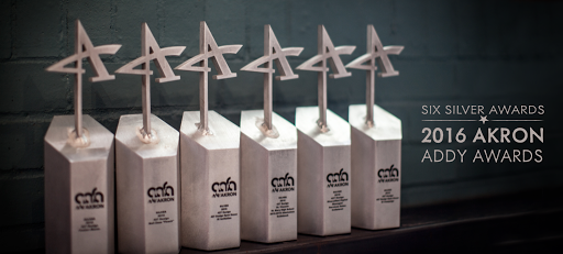
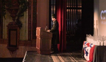
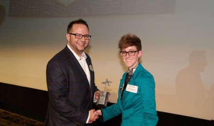
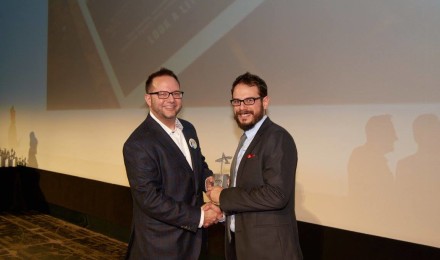
Once again, AAF-Akron hosted a varietal Who’s Who of the Akron advertising professionals and students. This year 427 Design received six Silver ADDY Awards from AAF-Akron at the aptly presidential-themed celebration of the Akron creative community on February 12th – Abe Lincoln’s Birthday.
At the close of each awards season we like to take the time to thank those who make it possible for us to do what we love. Our clients entrust us with their brands, engage us in overcoming their challenges and allow us the opportunity to produce and implement creative, in some cases award-winning, solutions. A few of the silver statues we received were awarded for work we did for Neil Zaza, Diversified Digital and St. Vincent-St. Mary High School.
. . .
2016 Akron ADDY Awards
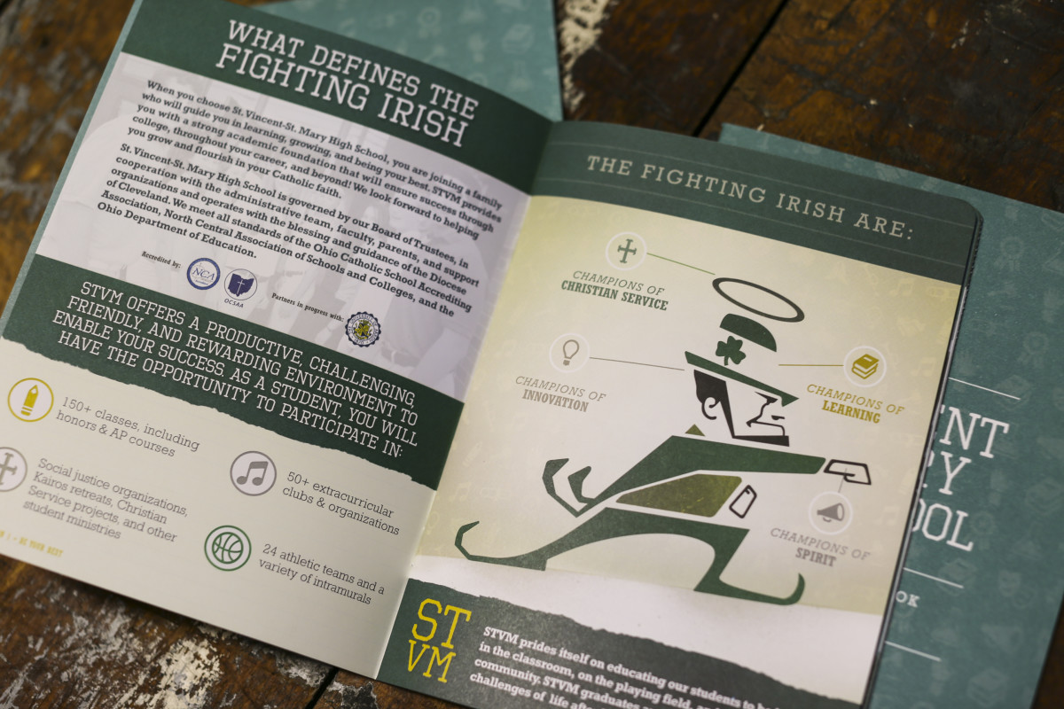
St. Vincent-St. Mary High School 2015-2016 Admissions Guidebook
Client: St. Vincent-St. Mary High School
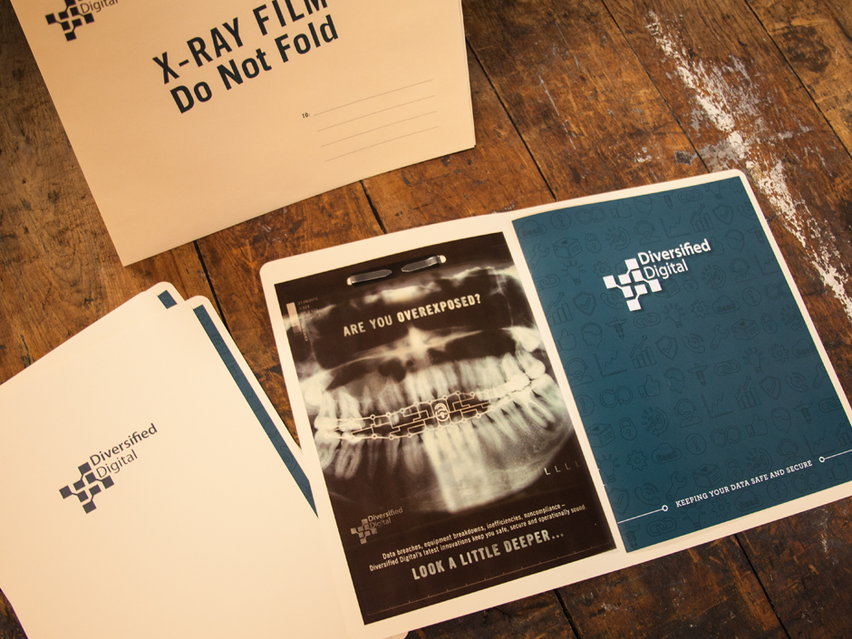
Diversified Digital Managed Services Sales Collateral
Client: Diversified Digital
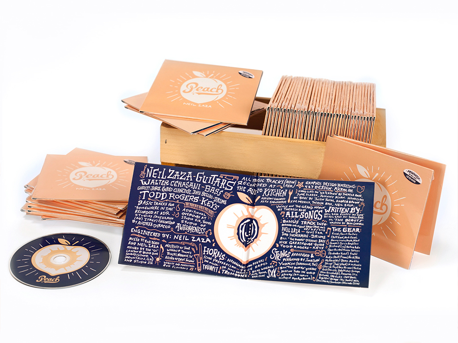
Album Art: Neil Zaza Peach
Client: Neil Zaza
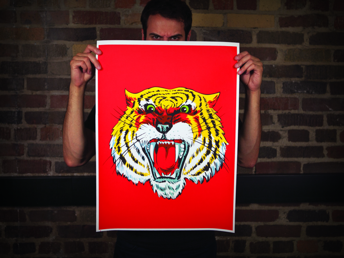
Poster: Meow.
Client: 427 Design
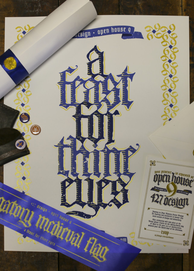
Open House IX Invitation
Client: 427 Design
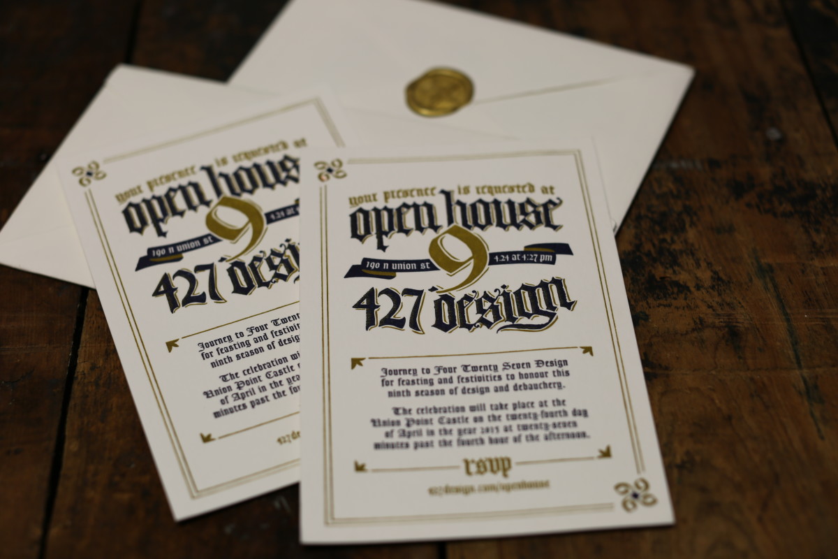
Open House IX Campaign
Client: 427 Design
Congratulations to all the winners of the 2016 ADDY awards. The work produced by the greater Akron creative community last year was outstanding and, as always, we are proud to be surrounded and challenged by each of you. Cheers to you, and here’s to another outstanding year.
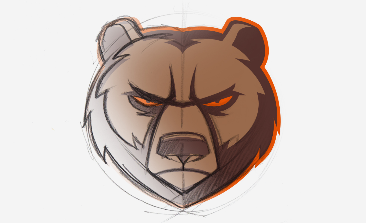
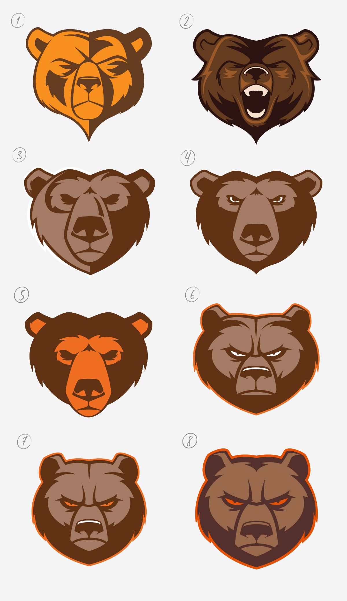
This summer, the 427 Design team was tasked with giving the Padua Franciscan High School mascot a fierce facelift. When designing the new athletic logo, a lot had to be taken into account. He needed to be representative of the staff and student body of Padua Franciscan; positive, strong and respectable. The new Bruin would require balance, should be stern and intimidating, yet not vicious or violent.
Oftentimes when a high school logo is developed, inspiration is drawn from college and/or professional team logos. But we feel that athletic teams at the high school level also deserve a strong and original logo. So we set out to deliver a great product without borrowing from an existing design. Padua Franciscan High School already stands out in so many ways, so the goal was to create a rebirth of the Bruin that would stand out in a sea of generic team logos. This logo would need to embody all that Padua stood for on and off the field or court.
Putting Pencil to Paper
In these initial sketches the bear was just starting to take shape. What started as a minor update to the existing logo (bottom right), quickly developed into a complete overhaul. While nearly four dozen different concepts were developed through this process, this small grouping shows the progression and various secondary logo ideas; essentially depicting the Bruin in every angle and mood imaginable. The top two are the genesis of what would become the final logo.
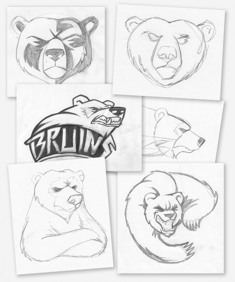
Once we settled on the front facing Bruin as the main logo, work began trying to find the right style. The challenge with a front facing bear is the angle of the face, it could easily look too much like a lion or wolf depending on the brow and muzzle placement. We started with an open roaring mouth concept, but it proved to be far too aggressive.
As you can see below, subtle changes through the various revisions make for significant changes overall.
The Life Cycle of the Bruin Rebranding
- A straight vector version of the initial top left sketch.
- A secondary concept featuring an open “roaring” mouth that was agreed to be a little too aggressive.
- A variation of the use of half-light/half-shadow approach.
- A variation of 3 but with a center light source, showing that when compared to the next version, how dropping the muzzle slightly can change his personality entirely
- Another variation in muzzle placement, as well as color usage.
- This was stage in which the look started to click with the whole team as a final concept.
- Narrowing of the face and facial features to give him a lean and mean presence. Aiming for a rounder appearance rather than a heart shaped one previously depicted.
- A minor adjustment to his “beard” and enlarging his facial features and Viola!
From one logo concept comes three variations of the Padua Athletics brand. It is important to have a tight design where the various elements can stand alone, and be just as recognizable as they are when they are presented all together. This gives the new Padua Franciscan High School athletic logo the versatility and originality that sets it apart from other athletic logos. The Bruin head can stand alone, as can the Padua Franciscan Bruins word mark. And then, the shield marries the imagery and the name together for a complete logo.
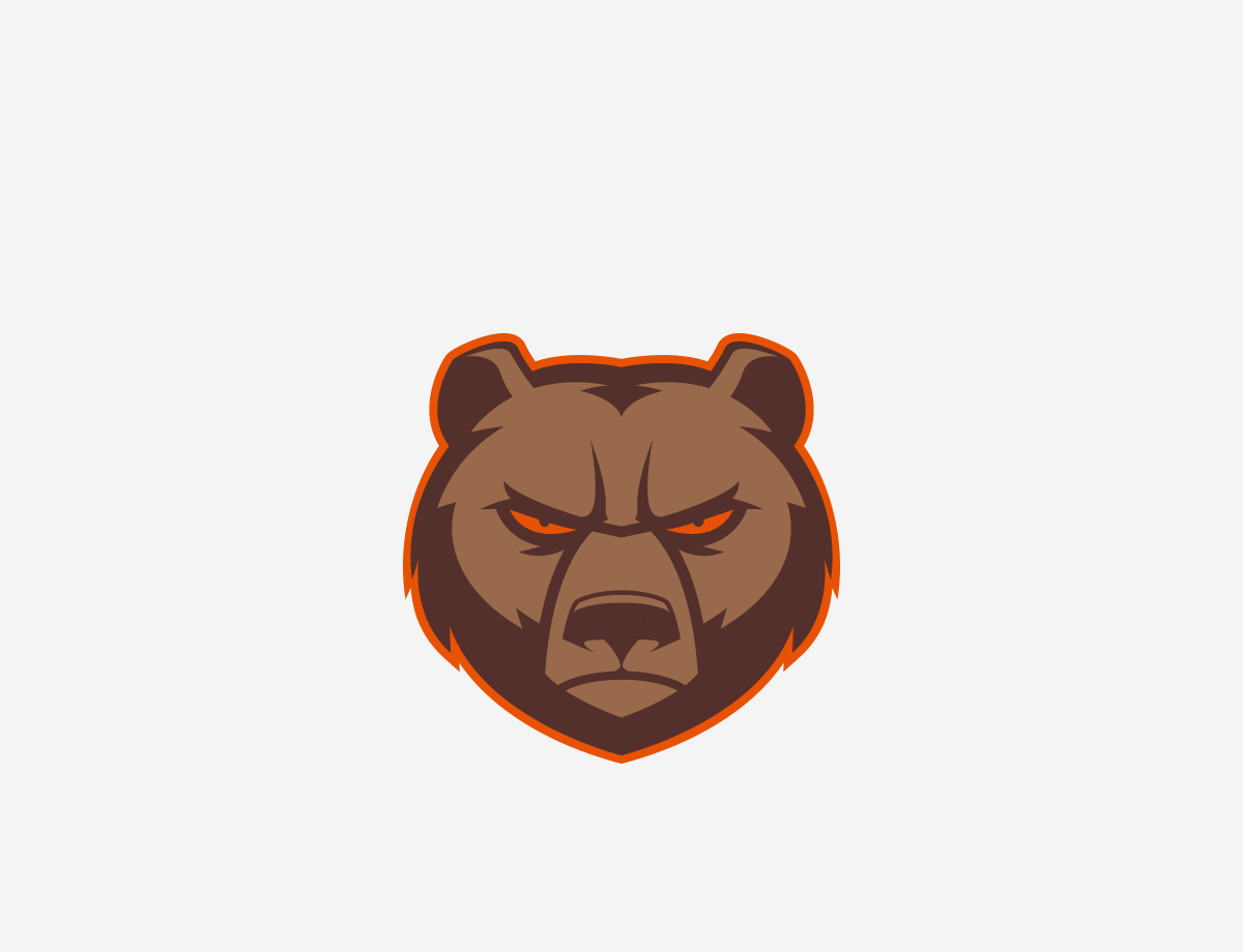 In the end, we are really proud of the final product. The new logo strikes a great balance of meeting all the goals and objectives of the project. More to come on the next phase of the Bruin logo, as we develop additional angles and positioning.
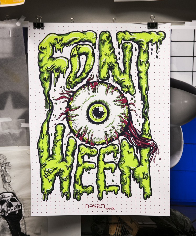
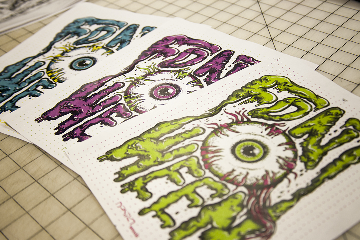
For the past four years we have opened our doors, and our print lab, to the students of the University of Akron Myers School of Art for a hands-on, screen printing workshop. This two-night workshop is one of many opportunities open to design students as a part of the program’s Design Week activities. The poster that we design and print is specifically tied to their annual Fontoween event where each student is encouraged to dress up as their favorite font.
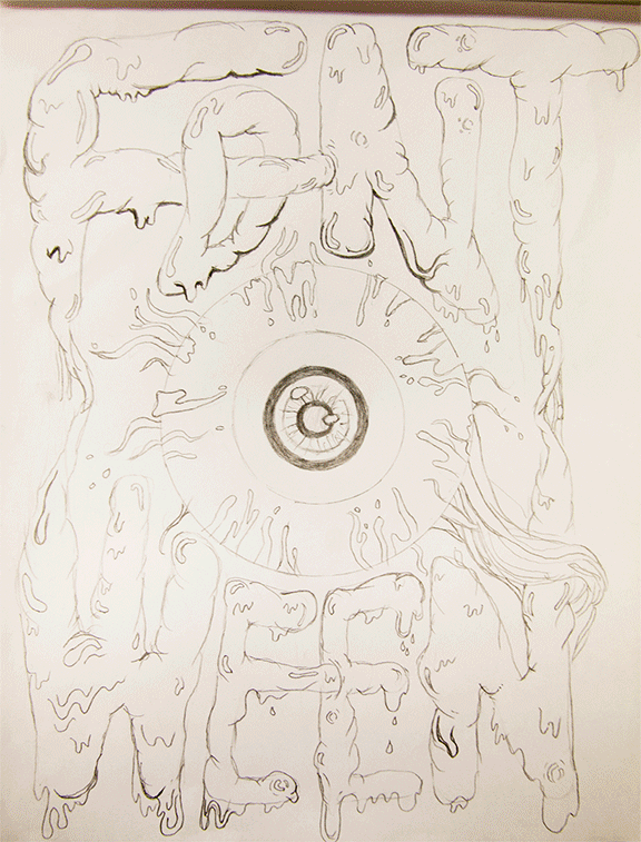
The poster-making process begins with the team at 427 Design collaborating on concepts for the new Fontoween design. A series of sketches are drawn and revised until the team agrees on the final poster concept. Then comes the creation of ink drawings, layers of textures, colorizing and finally setting up the files for film creation to be used in imaging the screens for printing.
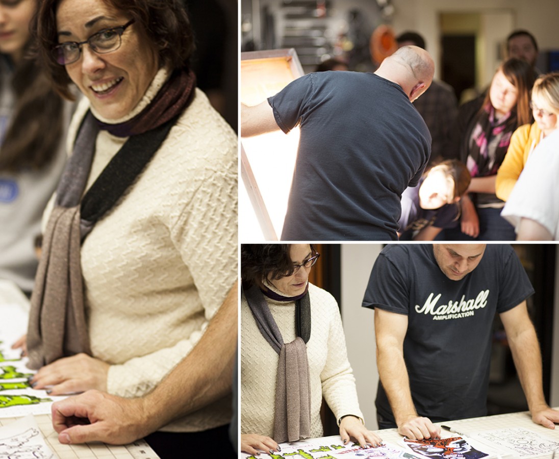
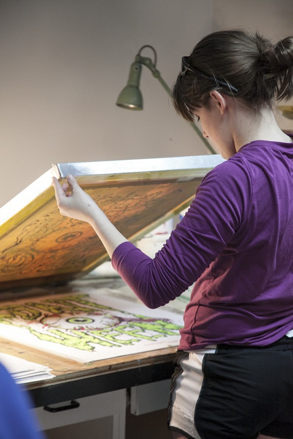
When the students arrive at 427 Design they are coached through the steps of creating the art using software and given some pointers and best practices throughout the process. They are then guided into transferring the artwork to the screens for printing, mixing the colors, and finally, registering and printing the actual posters. This year’s poster included a series of four colors. Since two groups of students participate the workshop, different students attending each night, two unique colors are printed during each session.

“This workshop gives students who want to learn about screen printing an opportunity to get hands on experience in a more condensed, focused way… while ruining others equipment and supplies”, says Justin Tokos, Vice President and Creative Director here at 427 Design. Tokos, who has been teaching Production and Illustration at the University of Akron since 2008, coordinates the event each year with the head of the Graphic Design Department, Janice Troutman.
The annual Fontoween screen printing workshop is an event that our team really looks forward to each fall. It’s refreshing to spend a little time with such eager and energetic design students and we really like being able to share our space with them.
Click here to see the previous Fontoween poster design.

By now I’m sure you’re aware that there’s this thing called an “election” going on today, but instead of comparing the candidates on important issues such as the economy, foreign affairs and social policy, I thought I’d talk about what really matters: each campaign’s respective graphic design.
From logos, to websites, to social networks, each campaign has literally spent millions (possibly billions) of dollars in hopes of securing your vote. So how did each campaign do? Until we know the actual results, here’s how they stack up from a purely visual standpoint:
LOGO

Infinitely adaptable, clever and just plain nice to look at, Obama’s logo has been a game changer from the start. Thankfully, this time around, the campaign had the good sense to leave the ‘O’ mark alone — if it ain’t broke.
Romney’s mark on the other hand is a bit of a yawn. That is until you realize that it also very closely resembles the Aquafresh toothpaste squiggle. I’m all for dental hygiene, but even that connection doesn’t make sense for Romney — if we’re comparing teeth to teeth, the Obama/Biden ticket is clearly the leader when it comes to their pearly whites.
LOGO INCORPORATION/TYPOGRAPHY

With a custom, slab-serif version of the typeface Gotham updating his look for 2012, the Obama campaign really understands beautiful typography. They could have very easily fallen into the trap of replacing the ‘O’ in Obama with his circular mark, but they are smarter than that. Yes, his yard signs are a bit hard to read from a distance, but the teeny-tiny-type-loving designer in me applauds the effort to keep it classy.
By contrast, the Romney campaign apparently had no qualms about replacing the ‘R’ in Romney with his toothpaste squigg, which creates its own readability issue (Omney for President!). The supporting, serif typeface isn’t terrible, but it’s not exactly a thing of beauty. The large ‘i’ in ‘IN’ is puzzling, and the combination of the e and y serifs is a bit sloppy. The ‘m’ and the ‘n’ are also awkwardly joined, but the ‘n’ and the ‘e’ are not — consistency is key, and is something the Romney campaign doesn’t seem to care much about.
WEBSITE

While both websites get my kudos for being well-designed, especially as far as governmental/political sites go, BarackObama.com is simpler, more consistent and feels more current than MittRomney.com. The Obama campaign keeps things easy with their main navigation broken into three categories. Romney has four up top, and then an additional four below.
The “Get the Facts, Get the Latest, Get Involved” language of Obama’s site is clear and direct and a lot more motivating than “Learn About Mitt.” It should also be said that the Romney campaign should hire a new photographer — almost every photograph they use in their materials is average at best, especially when compared with Obama’s striking (and well-edited) imagery.

Social Media has become an important and integral part of each campaign, with frequent Facebook updates on both sides. A quick visit to each candidates official page reveals an instant difference in style. While the messages (VOTE!) and elements (photo of candidate, American flag, text) are basically the same, the designs are radically different.
Once again, the Obama campaign presents a simple, clean and elegant design. They use two words to say essentially the same thing that the Romney campaign says in eight — plus a url. Their image of Obama is clearly a professional, quality photograph, while the rally photo of Romney (is that even Romney? Why isn’t the focus more on him, and less on the billowing American flags?) is as ordinary as can be.
The Obama typography is bold and consistent with their branding. I get what the Romney campaign is trying to do with the script/sans serif combination, but they’re not quite there. They also throw in an italic and serif, for a total of four different type styles, none of which come close to being as pleasing as Obama’s one.
VIRAL GRAPHICS

Each campaign has also tried to create individual, easily digestible, post-able graphics for Facebook, Twitter, Tumblr and Instagram. Once again consistency is key in the Obama campaign, and I’ve found myself envying their beautiful creations on numerous occasions. They’re informative, to the point, and just plain nice to look at.

By contrast, the Romney graphics are a bit all-over the place, in terms of style and general design. The photos are ho-hum (dark, poor quality, outdated — how many of you not only have a land line at home, but two??), the typography is sloppy (or hard to read) and they’re generally just… ugly.

Nowhere is the contrast between the two design styles more evident than when you compare these two graphics — both are intended to deliver a message about the candidate’s platform. The Obama campaign demonstrates a clear understanding and mastery of color usage, hierarchy, typography and readability. Which of these would you rather hang on your wall? Can you even stand to look at the Romney plan long enough to read it? Strange, unrecognizable silhouettes, gradients, stars, banners, speech bubbles, arrows, so many stripes — even those scissors are patriotic.
I think that no matter how you feel about Obama the candidate, there is no doubt that his campaign not only churned out some wonderful designs, but managed to maintain a quality and consistency level to which all future campaigns should aspire. Now go vote, if you haven’t already done so, and may the best man design win!
I’m Alexandra Charitan, and I approve this message.

It’s that time of year again — time for our annual open house, that is. This year our theme is “Showdown at 427” and you’re all invited! If you haven’t been to one of our five previous events, you can catch up on years one, two, three, four and five before you experience no. 6 on April 27th (4/27, GET IT? HUH?). Of course if you’ve been here before that’s no excuse not to attend, and if you’d like to RSVP you can do so by clicking this here link.

We’re already in full-prep mode, screen printing posters, pressing buttons and collecting taxidermy. We even had a custom branding iron made, but you’ll have to wait until 4/27 to see how it gets used.
So put on your boots, saddle your horse and hit the trails (er, Route 8 would be fine too) — we hope to see you there!