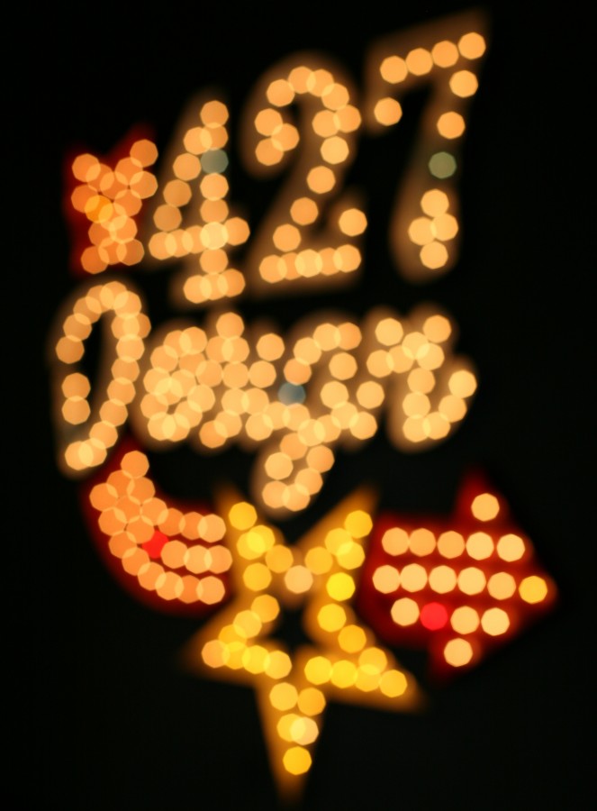
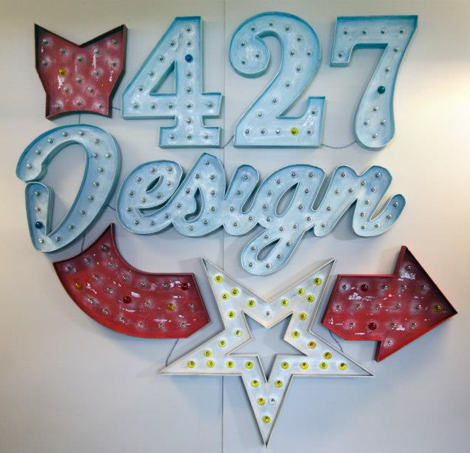
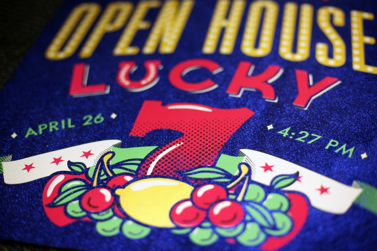
If you came to our 7th annual Open House on April 26th, you may have noticed a new addition to our office walls: a huge, lighted marquee sign consisting of our name, star logo and a curving arrow (it’s kind of hard not to notice).
When we first picked our Open House theme nearly a year ago (Lucky No. 7/Vegas) we almost immediately decided that we wanted to make a sign. Few things scream “Las Vegas” more than large, lighted signs, but we knew that we’d want something that could not only fit into our theme, but remain in our office for years to come. Our creative director, Justin, volunteered to take on the enormous task of building the sign, and one of our designers, Alexandra, designed it.
Here’s a peek into the process:
Research
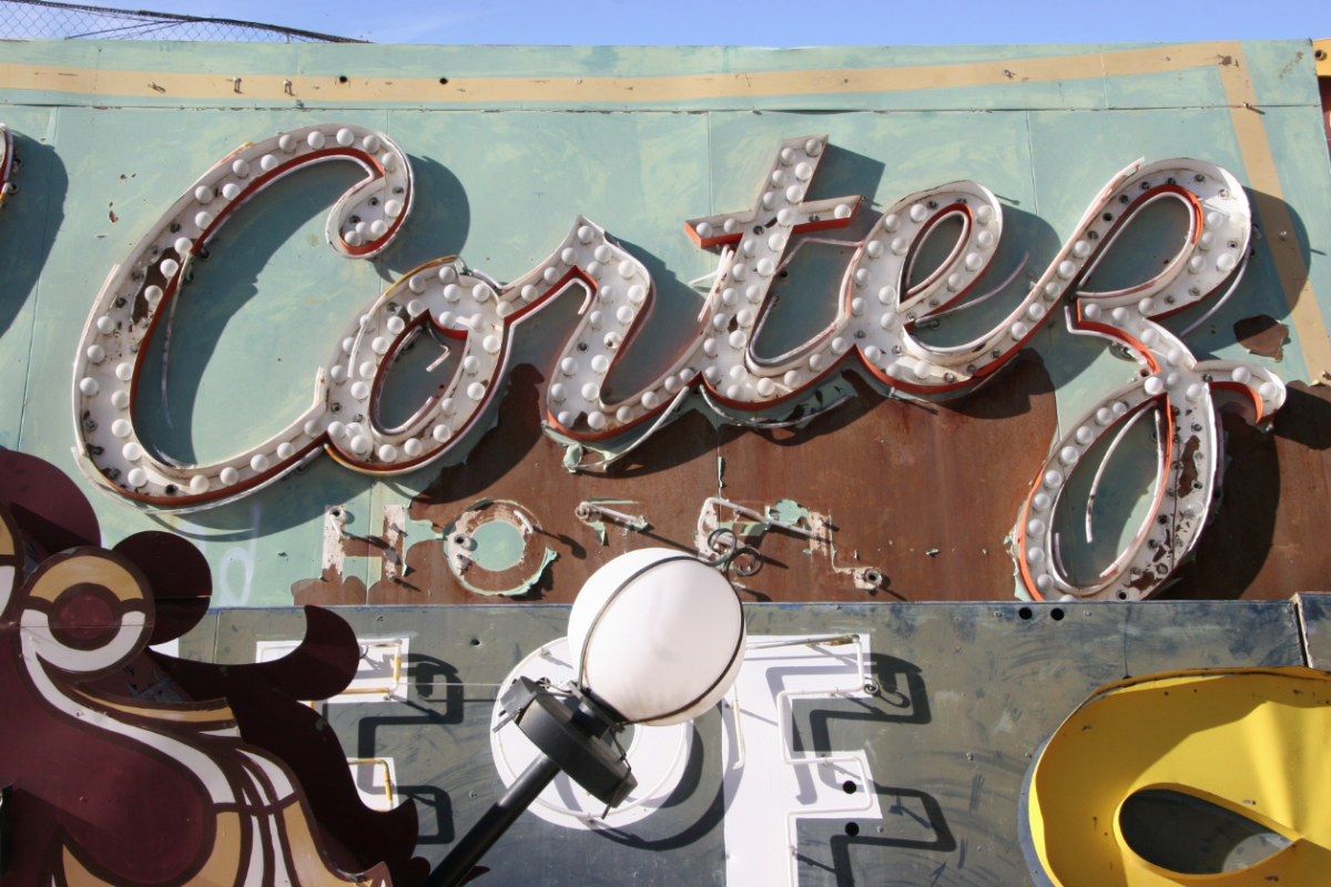
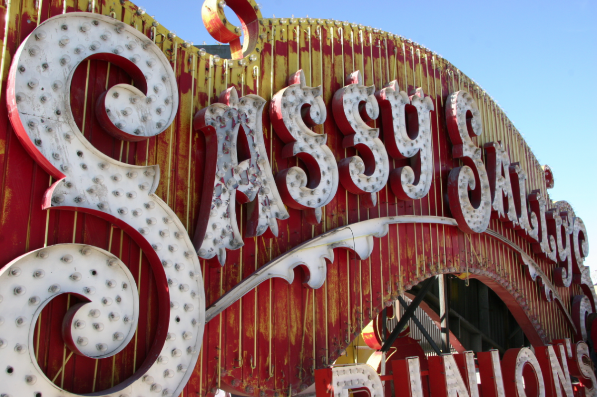
Most of our projects begin with extensive research. We had toured the Neon Sign Museum‘s boneyard on a trip to Vegas a few years back, so we started combing through the photos we took there for inspiration. We knew we wanted an arrow — and our logo was a given — but choosing the right typefaces and styles for the “427 Design” part was tricky.
We didn’t want the sign to feel too gimmicky or too themed; we wanted a classic and vintage look that would feel at home in our office.
While Alexandra was busy formulating the design, Justin was researching the construction end of the project. We initially considered making the sign from metal, but we quickly realized that wood was the most feasible option.
We knew we would be using bulbs (instead of neon), and we loved the dimensional quality of the signs with raised sides.
Design
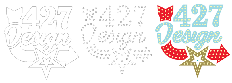
We designed the sign as vector art in Illustrator. We bought strings of simple, clear, round bulbs and measured one — after the final design was agreed upon, we took the same file and plotted out the placement of each light bulb.
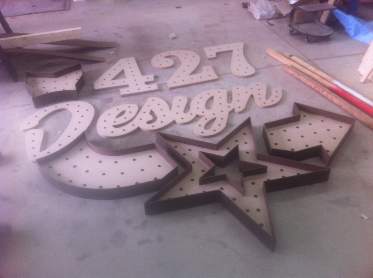
Laser-Cutting
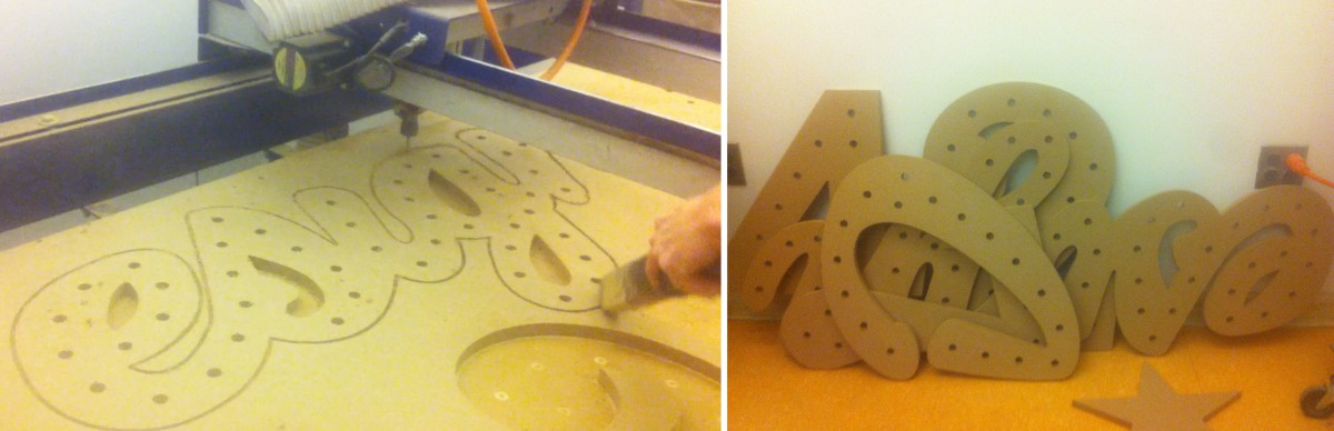
With the final plans in hand, Justin enlisted the help of Brad’s son Bryan. Bryan and Justin traveled to the Art Institute of Pittsburgh (their Alma Mater) to use their laser-cutting table. The bases for each section of the sign were cut from MDF, and a hole for each bulb was drilled.
This saved a lot of time and potential headaches, and ensured that our sign was as close to the original design as could be.
Adding Dimension
After the individual pieces were cut out, Justin began adding dimension to each one with strips of masonite. The straight sides were relatively simple: a few nails, some glue and a very precise measuring.
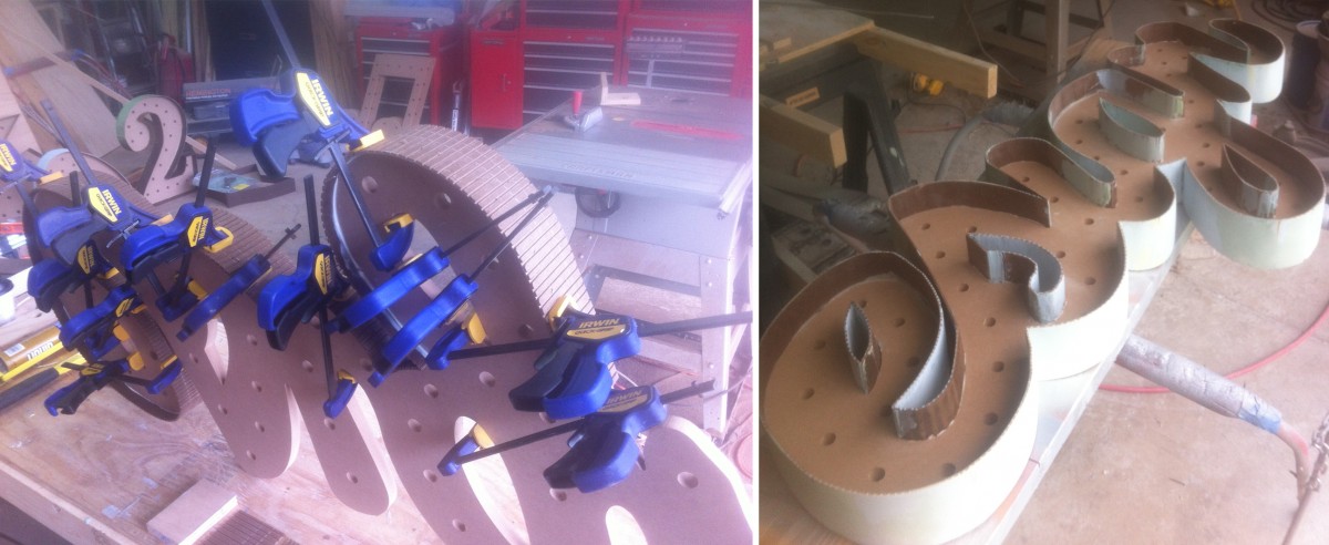
The curves were a different story. In order to get the masonite around the tight curves, he had to notch each strip so it wouldn’t break under the tension. After nailing and gluing the strips, he filled in the notched areas with body filler (thanks USC!) and sanded each one smooth.
If this sounds fun to you, let me introduce you to Justin’s fingerprints, which reappeared recently after being sanded completely smooth.
Faking Metal
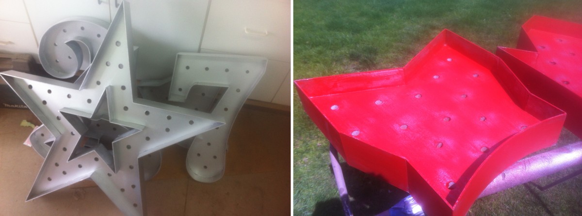
Although our sign was made from wood, we were able to mimic the look of the vintage, metal signs by using various painting techniques. After a few coats of primer, the entire sign was sprayed with a metallic silver spray paint.
The individual pieces were then painted with latex paint in their own color. Using a combination of scraping and sanding, Justin then distressed the pieces, paying special attention to the areas that would realistically have received the most wear (edges, around the bulb sockets, etc.).
Adding Bulbs
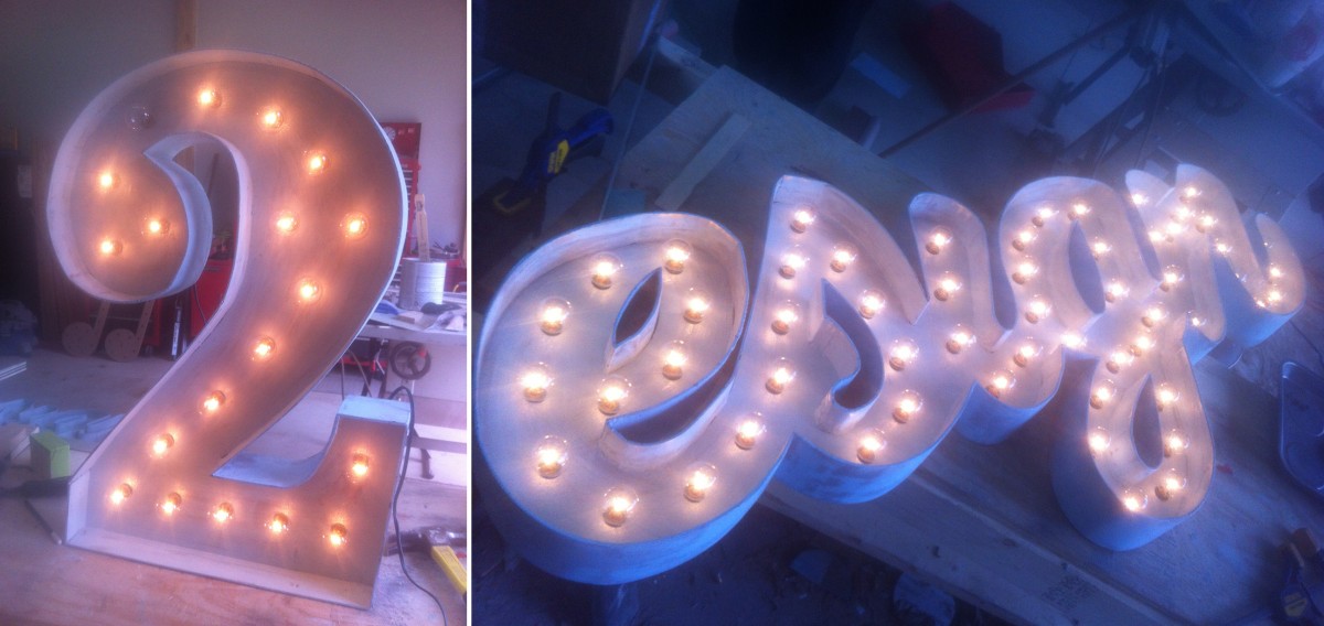
Turning a string of lights into a lighted marquee sign was no small task. Each bulb had to be removed from its string while the wires were wound around the back of each part of the sign. After the sockets were placed into their corresponding holes, the bulbs were screwed back in, one at a time.
We even used a vintage glass-dying kit to tint some of the bulbs — yellow for the star, and a few random red and blue bulbs to give it a used, vintage look.
Hanging the Sign
After everything was cut, sanded, painted and wired, the sign was ready to be transported from Justin’s shop to the office. We decided that it demanded space of its own, so we cleared off a central wall near our sitting area. Hanging such a large sign was a challenge, but with a few helping hands, a lot of picture hanging wire and a few monkey hooks, we got it up and secure a few days before the Open House.
We’re so incredibly happy with the way the sign turned out. The first time we lit all 209, 5-watt bulbs — for a total of 1045 watts — we were in awe (we might have also melted the first dimmer we attached to it). It’s definitely transformed our space (and maybe our electric bill too) and will surely be the highlight of our office for as long as we’re in this space.
If you weren’t able to make it to the Open House this year, you can read more about what you missed here, or check out our photo album on Facebook. If you’d like to see the sign in person, stop by — we’d love to show it to you!
Friday, April 26th was our seventh annual Open House, and we want to take a moment and thank the more than 200 people that attended. We try every year to top the previous year’s event, and we think we may have succeeded.
We hope you all had fun — maybe you even won a prize — but for those that couldn’t make it here’s what you missed:
The Sign
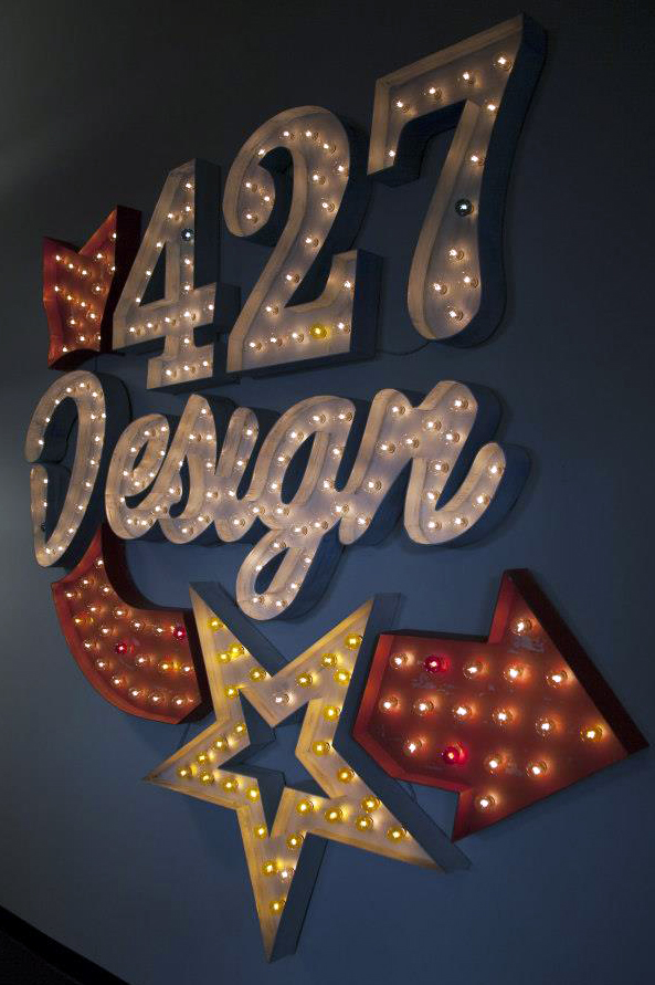
Our creative director, Justin, devoted weeks of his life leading up to the Open House building this 100% custom marquee sign (process post to come) that now hangs on a central wall in our office. We wanted to create a piece that would tie in to our Vegas theme, yet not look out of place hanging in our office year-round.
If you didn’t get a chance to see the sign in person, stop by and we’ll light it up for you!
The Shirts
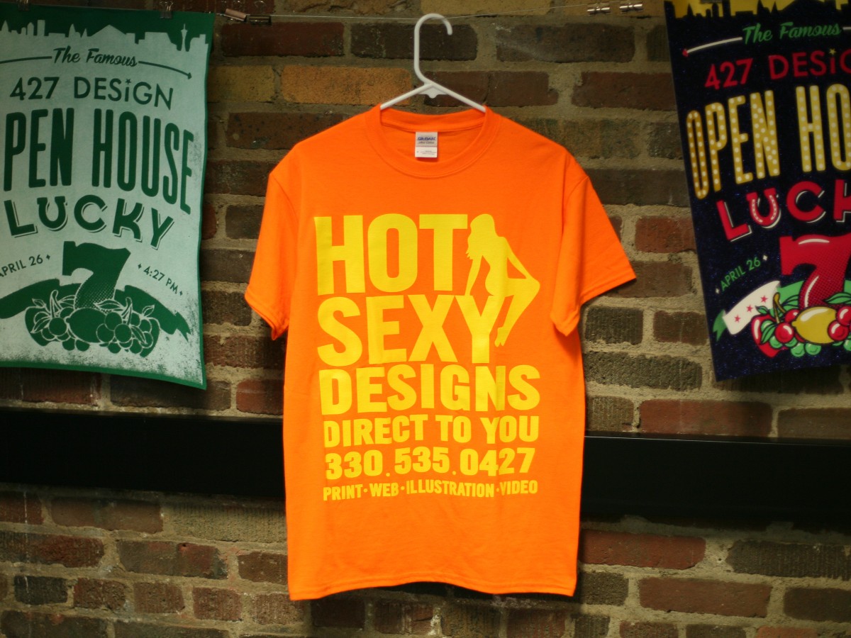
A week before the event, we were busy screen printing t-shirts. We designed this year’s shirts based on the “flapper card” men and women ubiquitous on the Vegas streets/sidewalks. We chose the most obnoxious color possible (fluorescent orange) so that guests had no doubts who was a 427 Design team member.
We printed extra for guests to take home, and despite the cautionary words of our intrepid president, Brad Hain (“Who would want to wear a shirt like that?“), we ran out halfway through the night.
The Food
Our delicious, all-you-can-eat buffet was catered by the Diamond Deli — pulled pork sliders, seafood croissants, their famous brownies — and the food went fast!
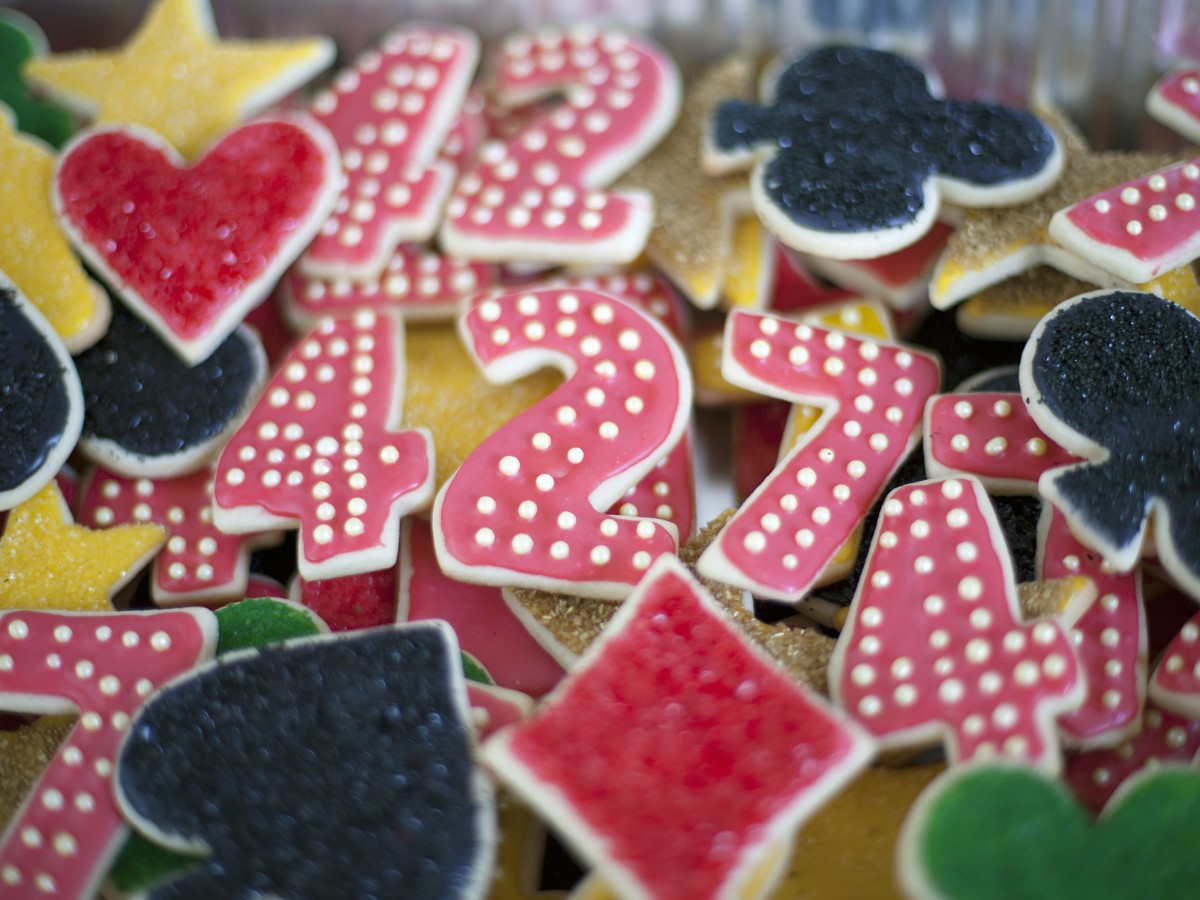
We also had amazing cupcakes by Cloud Nine Cupcake (a new client of ours) and cut-out cookies for the fifth year in a row by one of our designers, Alexandra.
The Games
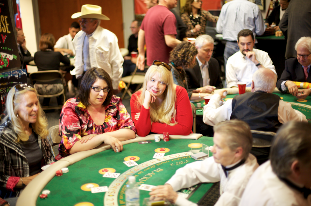
At 5pm our office space was transformed into a mini casino, with four blackjack tables, a poker room, four slot machines, a roulette table and fireman’s wheel. There were times when we wondered if we’d be able to pack every one in, but we were able to control the chaos for the most part.
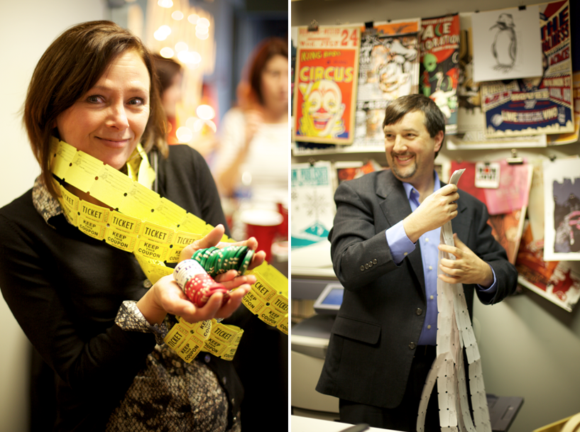
Guests played for chips, that they could exchange for raffle tickets. They then took their raffle tickets and put them into boxes to win any of our seven great prizes.
The Raffle
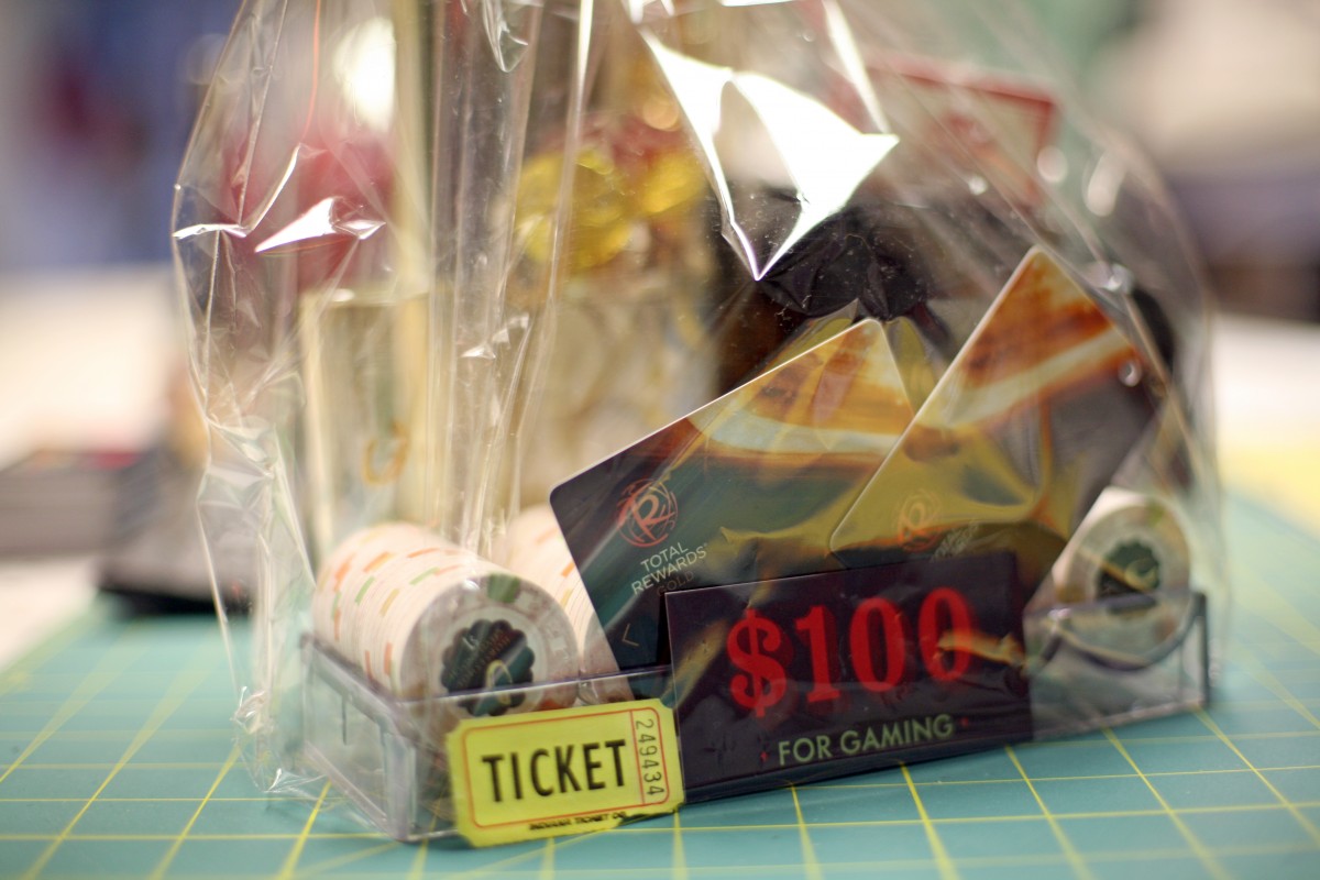
At the end of the night we drew winning tickets for our seven prizes:
- A night at the Horseshoe Casino and souvenir gift basket
- A poker table and poker set
- Trio of flavored whiskey
- Treat basket and Longhorn Steakhouse gift card
- Stow Massage gift certificate
- Las Vegas-themed movie set and Cinemark Gift Card
- 427 Design poster set
Three of the prizes went home with their rightful owners that night and the other winners have been contacted. Thanks to everyone for playing!
The Canned Goods
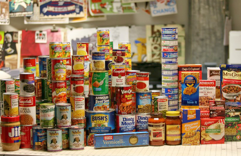
This year, the Open House also doubled as a fundraiser for the Akron Canton Regional Food Bank. Guests were encouraged to bring in a canned food item (or several), to receive extra vouchers for the games. We were blown away by the generosity of our guests, and ended up with a shopping cart full of food.
Of course we couldn’t resist stacking it in a pyramid for a mini photoshoot before it goes to the food bank.
Thanks again to all of our guests, and if we missed you this year, there’s always next year!
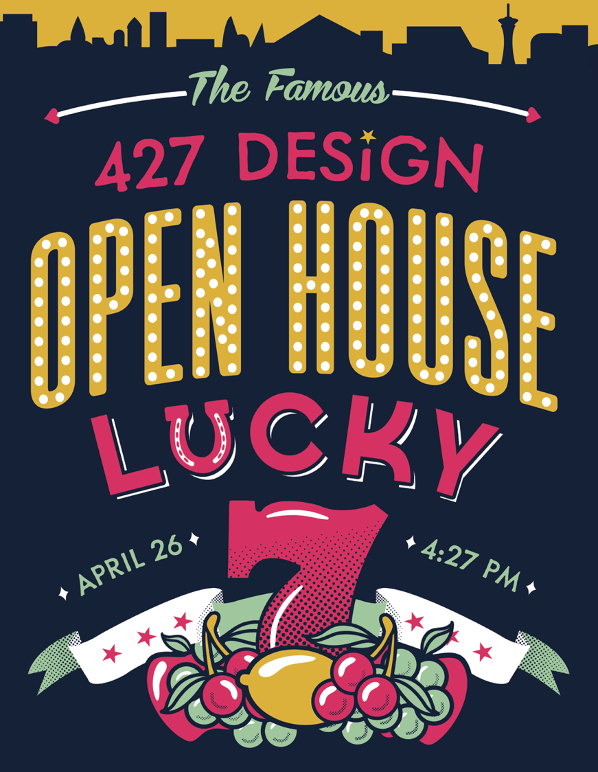
This year we’re celebrating our 7th year in business, and the theme of our annual open house is “Lucky No. 7.” We want all of our friends and clients to feel as lucky as we do, so this year’s party will be a little bit different than the past six.
We’ll have four blackjack tables, four slot machines, a roulette wheel, fireman’s wheel and poker table, and everyone gets a $100 voucher, which you can exchange for chips with any of the dealers.
The night will also double as a fundraiser for the Akron-Canton Regional Food Bank. Should you wish to purchase more chips, you can do so with any 427 Design team member throughout the night. One dollar or one canned food item will get you an additional ten dollars in chips.
At the end of the night we will exchange chips for raffle tickets ($10 in chips = 1 raffle ticket) and you’ll have the opportunity to win a variety of awesome prizes.
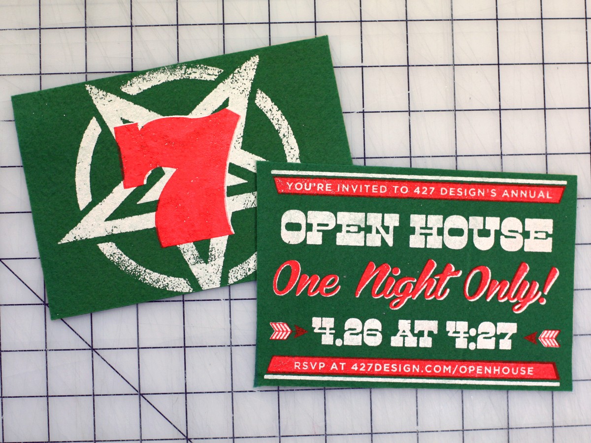
We’ve been super busy these last couple of weeks screen printing (and glittering!) posters and felt postcards and turning the office into Akron’s own little slice of Vegas. We don’t want to spoil all of the surprises, so you’ll have to come on Friday and see what we’ve been up to. Doors open at 4:27 pm, gambling starts at 5pm, ends at 9pm and the prize drawings are at 9:30 pm.
Some things to keep in mind:
- Elvis arrives at 4:27 PM… and so should you!
- Our all-you-can-eat Vegas-style buffet will be catered by Akron’s own Diamond Deli (with cupcakes by Canton’s own Cloud Nine Cupcake).
- Enjoy (responsibly) a variety of beers and cocktails, including a special feature by the Hoppin’ Frog Brewery.
- Don’t forget to bring canned food items or cash to exchange for additional casino chips.
For the full list of the gaming rules, please click here and don’t forget to RSVP. Hope to see you tomorrow!
Hi there! If this is your first time on our site, or our blog, welcome!
If you’ve been here before, you may notice that it looks a bit different. Ever since the total redesign of our site a few years ago, we’ve been working to make the site better. We’ve tried to simplify the design to make it more user-friendly and to not only work, but look great in all applications.
We’ve condensed some projects, retired older ones, and added a ton of new work to our portfolio section. We’ve redesigned the blog to allow for comments and made it easier to find exactly the kind of posts you’re interested in with our tags and authors sections. Our about/process page may have less sparky unicorns than it once did, but now it hopefully explains who we are, what we do and how we do it a bit better than before.
We’ve also added some options to our contact page that will hopefully help us to better help you with your next creative project, or maybe you just need directions to come talk to us in person — we’ve got those for you too.
We’re still adding projects and making small tweaks to the site, but take a minute and poke around and let us know what you think of our latest work or the site in general. And if you’d like to tell us in person, you can do so at our 7th annual Open House, here at 427 on Friday, April 26th at 4:27pm — don’t forget to RSVP!
It’s always a challenge for us to design pieces for ourselves — it’s hard to find the right balance between wanting to entertain our clients and friends, while also injecting the piece with our personalities. Our Christmas card this year was actually two years in the making for this, and other, reasons, but we’re super excited to finally debut the finished piece.
We had the idea last year to do an homage to 1965′s A Charlie Brown Christmas, and we knew immediately that it had revolve around the dancing scene. Equal parts ridiculous and charming, the characters dance so distinctly and we wanted to remain as faithful as possible to the original. But of course, instead of the usual cast of Peanuts characters, we are the ones doing the dancing.
As with a lot of projects, the animation was deceptively simple. What might look like two or three frames turned out to be many, many more in some cases. Here’s a sneak peek into our process:
Reference Material
Everyone who has ever turned on a TV in the month of December knows of A Charlie Brown Christmas — 47 years later, there’s still a Charlie Brown balloon in the Macy’s Thanksgiving Day Parade. We didn’t want to parody the classic characters, rather, we wanted to remain faithful and respectful to the original. This meant doing our research, and painstakingly capturing the scene frame, by frame for static reference.

Turning Peanuts into 427 Design
Our illustrator, Joe, took those reference frames and turned them into sketches — one-by-one modifying the Peanuts gang into the 427 Design crew. We chose characters that were close to our own personalities or with which we shared a physical characteristic: Joe is holding a jacket instead of a blanket, Allie and Sally are both blondes, and Andrea added a blazer and pants to her pink shirt.

Hundreds of Frames
After each character was born, Joe illustrated their dance sequence, frame by frame. Some were more complicated than others, but he drew hundreds of frames for the final animation. These line drawings were then colored and animated in After Effects.

Final Touches
In addition to the actual characters, we wanted the entire animation to feel like it took place in the Peanuts universe. We illustrated our office building for the beginning, and a snowy field for the ending. Everything you see is custom and hand-done, from the individual borders at the end, to the ribbon type “Merry Christmas”.

We hope you enjoyed watching our card as much as we enjoyed creating it! Merry Christmas from all of us at 427 Design!