Making of: Fontoween Poster
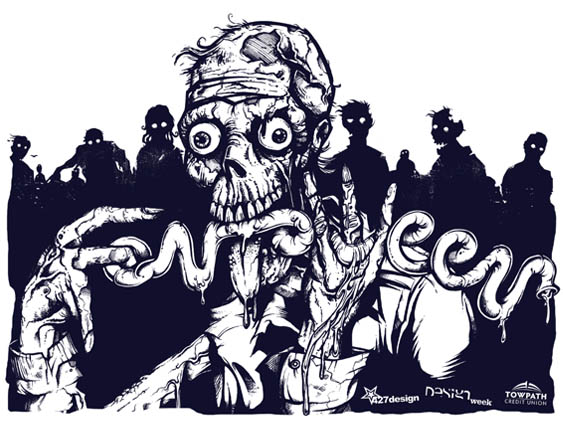
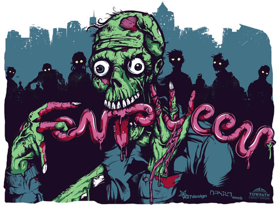
We recently worked in conjunction with the University of Akron to create art for a Design Week, “Fontoween” poster. The five-color poster was printed at our studio by a group of design students, who, over the course of three days, learned the ins and outs of screen printing and hopefully had a good time in the process. Apparently learning can be fun, especially when it involves glow-in-the-dark ink, one particularly gnarly zombie and a whole lot of illustrated intestines.
Our illustrator, Joe, walks us through his illustration process and offers us a glimpse of what goes on every day inside those delicious, pink bwains of his.
Step 1:
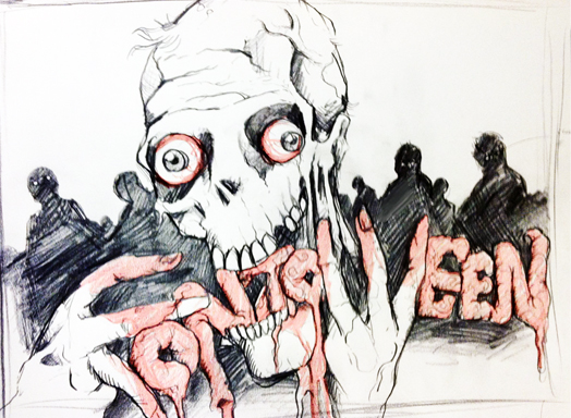
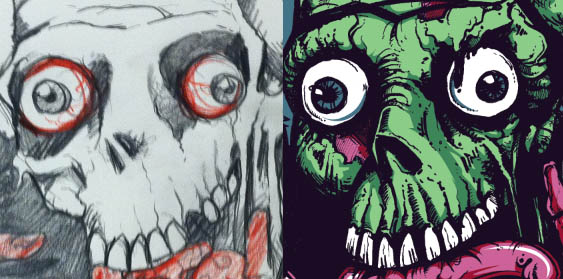
I start with a basic concept and pull from various sources of inspiration and reference. For the zombie pose, I photographed myself gnawing on my TV remote, which I will not show due to the unflattering nature of the photo. After a brainstorming session, I quickly sketched a rough concept of what I imagined for the poster. This original concept served as my blueprint for the poster building process.
Step 2:
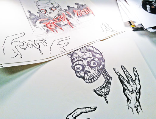
Next, I grabbed a set of Micron pens and a fine point Sharpie and started to draw the zombie’s head. A majority of people might start with pencil and work up to markers — committing to the artwork is a big step —but I’ve always been comfortable skipping pencil all together.
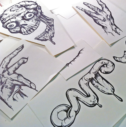
Each body part was drawn individually (and on separate sheets of paper), so I would have more control of the final art as it was scanned into the computer. After the head was done, I worked my way to his hands, neck and body — continuing to reference the original sketch as well as shots of my own hands.
Step 3:
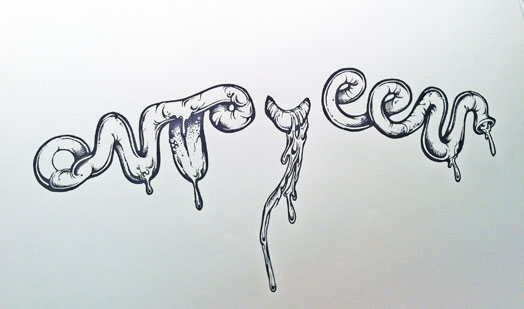
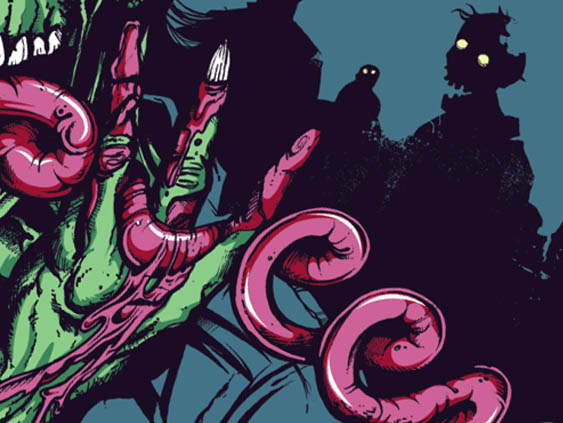
The smooth, shiny intestine-like ‘Fontoween’ had to have a different feel than his rough, sketchy skin. Figuring out exactly how the word would work was one of my favorite parts of this project — it’s not often that my creative challenge for the day includes illustrating words out of a string of innards.
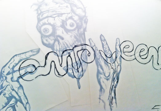
Using a sheet of vellum, I sketched the letters over the drawings of the zombie’s body, working it in through his hands and mouth. It was very important to me that I incorporated his hands, which eventually were utilized to form the ‘F’ and the ‘W’. Working with the twists, turns, and loops of the intestines, I created the other letter shapes.
Step 4:
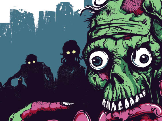
After all of the illustrations were done, I scanned the artwork at 300 dpi and adjusted the levels for maximum contrast. I was left with a black outline of all of the artwork; using the pen tool, I blocked in the shapes and shadows and started to add different color layers to bring the walking dead to life.
Step 5:
Then, once all of the colors were done and trapping was accounted for, I went in with Photoshop brushes to give the artwork a slightly distressed look.
Finally, as the finishing touch, I put a bird on it.
Sorry, comments for this entry are closed at this time.
