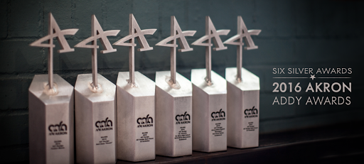
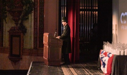
Once again, AAF-Akron hosted a varietal Who’s Who of the Akron advertising professionals and students. This year 427 Design received six Silver ADDY Awards from AAF-Akron at the aptly presidential-themed celebration of the Akron creative community on February 12th – Abe Lincoln’s Birthday.
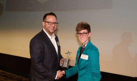
At the close of each awards season we like to take the time to thank those who make it possible for us to do what we love. Our clients entrust us with their brands, engage us in overcoming their challenges and allow us the opportunity to produce and implement creative, in some cases award-winning, solutions. A few of the silver statues we received were awarded for work we did for Neil Zaza, Diversified Digital and St. Vincent-St. Mary High School.

. . .
2016 Akron ADDY Awards
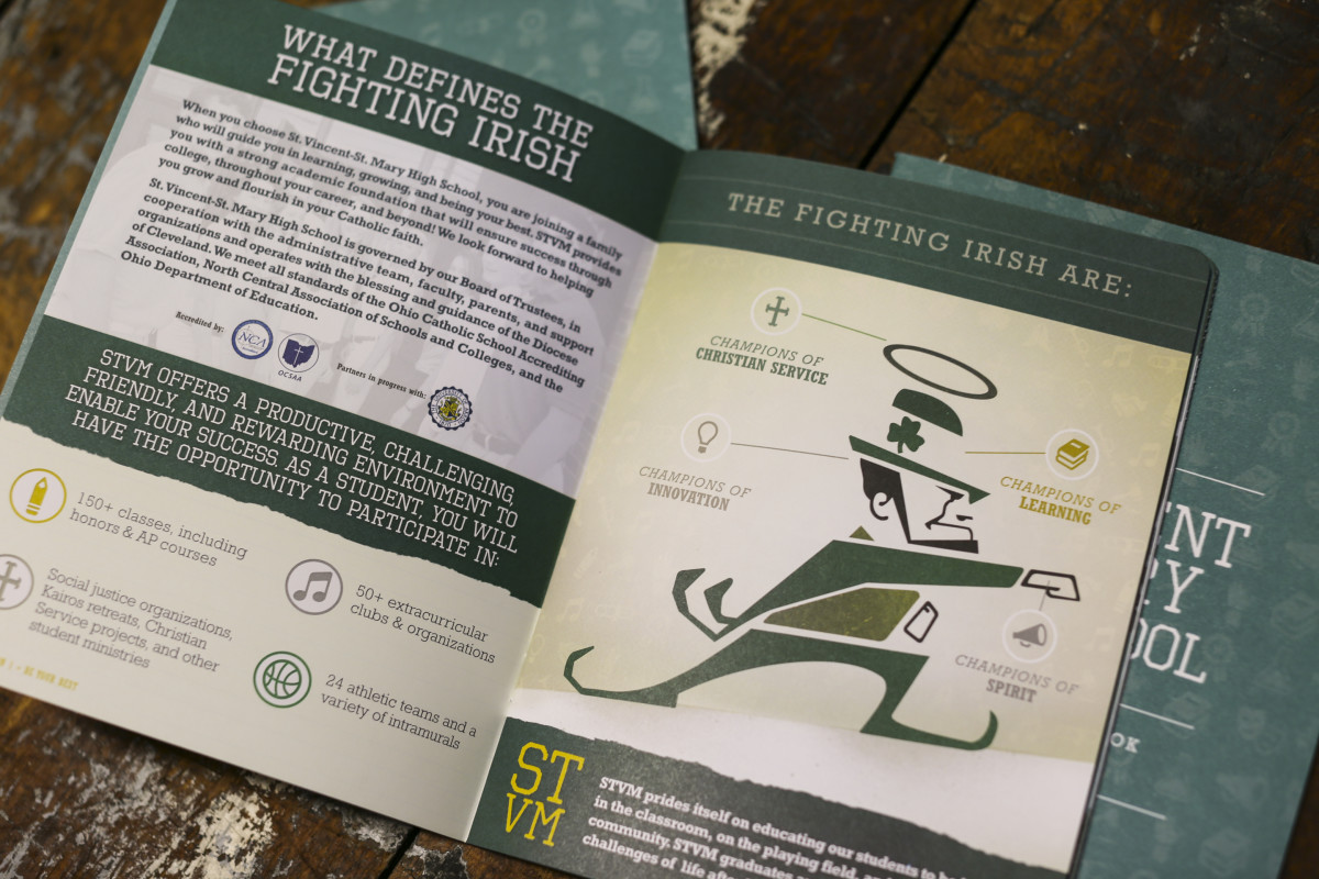
St. Vincent-St. Mary High School 2015-2016 Admissions Guidebook
Client: St. Vincent-St. Mary High School
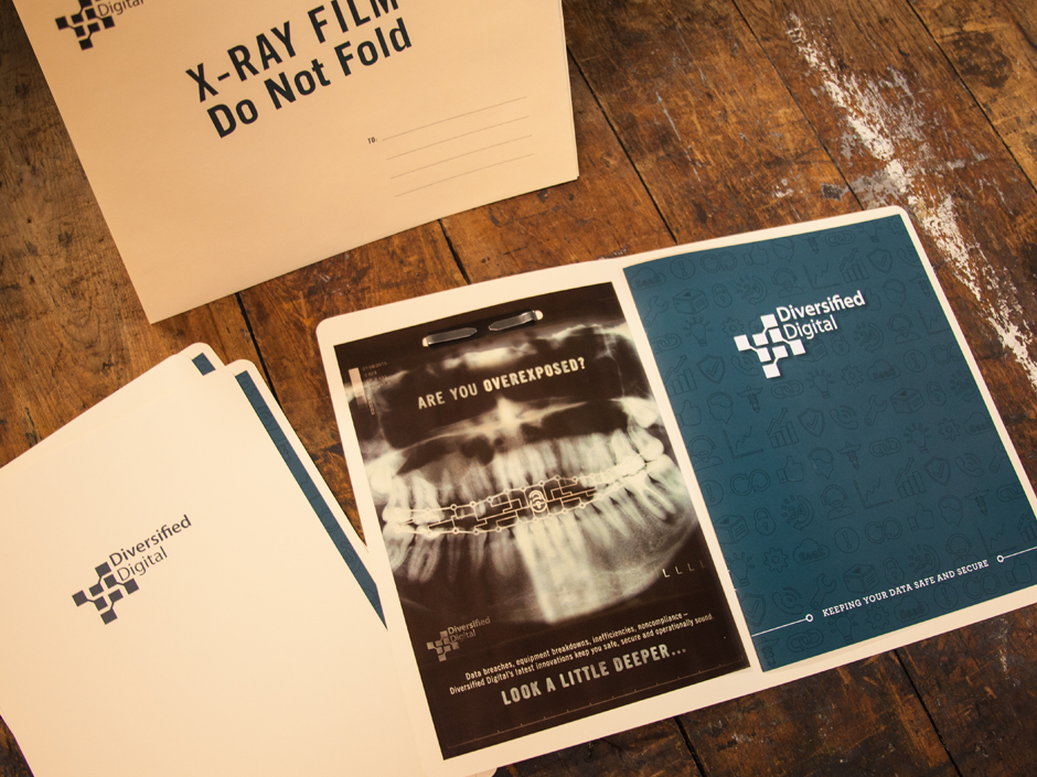
Diversified Digital Managed Services Sales Collateral
Client: Diversified Digital
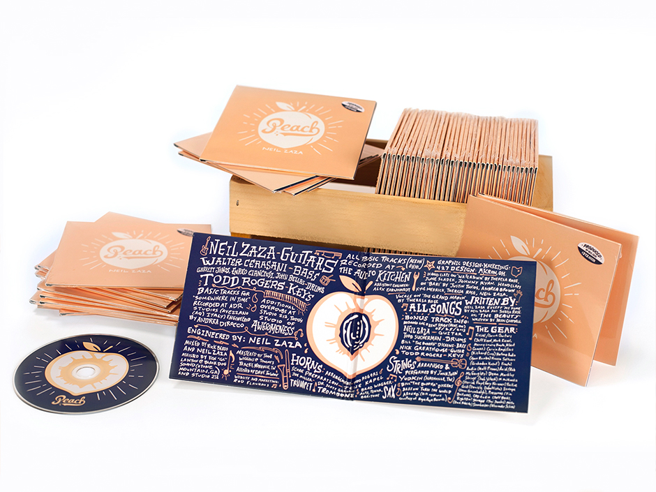
Album Art: Neil Zaza Peach
Client: Neil Zaza
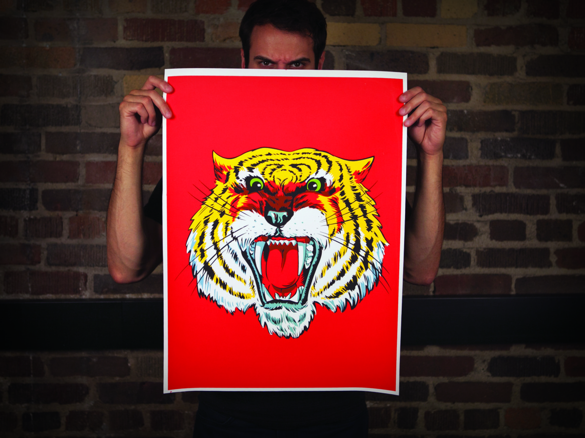
Poster: Meow.
Client: 427 Design
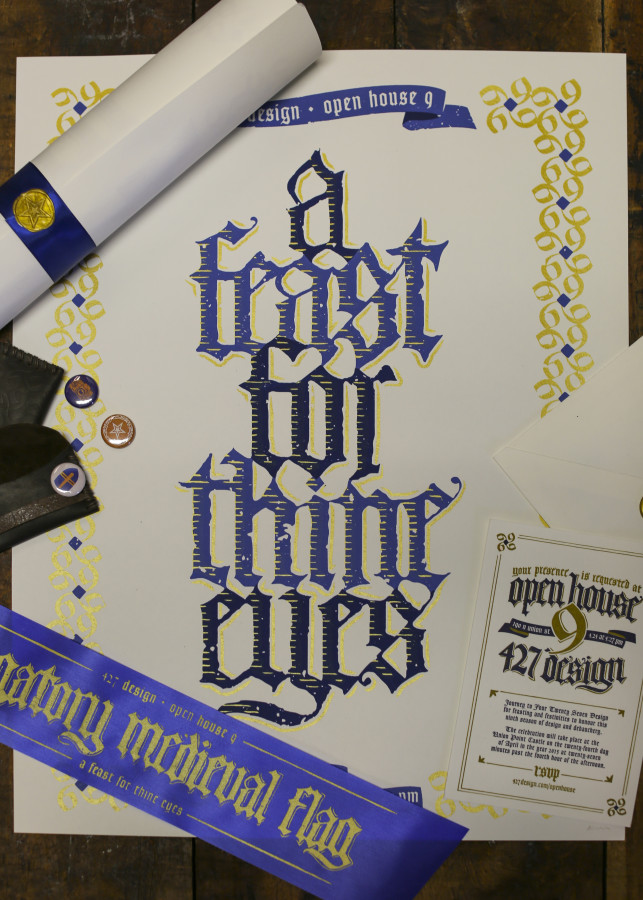
Open House IX Invitation
Client: 427 Design
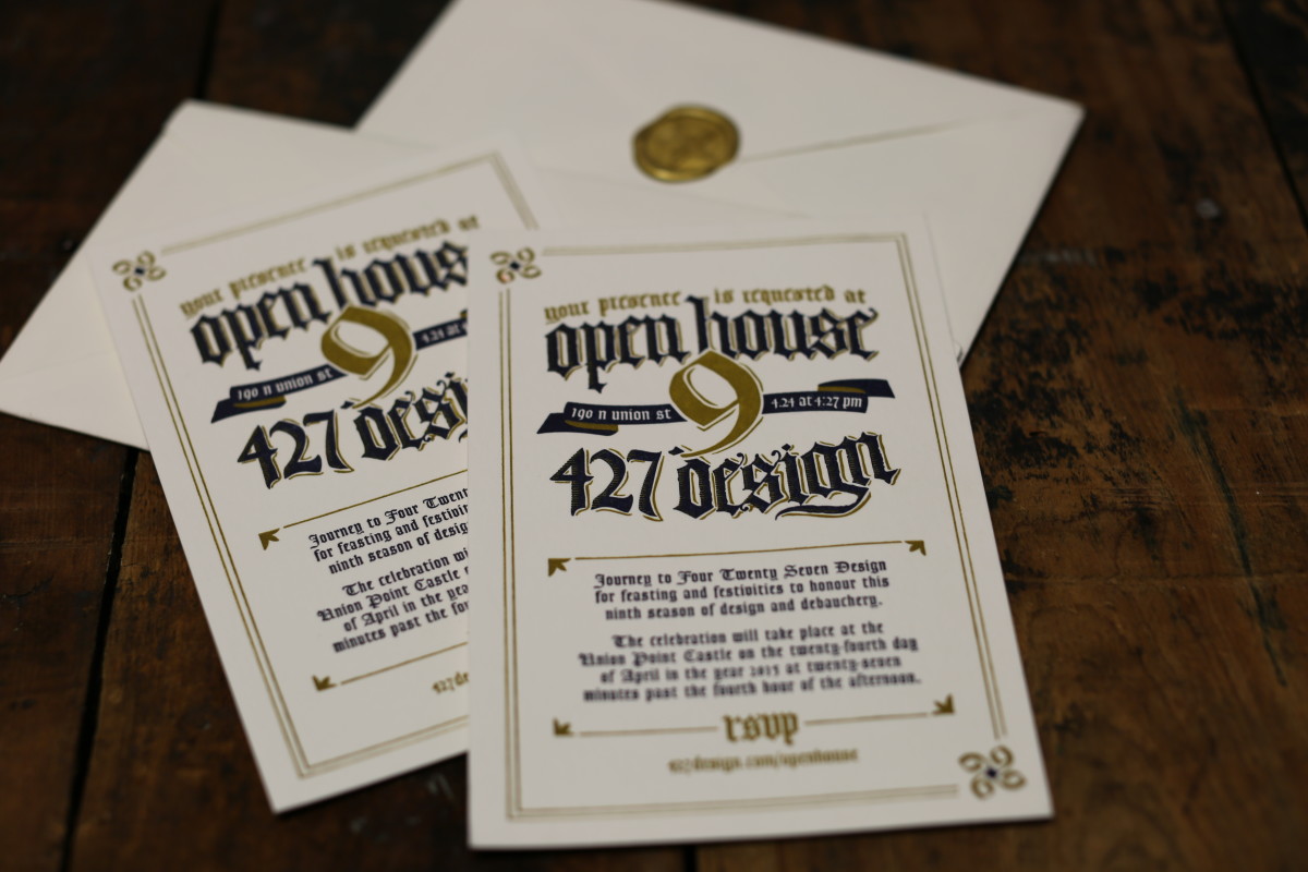
Open House IX Campaign
Client: 427 Design
Congratulations to all the winners of the 2016 ADDY awards. The work produced by the greater Akron creative community last year was outstanding and, as always, we are proud to be surrounded and challenged by each of you. Cheers to you, and here’s to another outstanding year.
This summer, the 427 Design team was tasked with giving the Padua Franciscan High School mascot a fierce facelift. When designing the new athletic logo, a lot had to be taken into account. He needed to be representative of the staff and student body of Padua Franciscan; positive, strong and respectable. The new Bruin would require balance, should be stern and intimidating, yet not vicious or violent.
Oftentimes when a high school logo is developed, inspiration is drawn from college and/or professional team logos. But we feel that athletic teams at the high school level also deserve a strong and original logo. So we set out to deliver a great product without borrowing from an existing design. Padua Franciscan High School already stands out in so many ways, so the goal was to create a rebirth of the Bruin that would stand out in a sea of generic team logos. This logo would need to embody all that Padua stood for on and off the field or court.
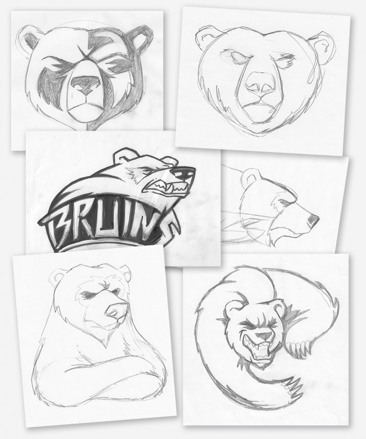
Putting Pencil to Paper
In these initial sketches the bear was just starting to take shape. What started as a minor update to the existing logo (bottom right), quickly developed into a complete overhaul. While nearly four dozen different concepts were developed through this process, this small grouping shows the progression and various secondary logo ideas; essentially depicting the Bruin in every angle and mood imaginable. The top two are the genesis of what would become the final logo.
Once we settled on the front facing Bruin as the main logo, work began trying to find the right style. The challenge with a front facing bear is the angle of the face, it could easily look too much like a lion or wolf depending on the brow and muzzle placement. We started with an open roaring mouth concept, but it proved to be far too aggressive.
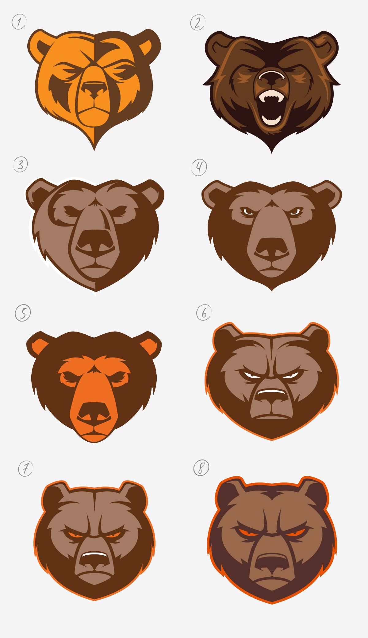
As you can see below, subtle changes through the various revisions make for significant changes overall.
The Life Cycle of the Bruin Rebranding
- A straight vector version of the initial top left sketch.
- A secondary concept featuring an open “roaring” mouth that was agreed to be a little too aggressive.
- A variation of the use of half-light/half-shadow approach.
- A variation of 3 but with a center light source, showing that when compared to the next version, how dropping the muzzle slightly can change his personality entirely
- Another variation in muzzle placement, as well as color usage.
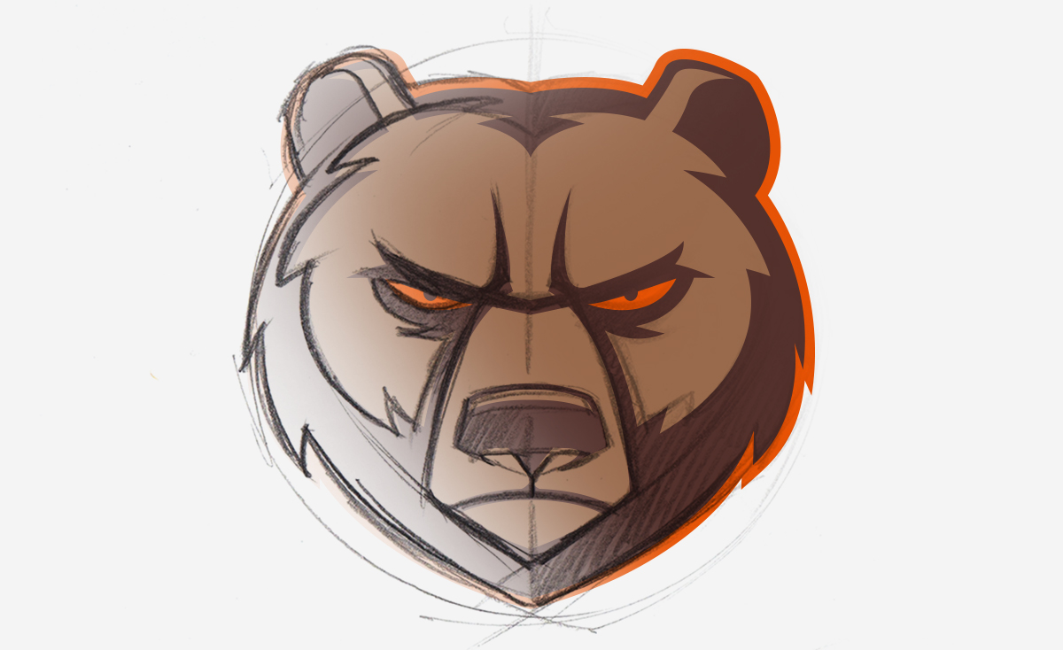
- This was stage in which the look started to click with the whole team as a final concept.
- Narrowing of the face and facial features to give him a lean and mean presence. Aiming for a rounder appearance rather than a heart shaped one previously depicted.
- A minor adjustment to his “beard” and enlarging his facial features and Viola!
From one logo concept comes three variations of the Padua Athletics brand. It is important to have a tight design where the various elements can stand alone, and be just as recognizable as they are when they are presented all together. This gives the new Padua Franciscan High School athletic logo the versatility and originality that sets it apart from other athletic logos. The Bruin head can stand alone, as can the Padua Franciscan Bruins word mark. And then, the shield marries the imagery and the name together for a complete logo.
 In the end, we are really proud of the final product. The new logo strikes a great balance of meeting all the goals and objectives of the project. More to come on the next phase of the Bruin logo, as we develop additional angles and positioning.