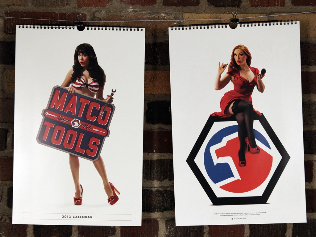
This year, we had the pleasure of working on the Matco Tools calendar for the second time (check out last year’s calendar here). We once again had an amazing time with everyone involved, and we hope it shows.
We decided (with Matco’s blessing) to pursue a pin-up theme, and we wanted to be extra careful to remain faithful to the artform. This meant hiring an artist to create one-of-a-kind illustrations for each page of the calendar — every image you see in the final is hand-illustrated, even down to the tools.
Here’s a peak into our process, from start to finish:
Assemble a Team:
We knew finding the perfect illustrator was key — not only someone talented, but also familiar with the pin-up style that we had in mind. Kelly X not only met those criteria, but she put us in touch with some of today’s top pin-up models, including (eventual calendar girls) Claire Sinclair, Sabina Kelley, Bondi Holly, Angela Riccio and Jessamyn Rose.
We still needed one more girl to round out the year (each girl represents two months), and from the minute we saw Miki Black, we knew she was it.
Lastly, we had worked with Studio Martone (photography) and Dresden Buras (stylist) on 2012′s calendar, and they were happy to reprise their roles for 2013.
Find a Direction:
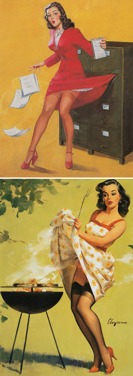
We knew we wanted to remain faithful to the pin-up style, but what does that mean, exactly? We did weeks of research, poring over the greats: Elvgren, Buell, Ekman, Vargas, Armitage, Ballantyne, and D’Ancona — to just name a few of our favorites.
We found pages upon pages of reference, and began planning our shots based on scenes and situations commonly represented in pin-up artwork. We then had to find a way to plausibly relate each girl/scene back to our common theme of Matco Tools.
In the end, we had more than 20 scene ideas that we narrowed down to the final six.
Find a Style:
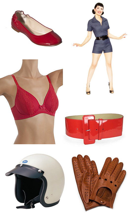
Using our pin-up research as a guide, we assembled a minimum of three outfits for each model. We tried to represent a variety of styles, while maintaining a similar look and feel. You may notice that we tried to primarily stay within the Matco color palette (red, white and blue).
We found our clothes/props from many different places, including a mix of modern clothing retailers and vintage sources. In the final product we managed to include three dresses, one jumpsuit, two bikini tops, one bikini bottom, one pair of teeny-tiny boy shorts, two lacy bras, one racing suit and a ton of stockings and garters.
Shoot Reference Photographs:
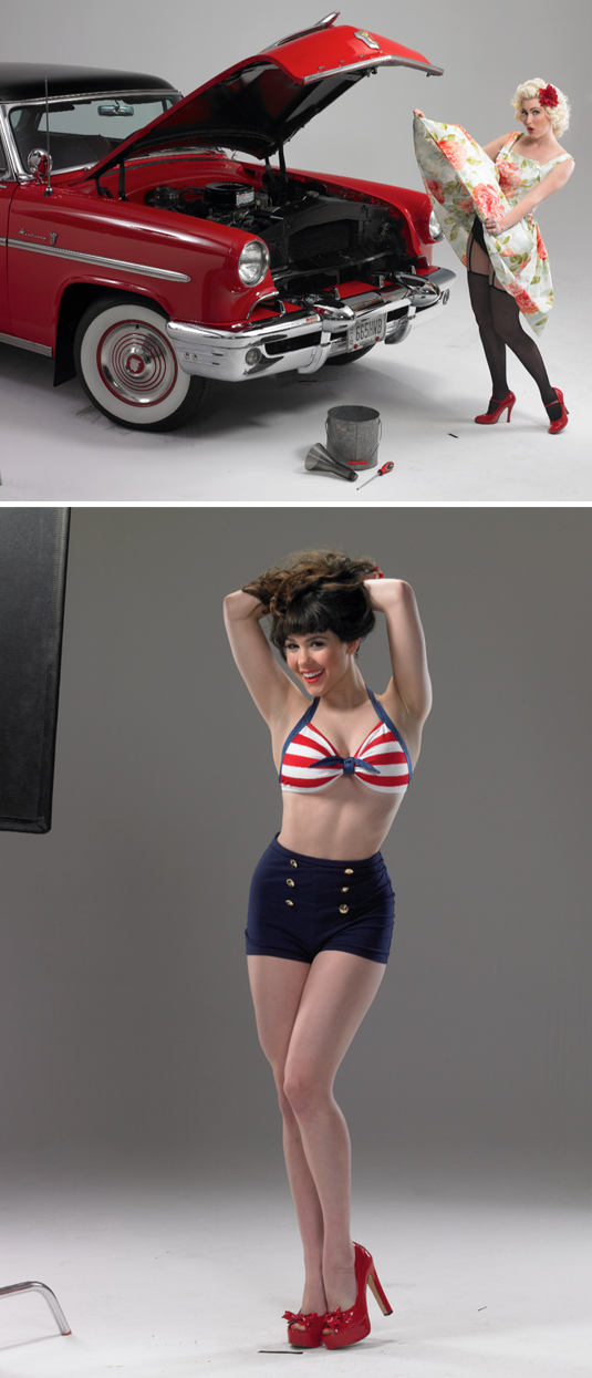
Much like a lot of the pin-up art of the 40s and 50s, we began with photographic reference. We spent a day with each model at Studio Martone, shooting with as many of our props in place as possible.
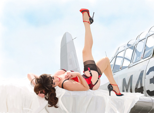
The fact that these were eventually being illustrated, allowed us a bit of freedom with our final compositions — for example, we actually shot Bondi Holly next to that 1953 Mercury, while Claire Sinclair was shot separately from the P-41 Warhawk.
Turn Photos into Pin-ups:
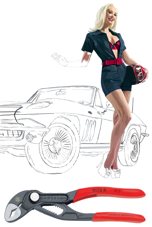
After a bit of Photoshop work (light retouching, composition, etc.) we sent the photos over to Kelly X, who turned them each into beautiful illustrated, one-of-a-kind works of art.
Starting with a pencil sketch based on each photo, Kelly painted layer upon layer until each girl was ready for the calendar. She also worked her magic on six classic Matco tools, illustrating each one so that the entire calendar would feel cohesive.
Make a Calendar:
We knew from the beginning that we wanted the 2013 calendar to be all about the girls, so we went with a full-page format, spiral-bound at the top (instead of the saddle-stitched bi-fold in 2012), and reserved 2/3 of the layout for the illustration. The other 1/3 was kept simple with the dates for two months, a featured tool and the Matco logo.

We are super happy with the final product, and hope you are too — you can see the entire calendar on our work page. We’re excited to finally be able to share all of our hard work with you, and we’re already looking forward to next year. If you’re interested in getting a 2013 Matco Tools Calendar to hang in your own shop or home, contact your local Matco Distributor.
Special thanks to everyone at Matco Tools, Kelly X and Studio Martone for all of your hard work!
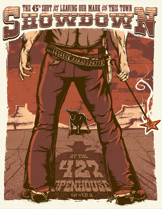
It’s that time of year again — time for our annual open house, that is. This year our theme is “Showdown at 427” and you’re all invited! If you haven’t been to one of our five previous events, you can catch up on years one, two, three, four and five before you experience no. 6 on April 27th (4/27, GET IT? HUH?). Of course if you’ve been here before that’s no excuse not to attend, and if you’d like to RSVP you can do so by clicking this here link.
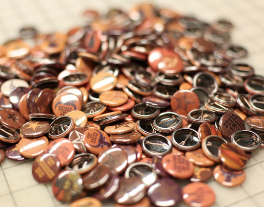
We’re already in full-prep mode, screen printing posters, pressing buttons and collecting taxidermy. We even had a custom branding iron made, but you’ll have to wait until 4/27 to see how it gets used.
So put on your boots, saddle your horse and hit the trails (er, Route 8 would be fine too) — we hope to see you there!
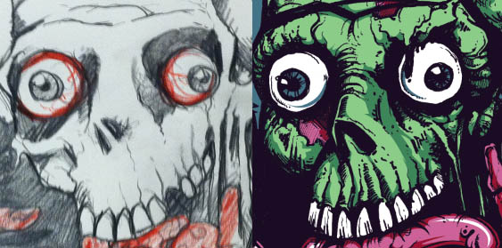
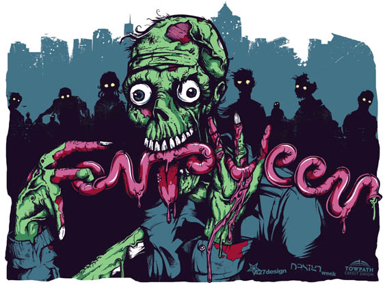
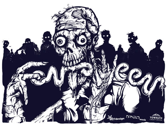
We recently worked in conjunction with the University of Akron to create art for a Design Week, “Fontoween” poster. The five-color poster was printed at our studio by a group of design students, who, over the course of three days, learned the ins and outs of screen printing and hopefully had a good time in the process. Apparently learning can be fun, especially when it involves glow-in-the-dark ink, one particularly gnarly zombie and a whole lot of illustrated intestines.
Our illustrator, Joe, walks us through his illustration process and offers us a glimpse of what goes on every day inside those delicious, pink bwains of his.
Step 1:
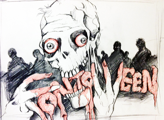
I start with a basic concept and pull from various sources of inspiration and reference. For the zombie pose, I photographed myself gnawing on my TV remote, which I will not show due to the unflattering nature of the photo. After a brainstorming session, I quickly sketched a rough concept of what I imagined for the poster. This original concept served as my blueprint for the poster building process.
Step 2:
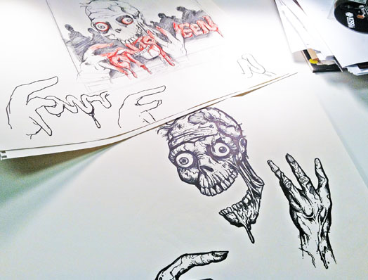
Next, I grabbed a set of Micron pens and a fine point Sharpie and started to draw the zombie’s head. A majority of people might start with pencil and work up to markers — committing to the artwork is a big step —but I’ve always been comfortable skipping pencil all together.
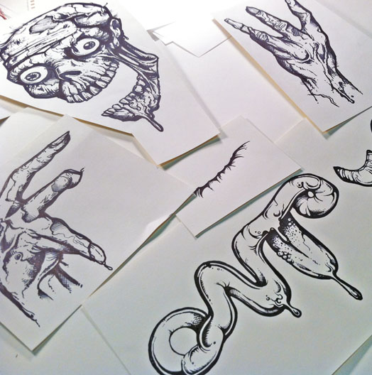
Each body part was drawn individually (and on separate sheets of paper), so I would have more control of the final art as it was scanned into the computer. After the head was done, I worked my way to his hands, neck and body — continuing to reference the original sketch as well as shots of my own hands.
Step 3:
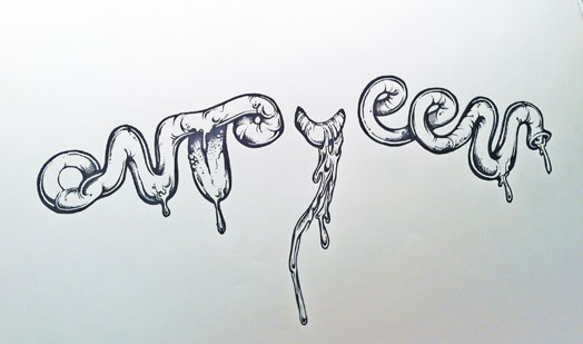
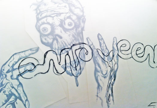
The smooth, shiny intestine-like ‘Fontoween’ had to have a different feel than his rough, sketchy skin. Figuring out exactly how the word would work was one of my favorite parts of this project — it’s not often that my creative challenge for the day includes illustrating words out of a string of innards.
Using a sheet of vellum, I sketched the letters over the drawings of the zombie’s body, working it in through his hands and mouth. It was very important to me that I incorporated his hands, which eventually were utilized to form the ‘F’ and the ‘W’. Working with the twists, turns, and loops of the intestines, I created the other letter shapes.
Step 4:
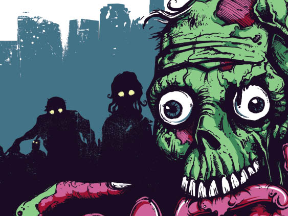
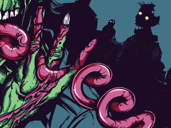
After all of the illustrations were done, I scanned the artwork at 300 dpi and adjusted the levels for maximum contrast. I was left with a black outline of all of the artwork; using the pen tool, I blocked in the shapes and shadows and started to add different color layers to bring the walking dead to life.
Step 5:
Then, once all of the colors were done and trapping was accounted for, I went in with Photoshop brushes to give the artwork a slightly distressed look.
Finally, as the finishing touch, I put a bird on it.
