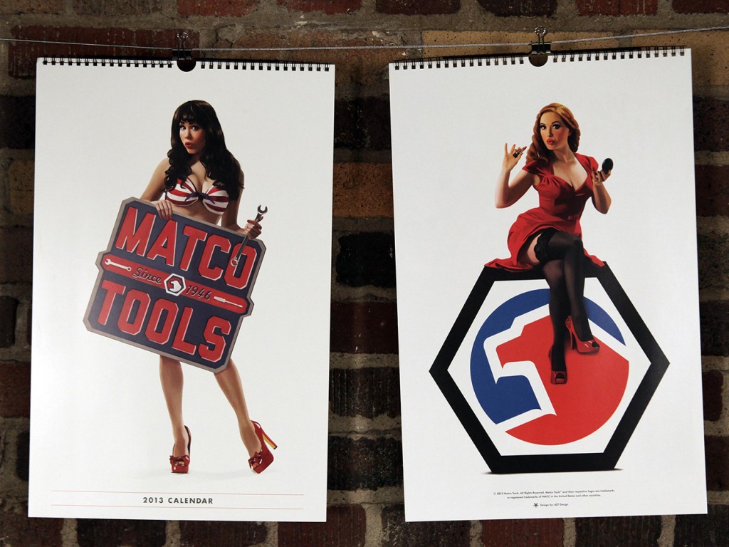
This year, we had the pleasure of working on the Matco Tools calendar for the second time (check out last year’s calendar here). We once again had an amazing time with everyone involved, and we hope it shows.
We decided (with Matco’s blessing) to pursue a pin-up theme, and we wanted to be extra careful to remain faithful to the artform. This meant hiring an artist to create one-of-a-kind illustrations for each page of the calendar — every image you see in the final is hand-illustrated, even down to the tools.
Here’s a peak into our process, from start to finish:
Assemble a Team:
We knew finding the perfect illustrator was key — not only someone talented, but also familiar with the pin-up style that we had in mind. Kelly X not only met those criteria, but she put us in touch with some of today’s top pin-up models, including (eventual calendar girls) Claire Sinclair, Sabina Kelley, Bondi Holly, Angela Riccio and Jessamyn Rose.
We still needed one more girl to round out the year (each girl represents two months), and from the minute we saw Miki Black, we knew she was it.
Lastly, we had worked with Studio Martone (photography) and Dresden Buras (stylist) on 2012′s calendar, and they were happy to reprise their roles for 2013.

Find a Direction:
We knew we wanted to remain faithful to the pin-up style, but what does that mean, exactly? We did weeks of research, poring over the greats: Elvgren, Buell, Ekman, Vargas, Armitage, Ballantyne, and D’Ancona — to just name a few of our favorites.
We found pages upon pages of reference, and began planning our shots based on scenes and situations commonly represented in pin-up artwork. We then had to find a way to plausibly relate each girl/scene back to our common theme of Matco Tools.
In the end, we had more than 20 scene ideas that we narrowed down to the final six.

Find a Style:
Using our pin-up research as a guide, we assembled a minimum of three outfits for each model. We tried to represent a variety of styles, while maintaining a similar look and feel. You may notice that we tried to primarily stay within the Matco color palette (red, white and blue).
We found our clothes/props from many different places, including a mix of modern clothing retailers and vintage sources. In the final product we managed to include three dresses, one jumpsuit, two bikini tops, one bikini bottom, one pair of teeny-tiny boy shorts, two lacy bras, one racing suit and a ton of stockings and garters.

Shoot Reference Photographs:
Much like a lot of the pin-up art of the 40s and 50s, we began with photographic reference. We spent a day with each model at Studio Martone, shooting with as many of our props in place as possible.
The fact that these were eventually being illustrated, allowed us a bit of freedom with our final compositions — for example, we actually shot Bondi Holly next to that 1953 Mercury, while Claire Sinclair was shot separately from the P-41 Warhawk.

Turn Photos into Pin-ups:
After a bit of Photoshop work (light retouching, composition, etc.) we sent the photos over to Kelly X, who turned them each into beautiful illustrated, one-of-a-kind works of art.
Starting with a pencil sketch based on each photo, Kelly painted layer upon layer until each girl was ready for the calendar. She also worked her magic on six classic Matco tools, illustrating each one so that the entire calendar would feel cohesive.

Make a Calendar:
We knew from the beginning that we wanted the 2013 calendar to be all about the girls, so we went with a full-page format, spiral-bound at the top (instead of the saddle-stitched bi-fold in 2012), and reserved 2/3 of the layout for the illustration. The other 1/3 was kept simple with the dates for two months, a featured tool and the Matco logo.

We are super happy with the final product, and hope you are too — you can see the entire calendar on our work page. We’re excited to finally be able to share all of our hard work with you, and we’re already looking forward to next year. If you’re interested in getting a 2013 Matco Tools Calendar to hang in your own shop or home, contact your local Matco Distributor.
Special thanks to everyone at Matco Tools, Kelly X and Studio Martone for all of your hard work!

We recently had the wonderful opportunity to collaborate with our talented friends at TRIAD Communications on a poster project for Tuesday Musical Association. Both agencies came up with concepts, and a design from TRIAD was ultimately chosen.
The final, four-color poster was then screen printed in our print lab with help from both firms, as well as members of Tuesday Musical. You can watch the making of video (complements of TRIAD) here and read more about the process here.
A big thanks to the wonderful people of TRIAD and Tuesday Musical for allowing us to be involved in this wonderful collaboration — we hope it’s not our last!

By now I’m sure you’re aware that there’s this thing called an “election” going on today, but instead of comparing the candidates on important issues such as the economy, foreign affairs and social policy, I thought I’d talk about what really matters: each campaign’s respective graphic design.
From logos, to websites, to social networks, each campaign has literally spent millions (possibly billions) of dollars in hopes of securing your vote. So how did each campaign do? Until we know the actual results, here’s how they stack up from a purely visual standpoint:
LOGO

Infinitely adaptable, clever and just plain nice to look at, Obama’s logo has been a game changer from the start. Thankfully, this time around, the campaign had the good sense to leave the ‘O’ mark alone — if it ain’t broke.
Romney’s mark on the other hand is a bit of a yawn. That is until you realize that it also very closely resembles the Aquafresh toothpaste squiggle. I’m all for dental hygiene, but even that connection doesn’t make sense for Romney — if we’re comparing teeth to teeth, the Obama/Biden ticket is clearly the leader when it comes to their pearly whites.
LOGO INCORPORATION/TYPOGRAPHY

With a custom, slab-serif version of the typeface Gotham updating his look for 2012, the Obama campaign really understands beautiful typography. They could have very easily fallen into the trap of replacing the ‘O’ in Obama with his circular mark, but they are smarter than that. Yes, his yard signs are a bit hard to read from a distance, but the teeny-tiny-type-loving designer in me applauds the effort to keep it classy.
By contrast, the Romney campaign apparently had no qualms about replacing the ‘R’ in Romney with his toothpaste squigg, which creates its own readability issue (Omney for President!). The supporting, serif typeface isn’t terrible, but it’s not exactly a thing of beauty. The large ‘i’ in ‘IN’ is puzzling, and the combination of the e and y serifs is a bit sloppy. The ‘m’ and the ‘n’ are also awkwardly joined, but the ‘n’ and the ‘e’ are not — consistency is key, and is something the Romney campaign doesn’t seem to care much about.
WEBSITE

While both websites get my kudos for being well-designed, especially as far as governmental/political sites go, BarackObama.com is simpler, more consistent and feels more current than MittRomney.com. The Obama campaign keeps things easy with their main navigation broken into three categories. Romney has four up top, and then an additional four below.
The “Get the Facts, Get the Latest, Get Involved” language of Obama’s site is clear and direct and a lot more motivating than “Learn About Mitt.” It should also be said that the Romney campaign should hire a new photographer — almost every photograph they use in their materials is average at best, especially when compared with Obama’s striking (and well-edited) imagery.

Social Media has become an important and integral part of each campaign, with frequent Facebook updates on both sides. A quick visit to each candidates official page reveals an instant difference in style. While the messages (VOTE!) and elements (photo of candidate, American flag, text) are basically the same, the designs are radically different.
Once again, the Obama campaign presents a simple, clean and elegant design. They use two words to say essentially the same thing that the Romney campaign says in eight — plus a url. Their image of Obama is clearly a professional, quality photograph, while the rally photo of Romney (is that even Romney? Why isn’t the focus more on him, and less on the billowing American flags?) is as ordinary as can be.
The Obama typography is bold and consistent with their branding. I get what the Romney campaign is trying to do with the script/sans serif combination, but they’re not quite there. They also throw in an italic and serif, for a total of four different type styles, none of which come close to being as pleasing as Obama’s one.
VIRAL GRAPHICS

Each campaign has also tried to create individual, easily digestible, post-able graphics for Facebook, Twitter, Tumblr and Instagram. Once again consistency is key in the Obama campaign, and I’ve found myself envying their beautiful creations on numerous occasions. They’re informative, to the point, and just plain nice to look at.

By contrast, the Romney graphics are a bit all-over the place, in terms of style and general design. The photos are ho-hum (dark, poor quality, outdated — how many of you not only have a land line at home, but two??), the typography is sloppy (or hard to read) and they’re generally just… ugly.

Nowhere is the contrast between the two design styles more evident than when you compare these two graphics — both are intended to deliver a message about the candidate’s platform. The Obama campaign demonstrates a clear understanding and mastery of color usage, hierarchy, typography and readability. Which of these would you rather hang on your wall? Can you even stand to look at the Romney plan long enough to read it? Strange, unrecognizable silhouettes, gradients, stars, banners, speech bubbles, arrows, so many stripes — even those scissors are patriotic.
I think that no matter how you feel about Obama the candidate, there is no doubt that his campaign not only churned out some wonderful designs, but managed to maintain a quality and consistency level to which all future campaigns should aspire. Now go vote, if you haven’t already done so, and may the best man design win!
I’m Alexandra Charitan, and I approve this message.

It’s that time of year again — time for our annual open house, that is. This year our theme is “Showdown at 427” and you’re all invited! If you haven’t been to one of our five previous events, you can catch up on years one, two, three, four and five before you experience no. 6 on April 27th (4/27, GET IT? HUH?). Of course if you’ve been here before that’s no excuse not to attend, and if you’d like to RSVP you can do so by clicking this here link.

We’re already in full-prep mode, screen printing posters, pressing buttons and collecting taxidermy. We even had a custom branding iron made, but you’ll have to wait until 4/27 to see how it gets used.
So put on your boots, saddle your horse and hit the trails (er, Route 8 would be fine too) — we hope to see you there!

So, Andrea Brown — that’s a fairly common name. Maybe too common. Is it fake?
Yes. I’m in the witness protection program. If anyone asks, I have nooooo idea who killed Tupac.
Don’t worry, no one will see this interview.
Are you related to James Brown? Jackie Brown? What’s your favorite color? What is your favorite Cleveland football team?
I am not, but I think that if James Brown and Jackie Brown were to reproduce…I am what you would get. As for football, I prefer to keep my allegiances private…for my safety and that of my family (but there may or may not be a Terrible Towel hanging in my office come football season).
*Editor’s note: Andrea did not provide an answer to “What’s your favorite color?” thereby indicating to us, and the world, that she in fact, has no favorite color.
When is your birthday and what embarrassing thing about you can we ice on a cake?
February 5, whatever year makes me eternally 29. And why on earth would I tell you that?
So, you share a birthday month with Paul, John and Brad — that makes one less cake we need to get. Thank your parents for us.
No problem.
What brought you to 427 — besides the extravagant pay check, two day work weeks and free kittens (we don’t have any of those things here, by the way)?
Time to get serious…that’s easy. There is crazy talent here. CRAZY talent. And I had to be a part of it.
So you think we’re crazy?
My suspicions have been confirmed.
Now that you’re our new Account Executive, can you tell us exactly what an “account executive” does every day? Because I don’t think anyone here knows.
I have no idea, either, that’s why I changed the title to Client Service + Business Development (Brad said Sr. VP of Awesomeness was a little over the top).
If you were casting “427 Design 2: Lost in New York”, who would play you?
Betty White. Duh.
Were you nervous about occupying an office whose previous occupants have included a web programmer and a Sam Karlo?
No one told me that this was Sam Karlo’s office? That explains all the porn… At least the programmer was smart enough to wipe the system clean.
Do you have any advice for aspiring “account executives” out there, currently coveting your job?
Marry for money. Work for love.
Who is your favorite Golden Girl, and why?
I cannot possibly pick one. Its like asking me which color of M&M tastes better. Each they are all equally awesome!
Did you eat my lunch?
Nope, it was Joe. I saw him do it. And he said he is not afraid of you.
He should be.