Obama vs. Romney, Design Edition
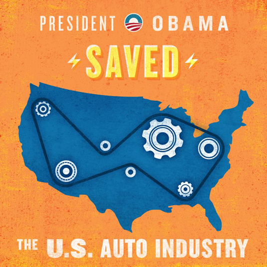
By now I’m sure you’re aware that there’s this thing called an “election” going on today, but instead of comparing the candidates on important issues such as the economy, foreign affairs and social policy, I thought I’d talk about what really matters: each campaign’s respective graphic design.
From logos, to websites, to social networks, each campaign has literally spent millions (possibly billions) of dollars in hopes of securing your vote. So how did each campaign do? Until we know the actual results, here’s how they stack up from a purely visual standpoint:
LOGO
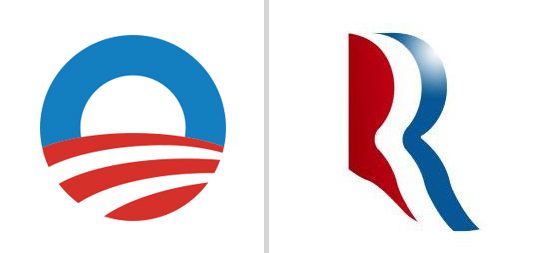
Infinitely adaptable, clever and just plain nice to look at, Obama’s logo has been a game changer from the start. Thankfully, this time around, the campaign had the good sense to leave the ‘O’ mark alone — if it ain’t broke.
Romney’s mark on the other hand is a bit of a yawn. That is until you realize that it also very closely resembles the Aquafresh toothpaste squiggle. I’m all for dental hygiene, but even that connection doesn’t make sense for Romney — if we’re comparing teeth to teeth, the Obama/Biden ticket is clearly the leader when it comes to their pearly whites.
LOGO INCORPORATION/TYPOGRAPHY
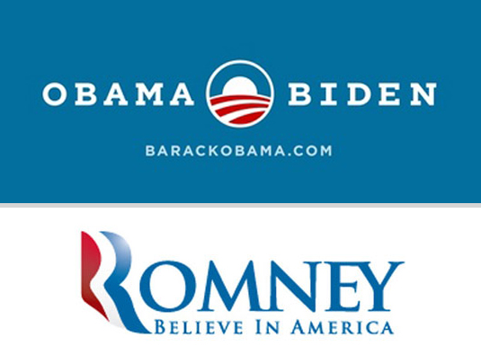
With a custom, slab-serif version of the typeface Gotham updating his look for 2012, the Obama campaign really understands beautiful typography. They could have very easily fallen into the trap of replacing the ‘O’ in Obama with his circular mark, but they are smarter than that. Yes, his yard signs are a bit hard to read from a distance, but the teeny-tiny-type-loving designer in me applauds the effort to keep it classy.
By contrast, the Romney campaign apparently had no qualms about replacing the ‘R’ in Romney with his toothpaste squigg, which creates its own readability issue (Omney for President!). The supporting, serif typeface isn’t terrible, but it’s not exactly a thing of beauty. The large ‘i’ in ‘IN’ is puzzling, and the combination of the e and y serifs is a bit sloppy. The ‘m’ and the ‘n’ are also awkwardly joined, but the ‘n’ and the ‘e’ are not — consistency is key, and is something the Romney campaign doesn’t seem to care much about.
WEBSITE
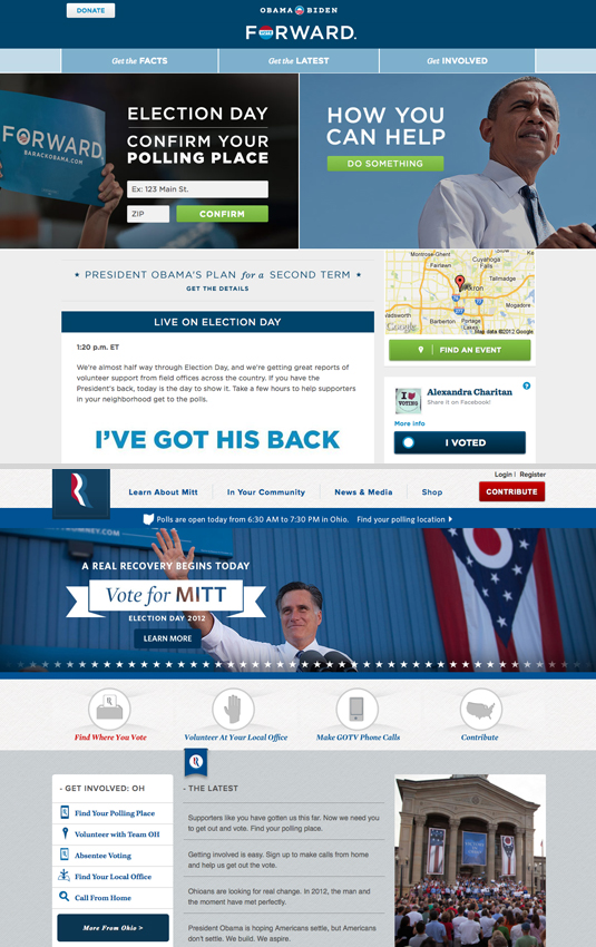
While both websites get my kudos for being well-designed, especially as far as governmental/political sites go, BarackObama.com is simpler, more consistent and feels more current than MittRomney.com. The Obama campaign keeps things easy with their main navigation broken into three categories. Romney has four up top, and then an additional four below.
The “Get the Facts, Get the Latest, Get Involved” language of Obama’s site is clear and direct and a lot more motivating than “Learn About Mitt.” It should also be said that the Romney campaign should hire a new photographer — almost every photograph they use in their materials is average at best, especially when compared with Obama’s striking (and well-edited) imagery.
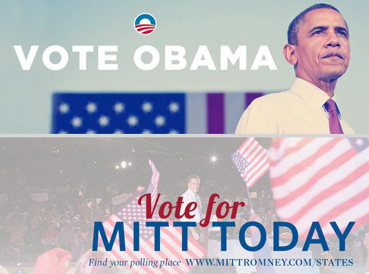
Social Media has become an important and integral part of each campaign, with frequent Facebook updates on both sides. A quick visit to each candidates official page reveals an instant difference in style. While the messages (VOTE!) and elements (photo of candidate, American flag, text) are basically the same, the designs are radically different.
Once again, the Obama campaign presents a simple, clean and elegant design. They use two words to say essentially the same thing that the Romney campaign says in eight — plus a url. Their image of Obama is clearly a professional, quality photograph, while the rally photo of Romney (is that even Romney? Why isn’t the focus more on him, and less on the billowing American flags?) is as ordinary as can be.
The Obama typography is bold and consistent with their branding. I get what the Romney campaign is trying to do with the script/sans serif combination, but they’re not quite there. They also throw in an italic and serif, for a total of four different type styles, none of which come close to being as pleasing as Obama’s one.
VIRAL GRAPHICS
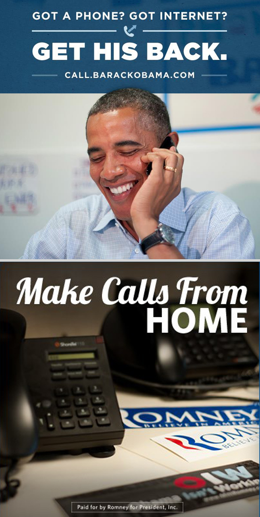
Each campaign has also tried to create individual, easily digestible, post-able graphics for Facebook, Twitter, Tumblr and Instagram. Once again consistency is key in the Obama campaign, and I’ve found myself envying their beautiful creations on numerous occasions. They’re informative, to the point, and just plain nice to look at.

By contrast, the Romney graphics are a bit all-over the place, in terms of style and general design. The photos are ho-hum (dark, poor quality, outdated — how many of you not only have a land line at home, but two??), the typography is sloppy (or hard to read) and they’re generally just… ugly.
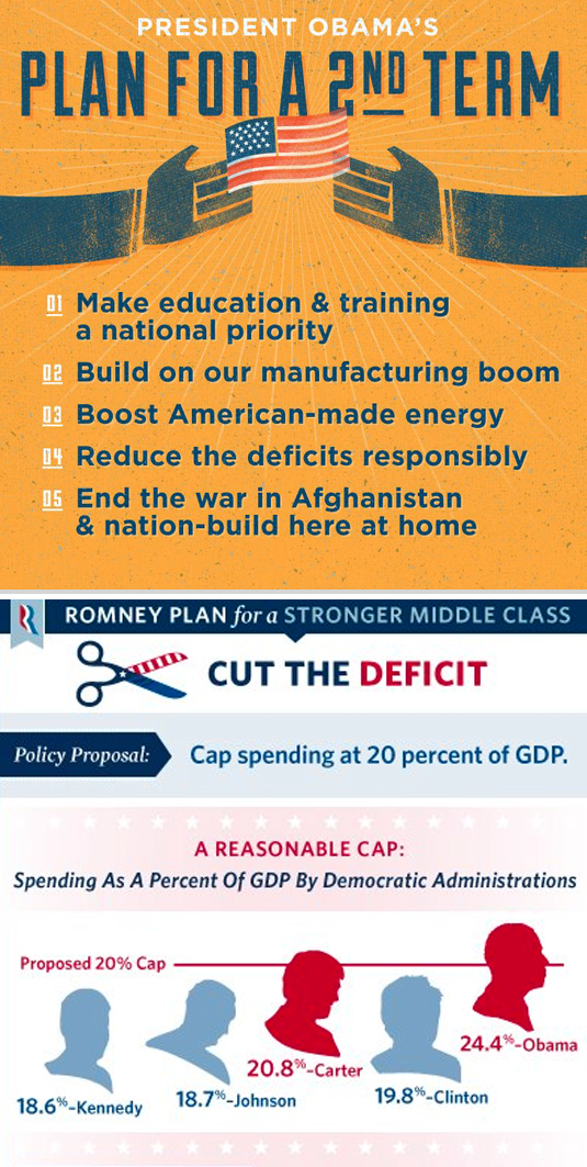
Nowhere is the contrast between the two design styles more evident than when you compare these two graphics — both are intended to deliver a message about the candidate’s platform. The Obama campaign demonstrates a clear understanding and mastery of color usage, hierarchy, typography and readability. Which of these would you rather hang on your wall? Can you even stand to look at the Romney plan long enough to read it? Strange, unrecognizable silhouettes, gradients, stars, banners, speech bubbles, arrows, so many stripes — even those scissors are patriotic.
I think that no matter how you feel about Obama the candidate, there is no doubt that his campaign not only churned out some wonderful designs, but managed to maintain a quality and consistency level to which all future campaigns should aspire. Now go vote, if you haven’t already done so, and may the best man design win!
I’m Alexandra Charitan, and I approve this message.
Sorry, comments for this entry are closed at this time.