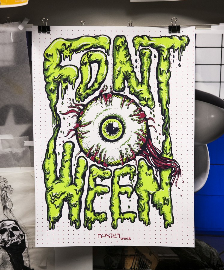
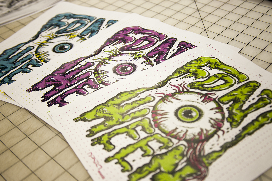
For the past four years we have opened our doors, and our print lab, to the students of the University of Akron Myers School of Art for a hands-on, screen printing workshop. This two-night workshop is one of many opportunities open to design students as a part of the program’s Design Week activities. The poster that we design and print is specifically tied to their annual Fontoween event where each student is encouraged to dress up as their favorite font.
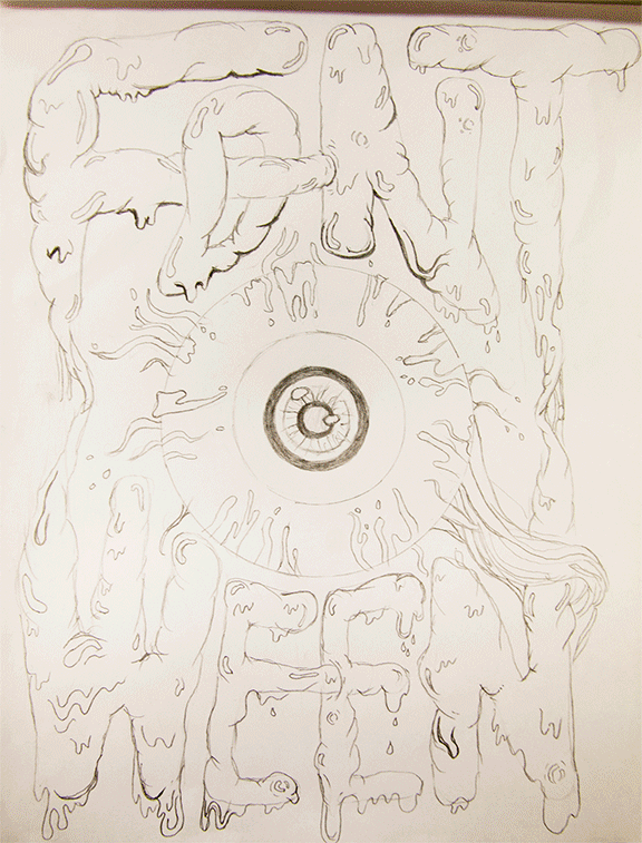
The poster-making process begins with the team at 427 Design collaborating on concepts for the new Fontoween design. A series of sketches are drawn and revised until the team agrees on the final poster concept. Then comes the creation of ink drawings, layers of textures, colorizing and finally setting up the files for film creation to be used in imaging the screens for printing.
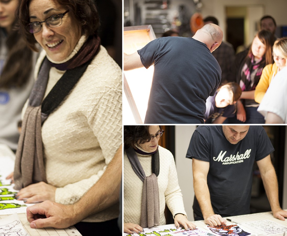
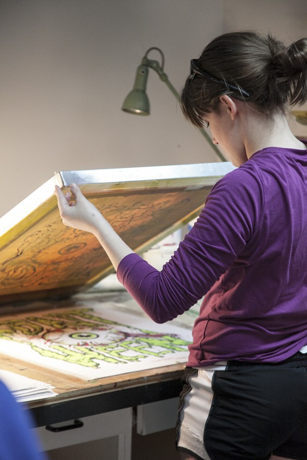
When the students arrive at 427 Design they are coached through the steps of creating the art using software and given some pointers and best practices throughout the process. They are then guided into transferring the artwork to the screens for printing, mixing the colors, and finally, registering and printing the actual posters. This year’s poster included a series of four colors. Since two groups of students participate the workshop, different students attending each night, two unique colors are printed during each session.

“This workshop gives students who want to learn about screen printing an opportunity to get hands on experience in a more condensed, focused way… while ruining others equipment and supplies”, says Justin Tokos, Vice President and Creative Director here at 427 Design. Tokos, who has been teaching Production and Illustration at the University of Akron since 2008, coordinates the event each year with the head of the Graphic Design Department, Janice Troutman.
The annual Fontoween screen printing workshop is an event that our team really looks forward to each fall. It’s refreshing to spend a little time with such eager and energetic design students and we really like being able to share our space with them.
Click here to see the previous Fontoween poster design.
What differentiates you from Kyle?
Not much, we are actually siblings — twin spies genetically engineered and sent by [edited for legal reasons] to infiltrate your company and corrupt your files. Our operation is going well — so far.
Where did you go to school?
Wellington Exempted Village public schools K-12
That sounds made up.
…
When is your birthday and what embarrassing thing about you can we ice on a cake?
October 31st — I know that has to set me up for something good, I have high expectations.
What terrifies you most about Justin Tokos?
Any type of food he tries to put on my desk. (Especially when he waits there and stares at me to see if I will or wont eat it.) Suspicious.
We were thinking you would say something more along the lines of “everything.”
Nope, just the food thing.
Aw, that’s cute.
So, what brought you to 427 — besides the extravagant pay check, two day work weeks and free kittens (we don’t have any of those things here, by the way)?
4 plus 2 plus 7 equals 13, the unluckiest number?
I’m not as good at math, but what does 4 + 2 + You’re Fired equal?
Still 13.
In “427 Design: The Movie”, who would play you?
[Edited for legal reasons], for obvious reasons.
Who is your favorite Ninja Turtle and why?
Venus, because she is the most hated.
I’ve never heard of her, but she sounds awesome.
So, what’s with all the vests?
They hold in my soul.
Don’t tell Justin.
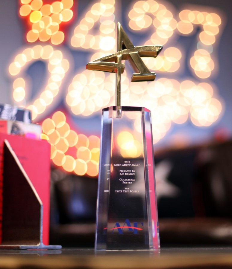
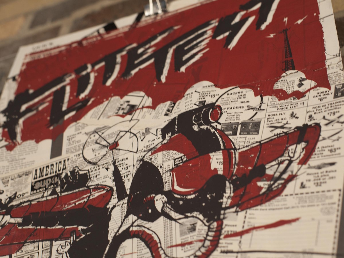
We are honored to be able to say that the poster(s) that we designed and printed for Flite Test won Gold at the National ADDY Awards, held in Phoenix, AZ on June 8th. The poster had won Gold, and Best of Show at the Akron ceremony in March, and Silver in the Fifth District ADDY Awards.
Flite Test is an Ohio-based organization created for people who are passionate about flight. We first worked in conjunction with Director/Executive Producer Chad Kapper to redesign the Flite Test logo. We wanted to maintain the essence of their former mark, while adding character and a handdrawn quality. We then took that logo and designed a series of two-color posters.
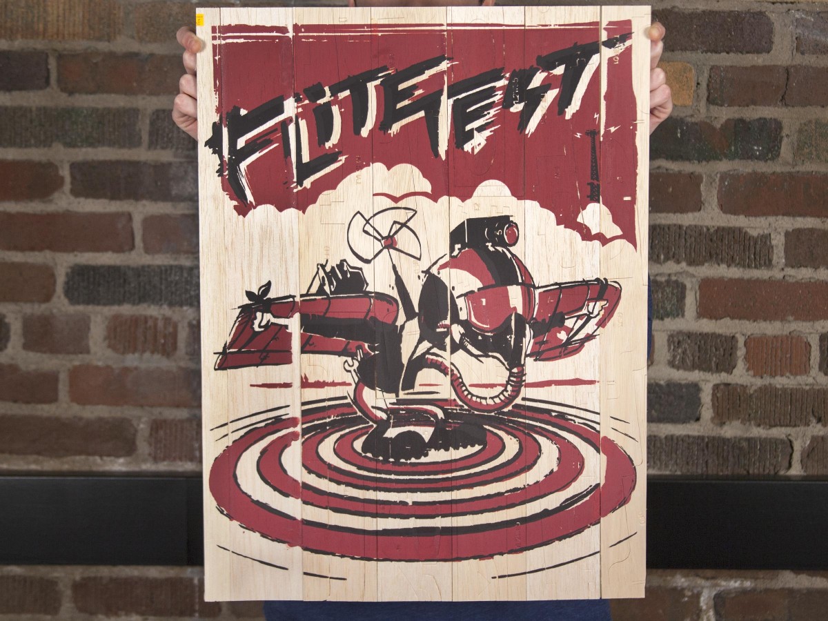
While some were printed on basic stock, most were screen printed in our print lab on unconventional materials — pages torn from hobby magazines, strips of balsa wood — we really tried to have fun with the whole process. It’s become a joke around our office that we’ll screen print on anything that will sit still long enough but we love making pieces that are a little bit unexpected and different.
We continue to be extremely grateful for clients that trust our crazy instincts, and are honored for our work to be recognized at every level of the ADDY awards this year. This is our third National award (we’ve won them in the past for our first Open House Poster and our rebrand of AAF Akron) and we hope it’s not our last. You can read more about the award from AAF Akron here.
So, Kyle — what’s it feel like to be the second of three “K-named” people we’ve hired in a month?
Kinda like being the middle child. But a lot better than being the third (sorry Kevin).
What differentiates you from Kaitlyn and Kevin?
That’s probably the hardest question honestly. I don’t really know Kaitlyn or Kevin that well yet.
Neither do we.
But Kaitlyn is shorter than me and Kevin is taller than me. I know that much.
Where did you go to school?
I went to Manchester High School in southern Summit County and I graduated from the University of Akron last May.
When is your birthday and what embarrassing thing about you can we ice on a cake?
My birthday is February 7th. The most embarrassing thing I have ever had happen to me in my life (so far) was when I accidentally used a women’s restroom in college and was almost caught, so take that as you will I guess. But I find it hilarious now.
Now. We’ll talk again on February 8th.
How do you feel about not having a window in your office?
Well, I do have a window.
Oh.
But I am forced to absorb all my sunlight for the day secondarily through Brad’s office.
What brought you to 427 — besides the extravagant pay check, two day work weeks and free kittens (we don’t have any of those things here, by the way)?
I WAS told about the kittens so that played a big part until I found out it wasn’t true. But the history, talent, and expectations 427 has makes working here a fun and challenging experience.
In “427 Design: The Movie”, who would play you?
Ryan Gosling
Who is your favorite BK Kid and why?
BK Kids may have been a little before my time, but from what I vaguely remember I’d say Kid Vid because of how much he loves videogames and his cool goggles.
Well, now that I feel officially old, can you explain to me how this Internet business works to me in five words or less?
A series of everlasting tubes.
So just like Discovery Zone?
Exactly.
Cool.
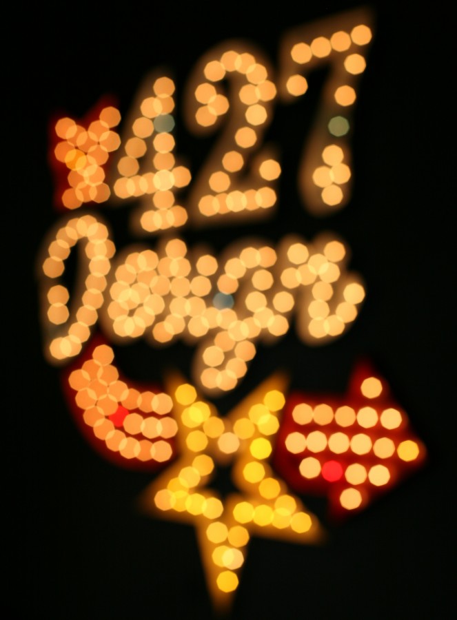
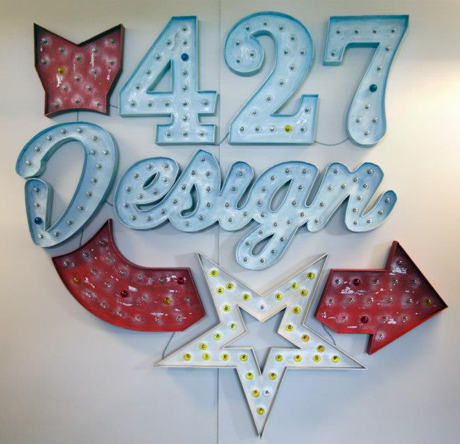
If you came to our 7th annual Open House on April 26th, you may have noticed a new addition to our office walls: a huge, lighted marquee sign consisting of our name, star logo and a curving arrow (it’s kind of hard not to notice).
When we first picked our Open House theme nearly a year ago (Lucky No. 7/Vegas) we almost immediately decided that we wanted to make a sign. Few things scream “Las Vegas” more than large, lighted signs, but we knew that we’d want something that could not only fit into our theme, but remain in our office for years to come. Our creative director, Justin, volunteered to take on the enormous task of building the sign, and one of our designers, Alexandra, designed it.
Here’s a peek into the process:
Research
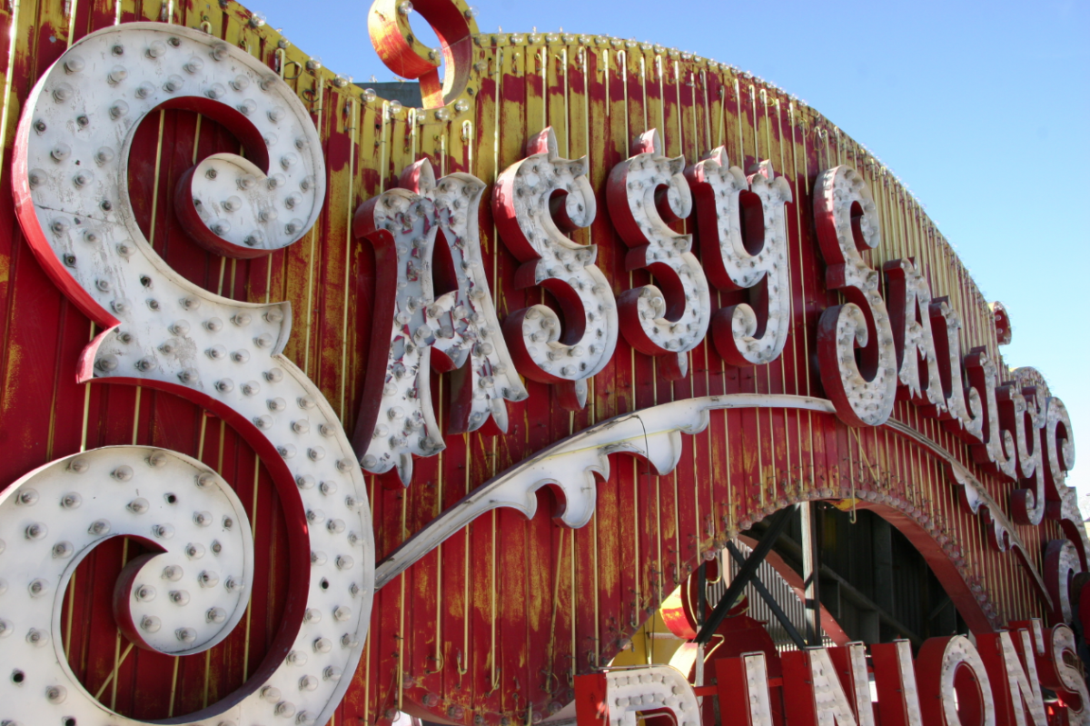
Most of our projects begin with extensive research. We had toured the Neon Sign Museum‘s boneyard on a trip to Vegas a few years back, so we started combing through the photos we took there for inspiration. We knew we wanted an arrow — and our logo was a given — but choosing the right typefaces and styles for the “427 Design” part was tricky.
We didn’t want the sign to feel too gimmicky or too themed; we wanted a classic and vintage look that would feel at home in our office.
While Alexandra was busy formulating the design, Justin was researching the construction end of the project. We initially considered making the sign from metal, but we quickly realized that wood was the most feasible option.
We knew we would be using bulbs (instead of neon), and we loved the dimensional quality of the signs with raised sides.
Design
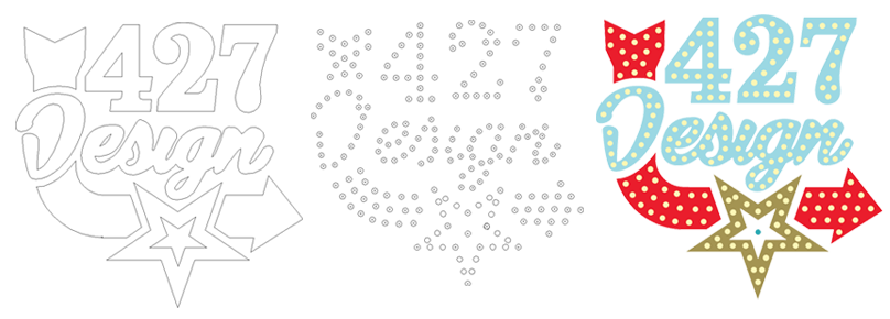
We designed the sign as vector art in Illustrator. We bought strings of simple, clear, round bulbs and measured one — after the final design was agreed upon, we took the same file and plotted out the placement of each light bulb.
Laser-Cutting
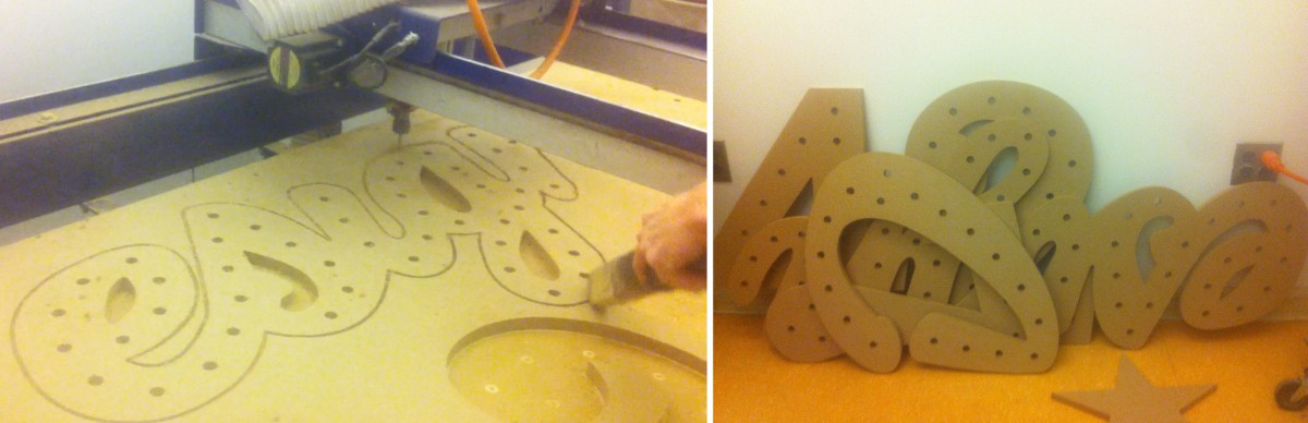
With the final plans in hand, Justin enlisted the help of Brad’s son Bryan. Bryan and Justin traveled to the Art Institute of Pittsburgh (their Alma Mater) to use their laser-cutting table. The bases for each section of the sign were cut from MDF, and a hole for each bulb was drilled.
This saved a lot of time and potential headaches, and ensured that our sign was as close to the original design as could be.
Adding Dimension
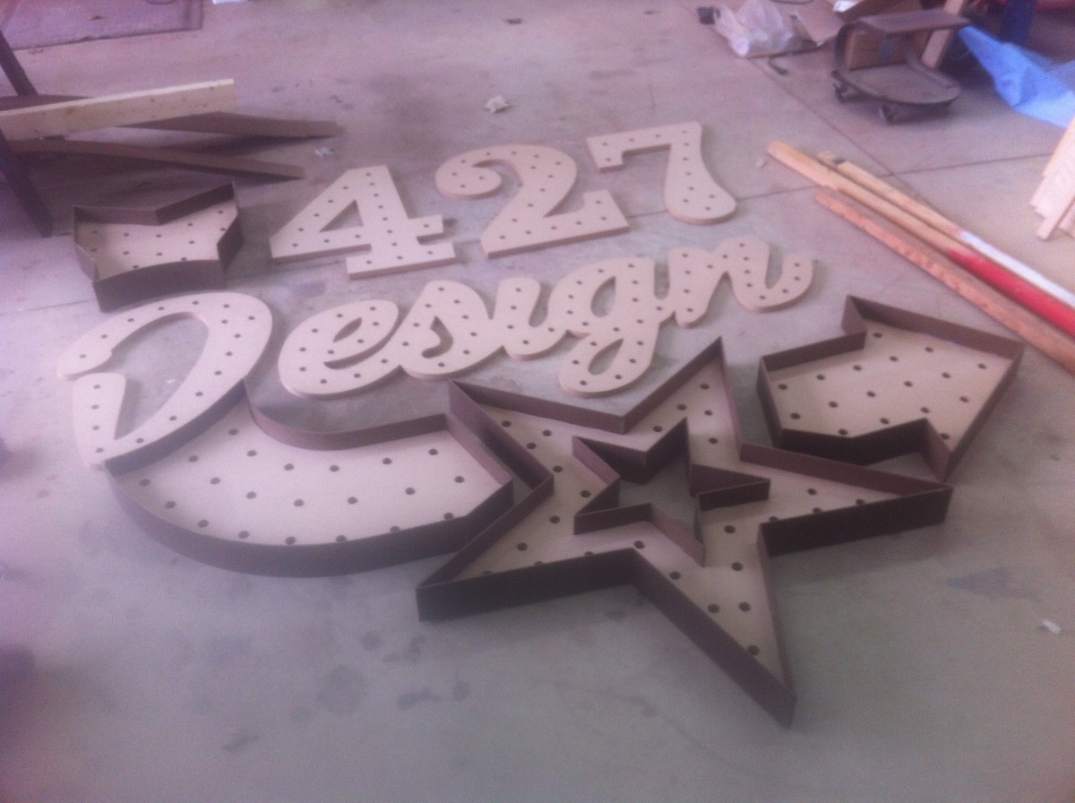
After the individual pieces were cut out, Justin began adding dimension to each one with strips of masonite. The straight sides were relatively simple: a few nails, some glue and a very precise measuring.
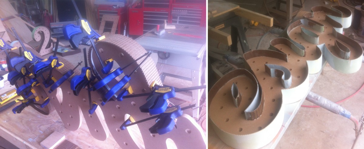
The curves were a different story. In order to get the masonite around the tight curves, he had to notch each strip so it wouldn’t break under the tension. After nailing and gluing the strips, he filled in the notched areas with body filler (thanks USC!) and sanded each one smooth.
If this sounds fun to you, let me introduce you to Justin’s fingerprints, which reappeared recently after being sanded completely smooth.
Faking Metal
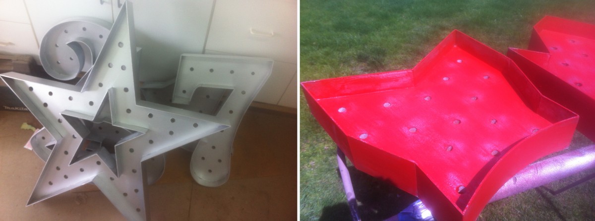
Although our sign was made from wood, we were able to mimic the look of the vintage, metal signs by using various painting techniques. After a few coats of primer, the entire sign was sprayed with a metallic silver spray paint.
The individual pieces were then painted with latex paint in their own color. Using a combination of scraping and sanding, Justin then distressed the pieces, paying special attention to the areas that would realistically have received the most wear (edges, around the bulb sockets, etc.).
Adding Bulbs
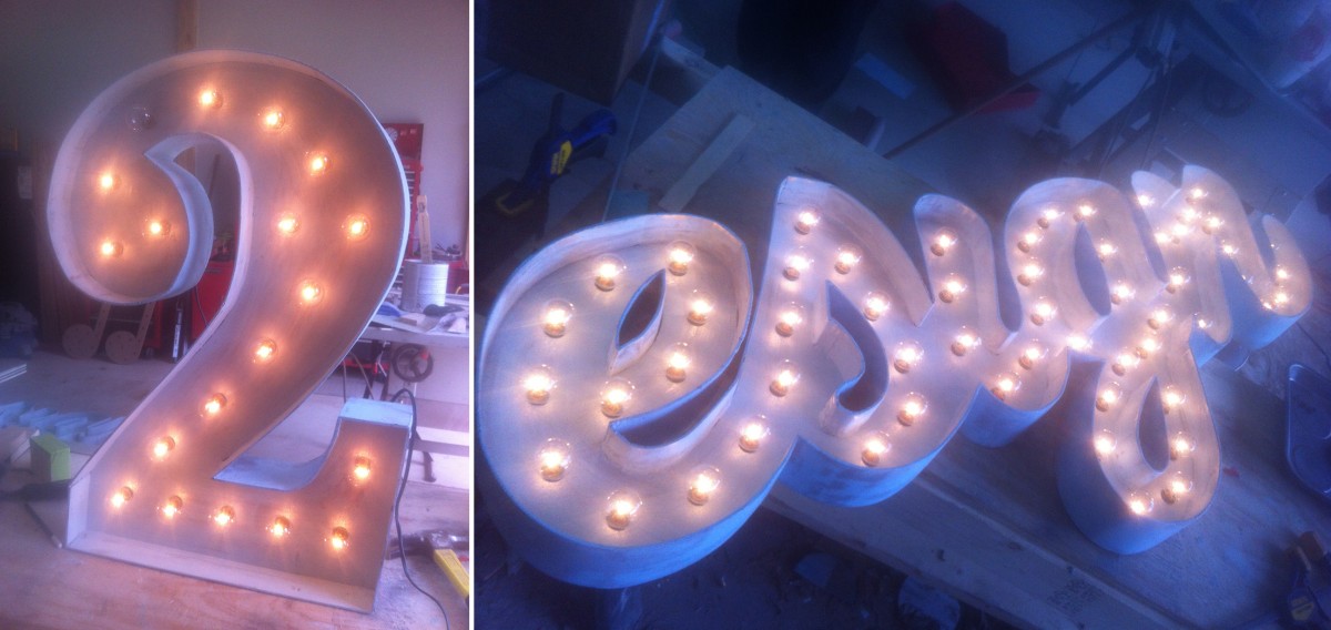
Turning a string of lights into a lighted marquee sign was no small task. Each bulb had to be removed from its string while the wires were wound around the back of each part of the sign. After the sockets were placed into their corresponding holes, the bulbs were screwed back in, one at a time.
We even used a vintage glass-dying kit to tint some of the bulbs — yellow for the star, and a few random red and blue bulbs to give it a used, vintage look.
Hanging the Sign
After everything was cut, sanded, painted and wired, the sign was ready to be transported from Justin’s shop to the office. We decided that it demanded space of its own, so we cleared off a central wall near our sitting area. Hanging such a large sign was a challenge, but with a few helping hands, a lot of picture hanging wire and a few monkey hooks, we got it up and secure a few days before the Open House.
We’re so incredibly happy with the way the sign turned out. The first time we lit all 209, 5-watt bulbs — for a total of 1045 watts — we were in awe (we might have also melted the first dimmer we attached to it). It’s definitely transformed our space (and maybe our electric bill too) and will surely be the highlight of our office for as long as we’re in this space.
If you weren’t able to make it to the Open House this year, you can read more about what you missed here, or check out our photo album on Facebook. If you’d like to see the sign in person, stop by — we’d love to show it to you!