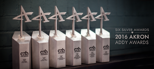
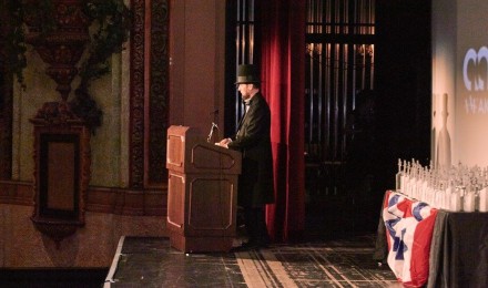
Once again, AAF-Akron hosted a varietal Who’s Who of the Akron advertising professionals and students. This year 427 Design received six Silver ADDY Awards from AAF-Akron at the aptly presidential-themed celebration of the Akron creative community on February 12th – Abe Lincoln’s Birthday.
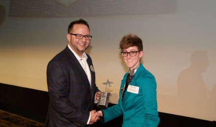
At the close of each awards season we like to take the time to thank those who make it possible for us to do what we love. Our clients entrust us with their brands, engage us in overcoming their challenges and allow us the opportunity to produce and implement creative, in some cases award-winning, solutions. A few of the silver statues we received were awarded for work we did for Neil Zaza, Diversified Digital and St. Vincent-St. Mary High School.

. . .
2016 Akron ADDY Awards
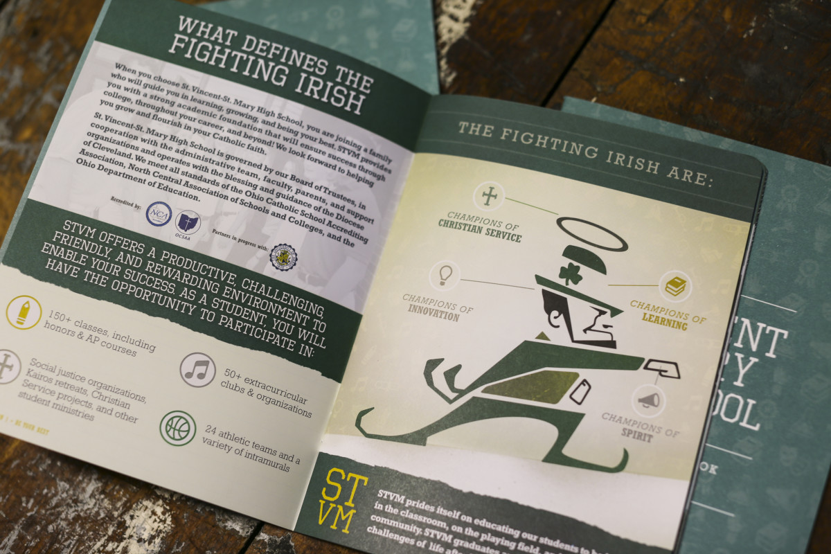
St. Vincent-St. Mary High School 2015-2016 Admissions Guidebook
Client: St. Vincent-St. Mary High School
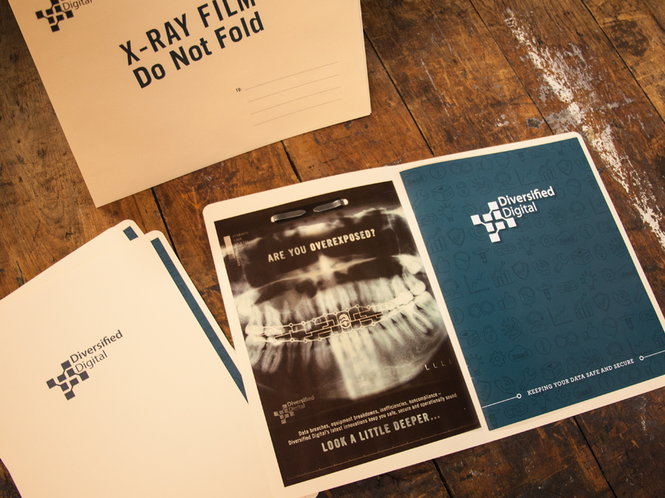
Diversified Digital Managed Services Sales Collateral
Client: Diversified Digital
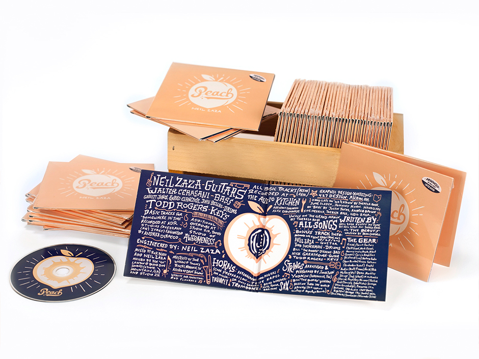
Album Art: Neil Zaza Peach
Client: Neil Zaza
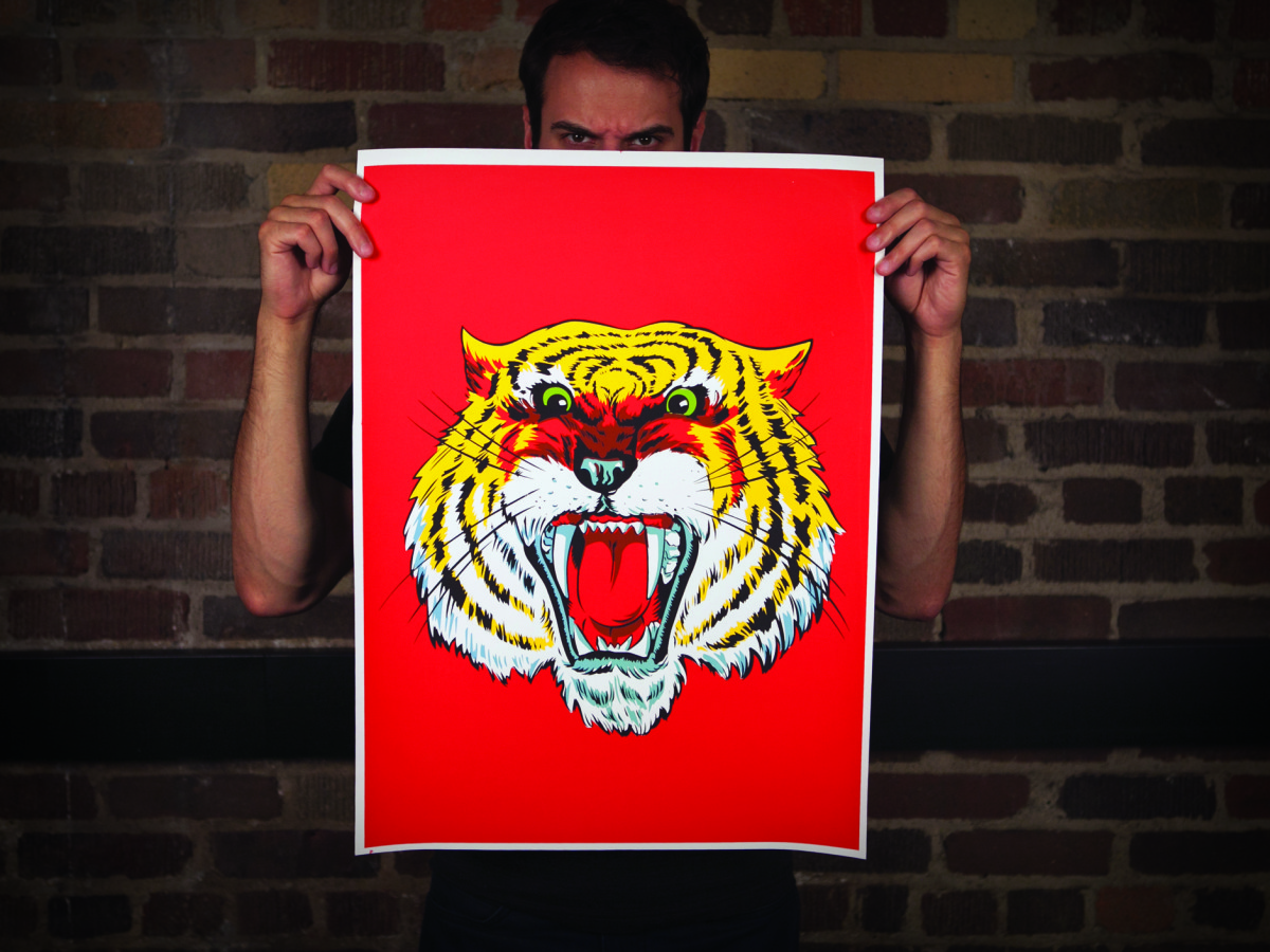
Poster: Meow.
Client: 427 Design
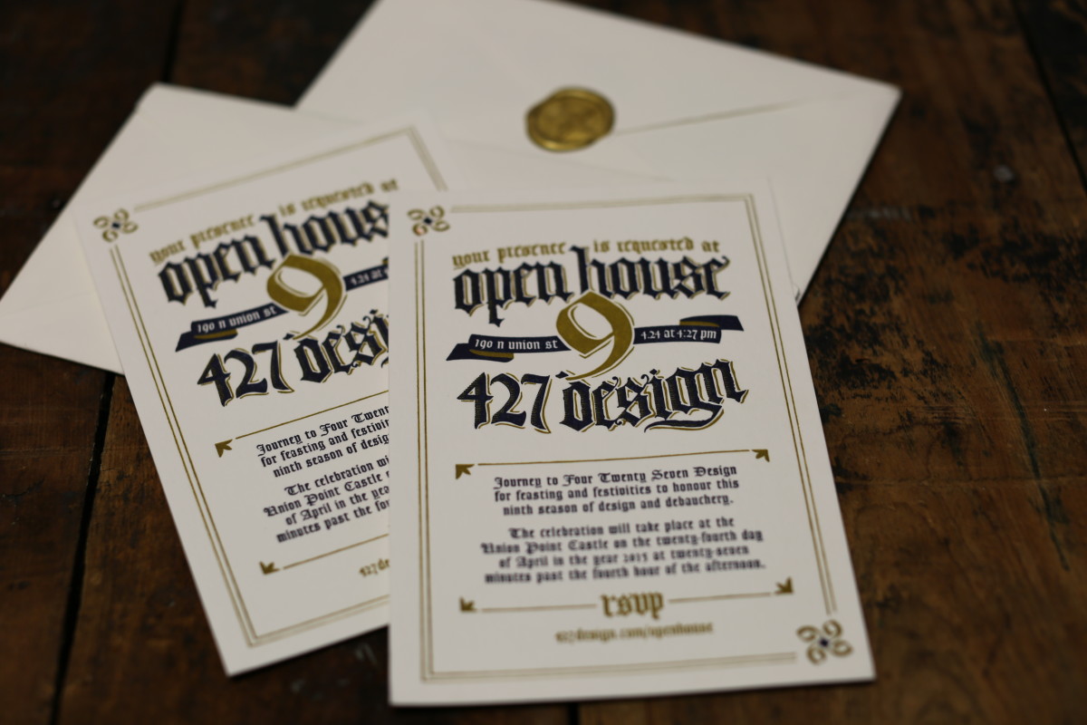
Open House IX Invitation
Client: 427 Design
Open House IX Campaign
Client: 427 Design
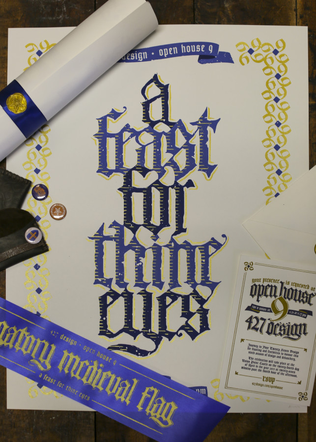
Congratulations to all the winners of the 2016 ADDY awards. The work produced by the greater Akron creative community last year was outstanding and, as always, we are proud to be surrounded and challenged by each of you. Cheers to you, and here’s to another outstanding year.
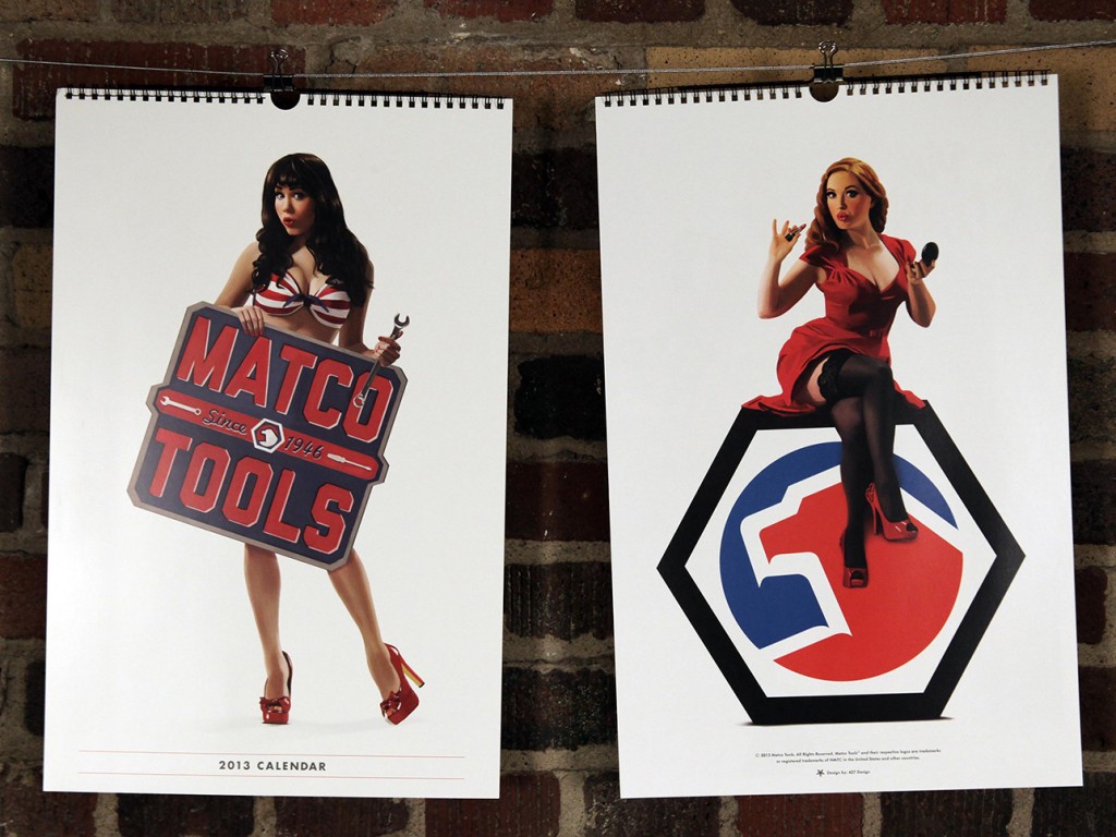
This year, we had the pleasure of working on the Matco Tools calendar for the second time (check out last year’s calendar here). We once again had an amazing time with everyone involved, and we hope it shows.
We decided (with Matco’s blessing) to pursue a pin-up theme, and we wanted to be extra careful to remain faithful to the artform. This meant hiring an artist to create one-of-a-kind illustrations for each page of the calendar — every image you see in the final is hand-illustrated, even down to the tools.
Here’s a peak into our process, from start to finish:
Assemble a Team:
We knew finding the perfect illustrator was key — not only someone talented, but also familiar with the pin-up style that we had in mind. Kelly X not only met those criteria, but she put us in touch with some of today’s top pin-up models, including (eventual calendar girls) Claire Sinclair, Sabina Kelley, Bondi Holly, Angela Riccio and Jessamyn Rose.
We still needed one more girl to round out the year (each girl represents two months), and from the minute we saw Miki Black, we knew she was it.
Lastly, we had worked with Studio Martone (photography) and Dresden Buras (stylist) on 2012′s calendar, and they were happy to reprise their roles for 2013.
Find a Direction:
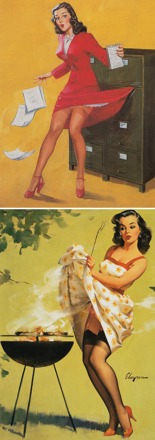
We knew we wanted to remain faithful to the pin-up style, but what does that mean, exactly? We did weeks of research, poring over the greats: Elvgren, Buell, Ekman, Vargas, Armitage, Ballantyne, and D’Ancona — to just name a few of our favorites.
We found pages upon pages of reference, and began planning our shots based on scenes and situations commonly represented in pin-up artwork. We then had to find a way to plausibly relate each girl/scene back to our common theme of Matco Tools.
In the end, we had more than 20 scene ideas that we narrowed down to the final six.
Find a Style:
Using our pin-up research as a guide, we assembled a minimum of three outfits for each model. We tried to represent a variety of styles, while maintaining a similar look and feel. You may notice that we tried to primarily stay within the Matco color palette (red, white and blue).
We found our clothes/props from many different places, including a mix of modern clothing retailers and vintage sources. In the final product we managed to include three dresses, one jumpsuit, two bikini tops, one bikini bottom, one pair of teeny-tiny boy shorts, two lacy bras, one racing suit and a ton of stockings and garters.

Shoot Reference Photographs:
Much like a lot of the pin-up art of the 40s and 50s, we began with photographic reference. We spent a day with each model at Studio Martone, shooting with as many of our props in place as possible.
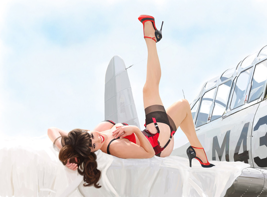
The fact that these were eventually being illustrated, allowed us a bit of freedom with our final compositions — for example, we actually shot Bondi Holly next to that 1953 Mercury, while Claire Sinclair was shot separately from the P-41 Warhawk.
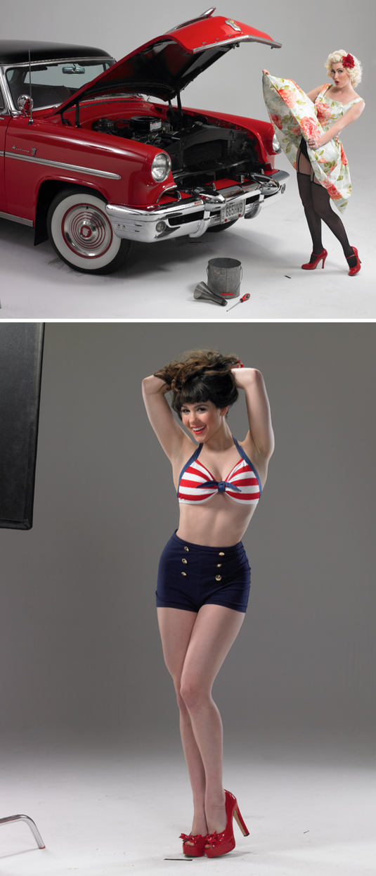
Turn Photos into Pin-ups:
After a bit of Photoshop work (light retouching, composition, etc.) we sent the photos over to Kelly X, who turned them each into beautiful illustrated, one-of-a-kind works of art.
Starting with a pencil sketch based on each photo, Kelly painted layer upon layer until each girl was ready for the calendar. She also worked her magic on six classic Matco tools, illustrating each one so that the entire calendar would feel cohesive.

Make a Calendar:
We knew from the beginning that we wanted the 2013 calendar to be all about the girls, so we went with a full-page format, spiral-bound at the top (instead of the saddle-stitched bi-fold in 2012), and reserved 2/3 of the layout for the illustration. The other 1/3 was kept simple with the dates for two months, a featured tool and the Matco logo.

We are super happy with the final product, and hope you are too — you can see the entire calendar on our work page. We’re excited to finally be able to share all of our hard work with you, and we’re already looking forward to next year. If you’re interested in getting a 2013 Matco Tools Calendar to hang in your own shop or home, contact your local Matco Distributor.
Special thanks to everyone at Matco Tools, Kelly X and Studio Martone for all of your hard work!