It’s always a challenge for us to design pieces for ourselves — it’s hard to find the right balance between wanting to entertain our clients and friends, while also injecting the piece with our personalities. Our Christmas card this year was actually two years in the making for this, and other, reasons, but we’re super excited to finally debut the finished piece.
We had the idea last year to do an homage to 1965′s A Charlie Brown Christmas, and we knew immediately that it had revolve around the dancing scene. Equal parts ridiculous and charming, the characters dance so distinctly and we wanted to remain as faithful as possible to the original. But of course, instead of the usual cast of Peanuts characters, we are the ones doing the dancing.
As with a lot of projects, the animation was deceptively simple. What might look like two or three frames turned out to be many, many more in some cases. Here’s a sneak peek into our process:
Reference Material
Everyone who has ever turned on a TV in the month of December knows of A Charlie Brown Christmas — 47 years later, there’s still a Charlie Brown balloon in the Macy’s Thanksgiving Day Parade. We didn’t want to parody the classic characters, rather, we wanted to remain faithful and respectful to the original. This meant doing our research, and painstakingly capturing the scene frame, by frame for static reference.
Turning Peanuts into 427 Design
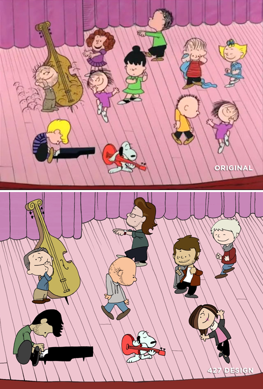
Our illustrator, Joe, took those reference frames and turned them into sketches — one-by-one modifying the Peanuts gang into the 427 Design crew. We chose characters that were close to our own personalities or with which we shared a physical characteristic: Joe is holding a jacket instead of a blanket, Allie and Sally are both blondes, and Andrea added a blazer and pants to her pink shirt.
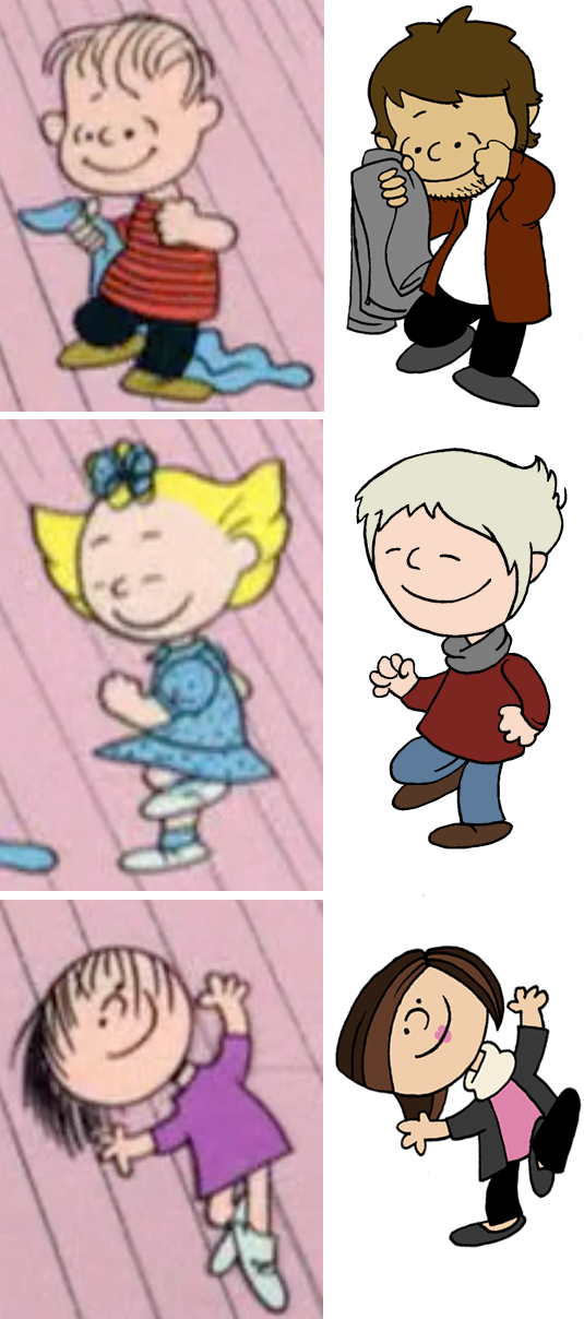
Hundreds of Frames
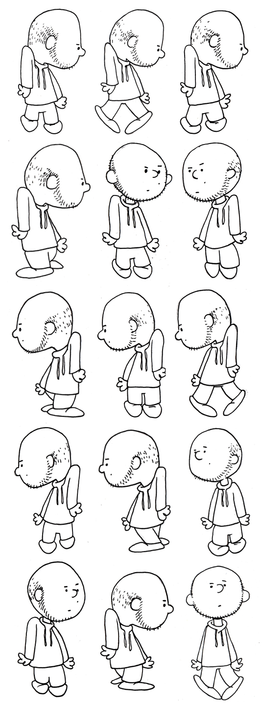
After each character was born, Joe illustrated their dance sequence, frame by frame. Some were more complicated than others, but he drew hundreds of frames for the final animation. These line drawings were then colored and animated in After Effects.
Final Touches
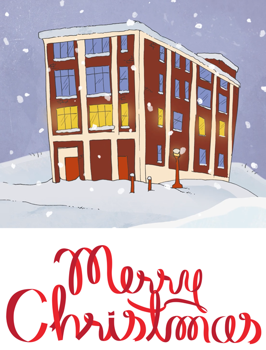
In addition to the actual characters, we wanted the entire animation to feel like it took place in the Peanuts universe. We illustrated our office building for the beginning, and a snowy field for the ending. Everything you see is custom and hand-done, from the individual borders at the end, to the ribbon type “Merry Christmas”.
We hope you enjoyed watching our card as much as we enjoyed creating it! Merry Christmas from all of us at 427 Design!
According to the musical, Rent, there are numerous ways to measure a year. You can add up the daylights and sunsets (365 of each expected this year, respectively) or even the midnights (the same). You can count the cups of coffee (let’s say, conservatively, two cups a day x 4 habitual coffee drinkers x 52 weeks, minus weekends + an extreme increase halfway through the year when Sam mysteriously discovered coffee = math is hard), or maybe you can’t, really.
You can also count the minutes, but thanks to Jonathon Larson, you don’t have to — in one year there are five hundred twenty-five thousand, six hundred of them to be exact. Here’s what we did with ours:
We won awards:
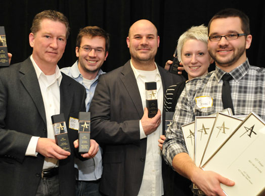
In February we won 10 local Addy Awards — 5 gold, 4 silver and the Best Use of Paper and in April, we won 3 additional District Five Addy Awards — 1 gold and 2 silver.
We printed all of the things:
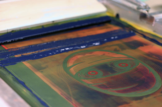
We turned a portion of our photo studio into a silk-screening workshop — officially christened, The Print Lab. We’ve since printed posters, t-shirts and basically anything that will sit still long enough under a screen.
We opened our house:
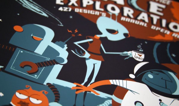
In April, we celebrated the beginning of our fifth year with our biggest and best open house to date. We had glow-in-the-dark button packs, screen-printed posters and we each built our own robots. Guests dined on moon cheese, astronaut ice cream and posed for a photo booth with custom-made ray guns. Dare we say, the space-themed bash was… out-of-this-world.
We made this site:
In case you didn’t notice, this beautiful (and functional!) site you’re on — it launched in May of this year. We hope you enjoy the weekly blog posts, deep thoughts and portfolio updates, all of which will continue into the new year (and hopefully many years after that).
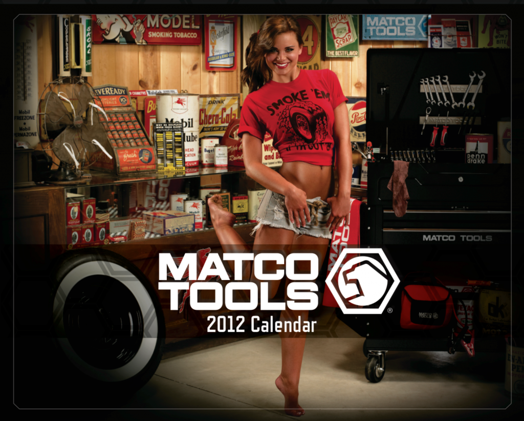
We made a calendar:
We spent the majority of our summer working with Studio Martone and the good folks at Matco Tools on the 2012 Matco Tools Calendar, a huge project that we’re still (nearly six months later) super excited about. We scouted mulitple locations and ended up shooting at six great ones — DSR Racing in Indiana; Cain BMW in Canton, OH; a replica Mobil Gas Station in Waynesburg, OH; Lucas Oil Raceway in Indiana; MAPS Air Museum in North Canton, OH and a picturesque farm in Magnolia, OH.
Look for the final art to be added soon to our print and video sections.
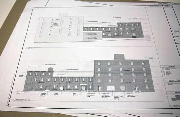
We bought a building:
Somehow, in the midst of the Matco madness, we managed to buy a building. A 58,000 sq foot, cereal factory from the 1890s at 243 Furnace Street. You can read all about the ongoing project here, here and here.
We hired some people:
Over the course of the year, we’ve had two interns (one of which we hired part-time — lookin’ at you, Manders) and hired Sam Karlo and Jameson Campbell on as full-time employees. And we haven’t regretted at least two of these decisions.
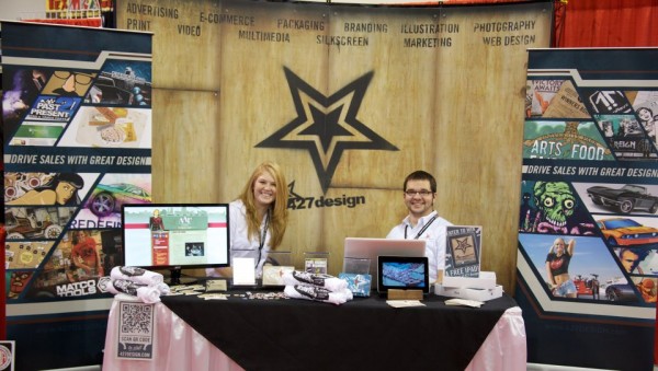
We worked hard for the money:
Justin, Amanda and John manned (and wo-manned) the 427 booth at the SEMA show in Vegas this November. They claim that they worked harder than those of us stuck back here in frigid Ohio, but we remain unsympathetic and unconvinced.
And then, we bowled:
To celebrate all 525,600 minutes of our work this year, we had our Christmas party at Stonehenge Family Fun Center last week, where our talents on the lanes ranged from non-existent (ahem, Joe) to inconsistent (hi, Jameson) to why-are-you-wasting-your-talents-working-for-us amazing (Brad “Bad” Hain and Sam “The Hurricane” Karlo). We only managed to get photos of two out of the three ‘teams’, because the third team had already taken their talents to the Ski Ball machines.
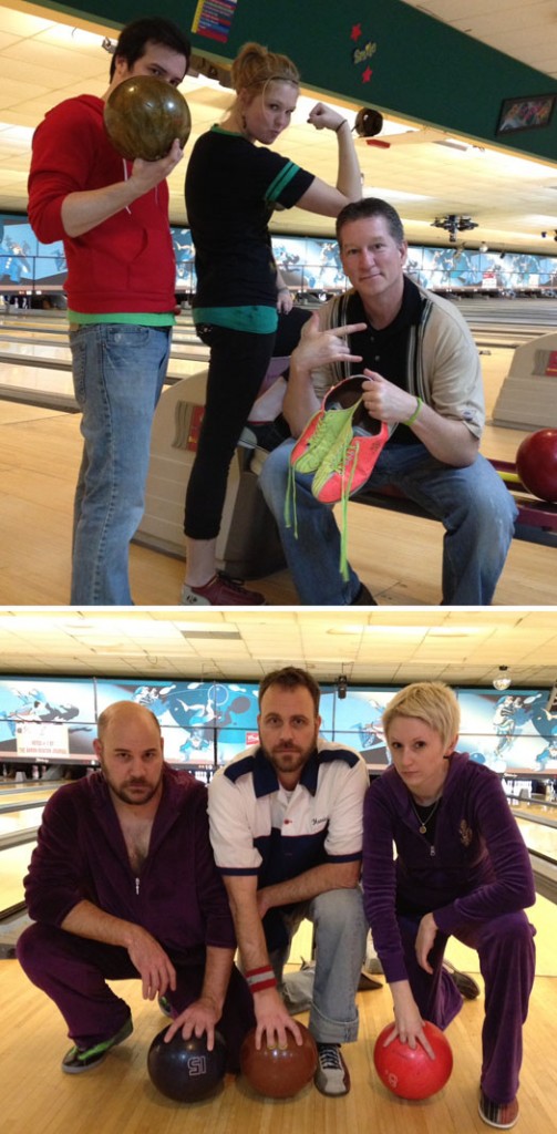
Is there a more fitting tribute to a year of great work, hard work and fun work than purple velour jogging suits, two personalized bowling shirts and a little friendly rivalry? We didn’t think so.
If you’ve ever changed the handles on your cabinets, or moved a wall clock, you know that we are creatures of habit. We gravitate towards the right (unless you’re that one, slow a-hole blocking rush-hour stair traffic) and buy our beverages based solely on the color of the can.
We’d like to think that we’re incredibly self-aware, able to make informed choices and possess open minds, but if the recent Coca Cola s-can-dal has taught us anything, it’s that we’re anything but. Basically, as an attempt to call attention to a partnership with the World Wildlife Fund, the powers-that-be at Coke released a special holiday version of their classic red can — something they do every year — but this one was, wait for it … white. GASP!
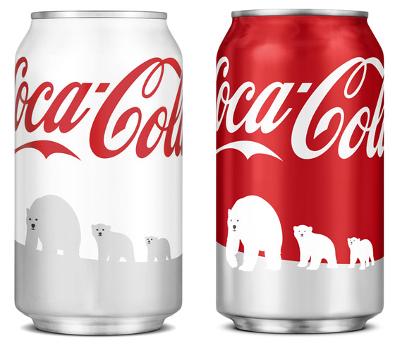
Mayhem ensued, with diabetics unknowingly guzzling the classic (read: sugar-filled) formula — duped as they were by the white can. “It was too similar to the Diet version!” they exclaimed. “It tasted differently“, others insisted. Never mind that the can clearly shows the “Coca-Cola” logo — much different, aesthetically from the Diet Coke branding — and that the iconic script occupies nearly a third of the can. Also, ignore the fact that the outside packaging remained red. America had had enough and demanded that the hoighty-toighty design-conscious snobs stop messing around with their beloved can.
So, they did. Coke is pulling their “bastardized” cans from shelves and replacing them with different, more consumer-friendly (red) designs — a plan they claim was always in the works (how convenient).
Aside from highlighting the incredibly finicky nature of the American consumer, this recent s-can-dal only reinforces what most designers already know: change is a difficult sell. No matter how much of an improvement, or how much more aesthetically pleasing a design may be, re-branding a product (or company, or person) can be an enormously difficult and touchy undertaking.
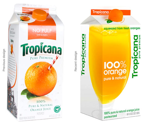 Aunt Mae’s corner cupcake shop is one thing. Huge, well-loved and well-known brands face the ire and criticism of the whole world, or at least it can seem like it (especially with the advent of that every-man’s soapbox, Twitter). Just ask the marketing departments at Tropicana or the Gap — both companies rolled out “drastic” (and I’m sure, very expensive) redesigns of their beloved brands this year, only to say out with the new, (back) in with the old, as a response to the outcries each respective design received.
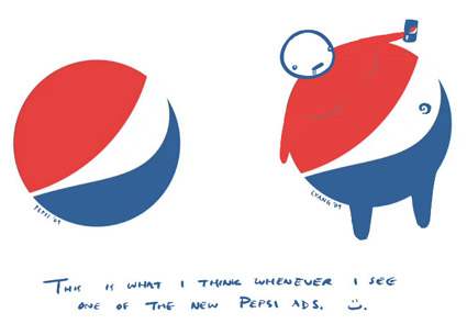
People don’t like change, or at least most people don’t — whether they’re aware of it or not. Just because something is new, however, does not mean it is inherently evil — although I could argue that there have been plenty of re-brands that should have been scrapped, or at least immediately re-worked (I’m looking at you, Pepsi).
As designers, we generally have pretty amazing jobs. We’re not working in a coal mine, or operating on hearts — at the same time, our profession is legitimate and some times (if we’re lucky) even influential. We have to be thoughtful and respectful with our ideas, whether they be for Aunt Mae or an industry titan like Coke.
And then, we have to stand behind our choices as professionals, or be prepared to crumble and suffer the often-times, very public (and expensive) indignity of a “just kidding” (Qwikster, anyone?).
